Services
- Brand Strategy
- Branding
- Digital Design
Project Overview
Idea worked with Downey to refresh their existing brand identity, with the aim of creating a clean, contemporary logo identity and dynamic visual language.
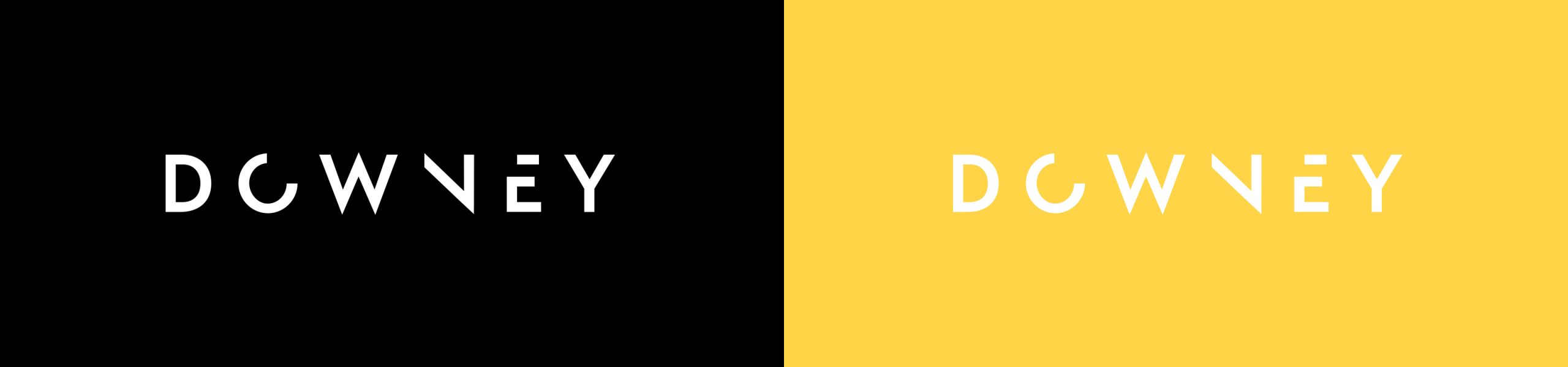
Brand Refresh
A strong and confident logotype was created using a simple sans serif typeface. This resulted in a bold identity that reflects Downey’s vigour and professionalism when it comes to their work. A dynamic visual language was developed which is led by the concept of collective parts coming together to form something new. These shapes all derived from the identity and can be used in a variety of applications, creating a flexible and active brand.

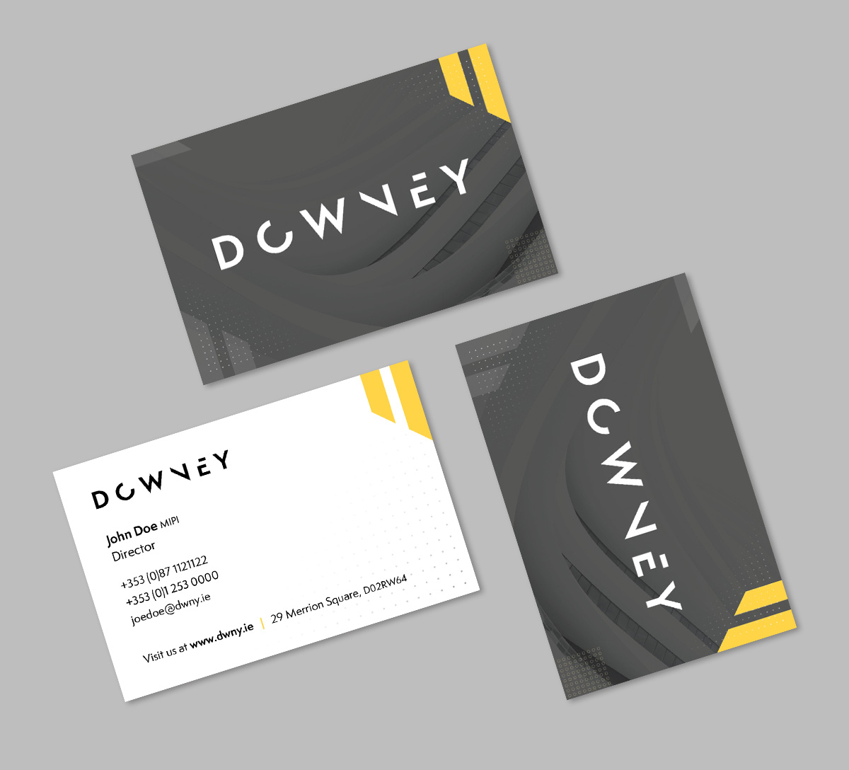
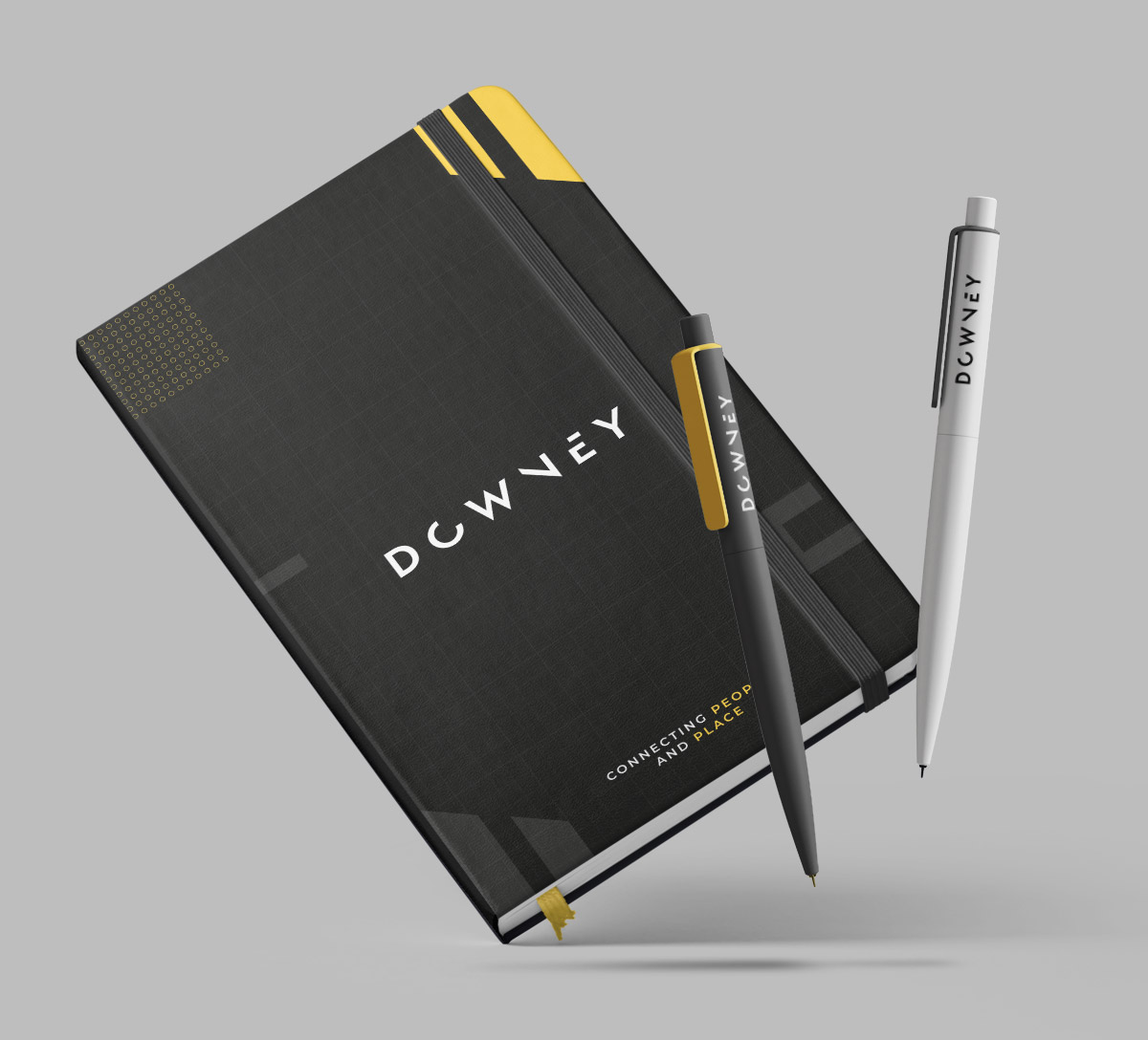
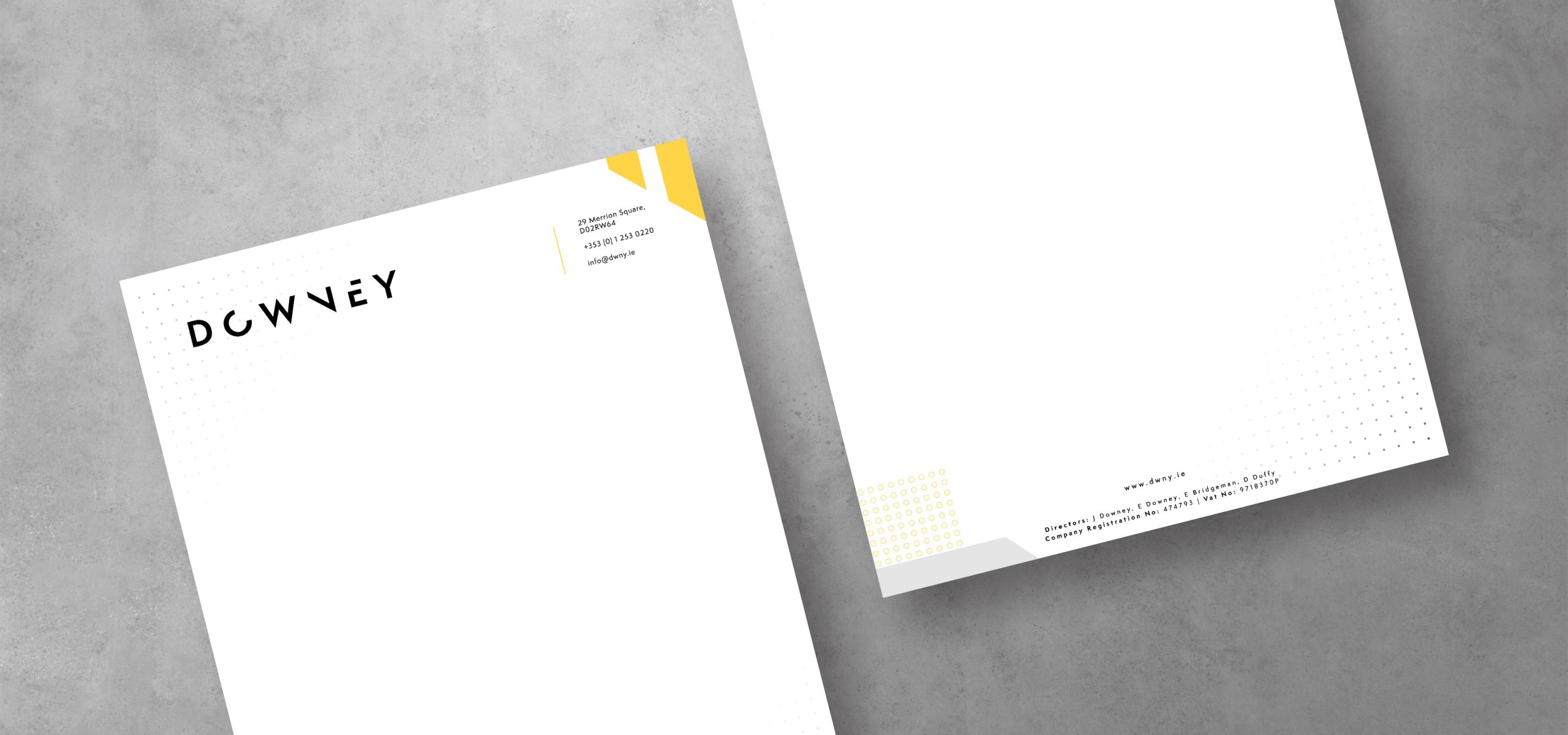
Stationery
A simple colour palette was created consisting of black, white and yellow for maximum impact, confidence and strength.
Brand Rollout
The brand identity was rolled out across a variety of materials including business cards, email signatures, flyers, invites, pull ups, a compliment slip, letterhead and holding page.
Minimal Approach
A simple approach was taken with the visual language, utilising contrasting colours to allow the accent tones to really stand out on the stationery, leaving the brand to take centre stage.