Services
- Brand Strategy
- Branding
Project Overview
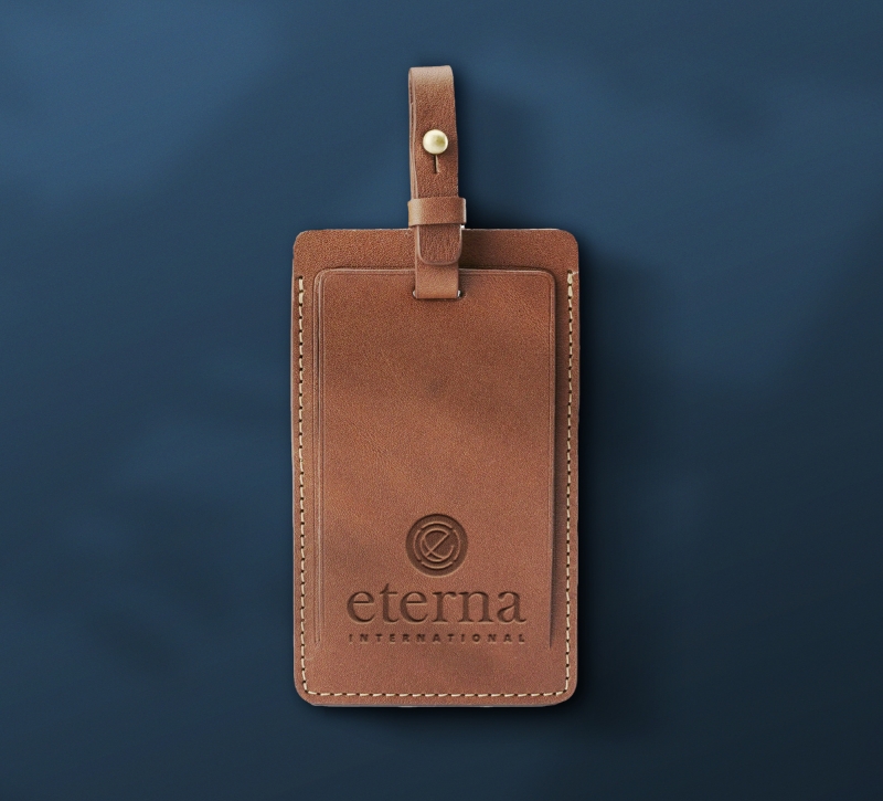
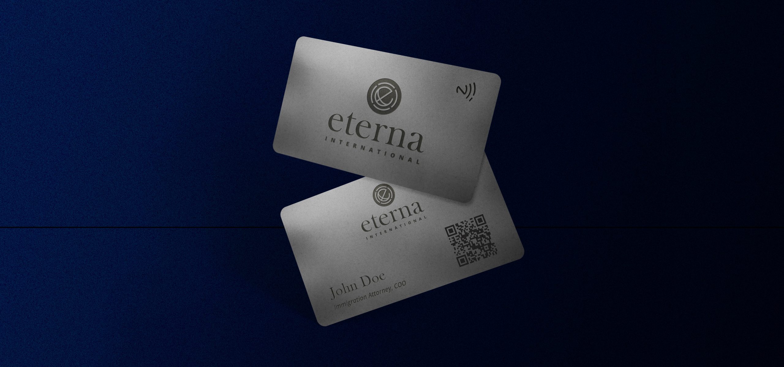
Eterna is an Immigration and Wealth Management Consultancy helping successful investors and entrepreneurs since 1928. Eterna International helps clients to increase their global mobility, to safeguard their wealth and to seize unique business opportunities across continents. Eterna came to us with the task of evolving their brand identity. They felt their previous identity was outdated and didn’t express the brands overall message. With the global nature of their business, it was important to the client for their brand to reflect this.
A fresh look and feel
We started with the shape of the globe and the letter ‘e’ from the Eterna name. We worked on combining the two before adding a circular device surrounding them, divided into four shapes to symbolise North, South, East and West. Pushing the whole global messaging of the brand further.
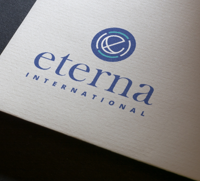
Global Citizenship
Using a lower case ‘e’ creates a more approachable identity and gives a nice balance between the word-mark and icon. Creating a distinct and memorable logo.
Modernise
The colour palette also needed to reflect their brand values. Choosing a bright navy colour as the master brand colour, chosen because of the significance of navy conveying importance, confidence, power, and authority, as well as intelligence, stability, unity, and conservatism.