Tag: Works by idea digital
Branding and Marketing Works Done by Idea Digital
Idea is a leading branding & digital marketing agency in Dublin, Ireland. Checkout all the work/projects done by us for various brands and businesses.
- Simply Blue Energy
- Payac
- The Gut Experts
- Savills
- Barretstown
- Niche Living
- Attestor
- Bord Bia Bloom
- Broadcasting Sustainability Network
- Comhar Linn INTO Credit Union
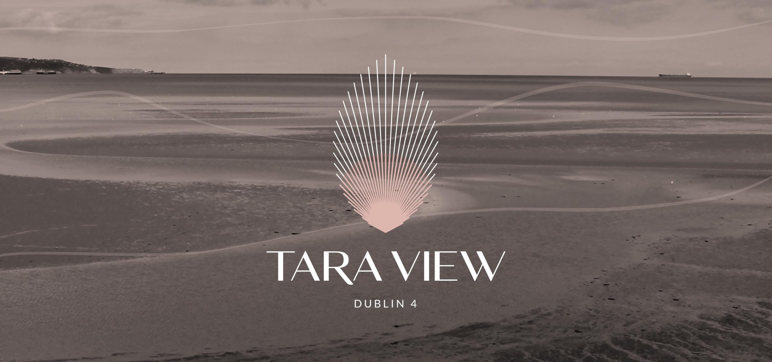
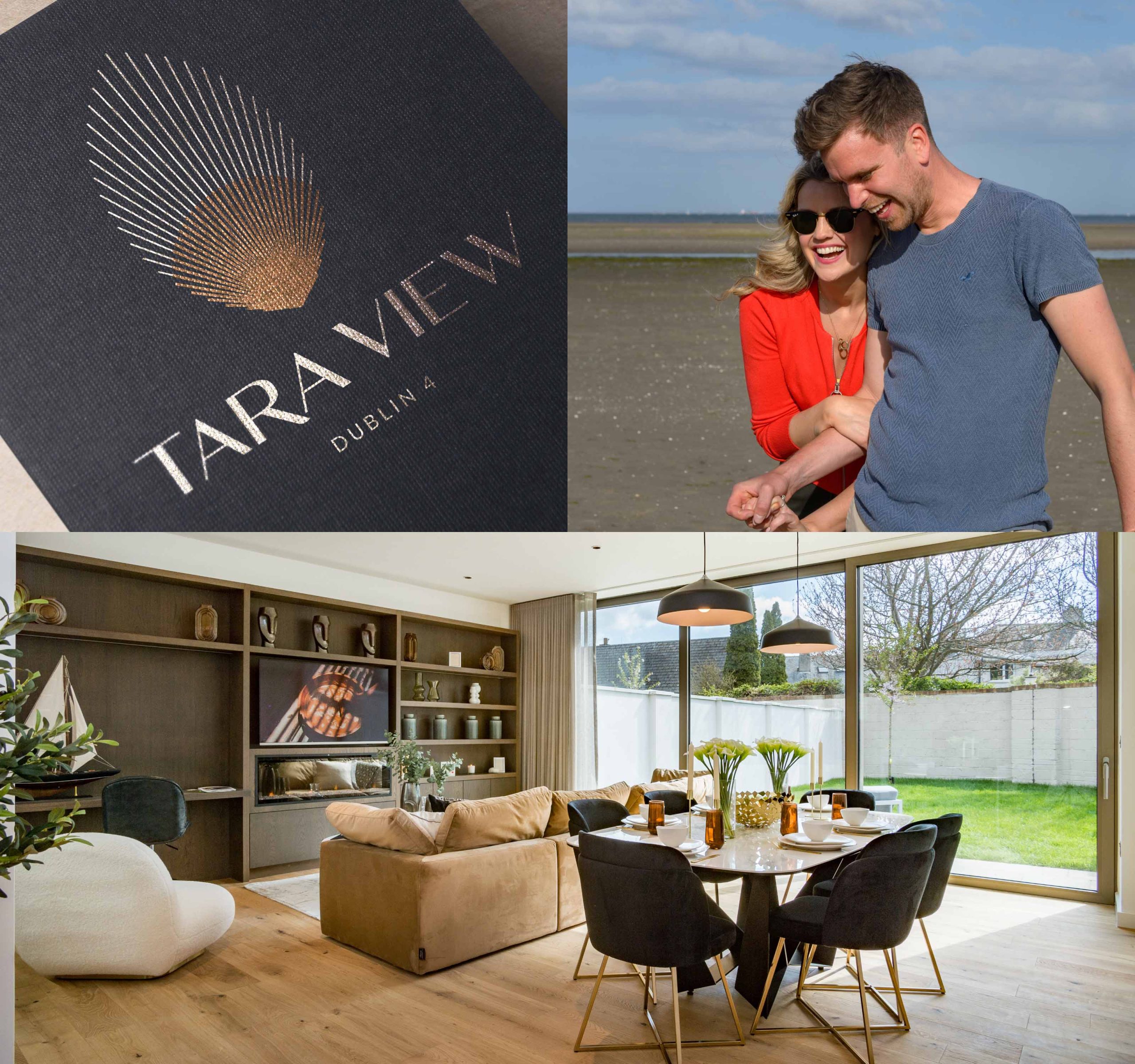
- Tara View
- Model Works
- Enterprise Ireland
- Eterna International
- Darmody Architecture
- Dortek
- Glensavage by Bartra
- SuirSafe Technologies
- KTI
- Bartra Healthcare
- RocDoc
Services
- Brand Identity
- Digital Strategy
- Website Design & Development
- OOH Advertising
Project Overview
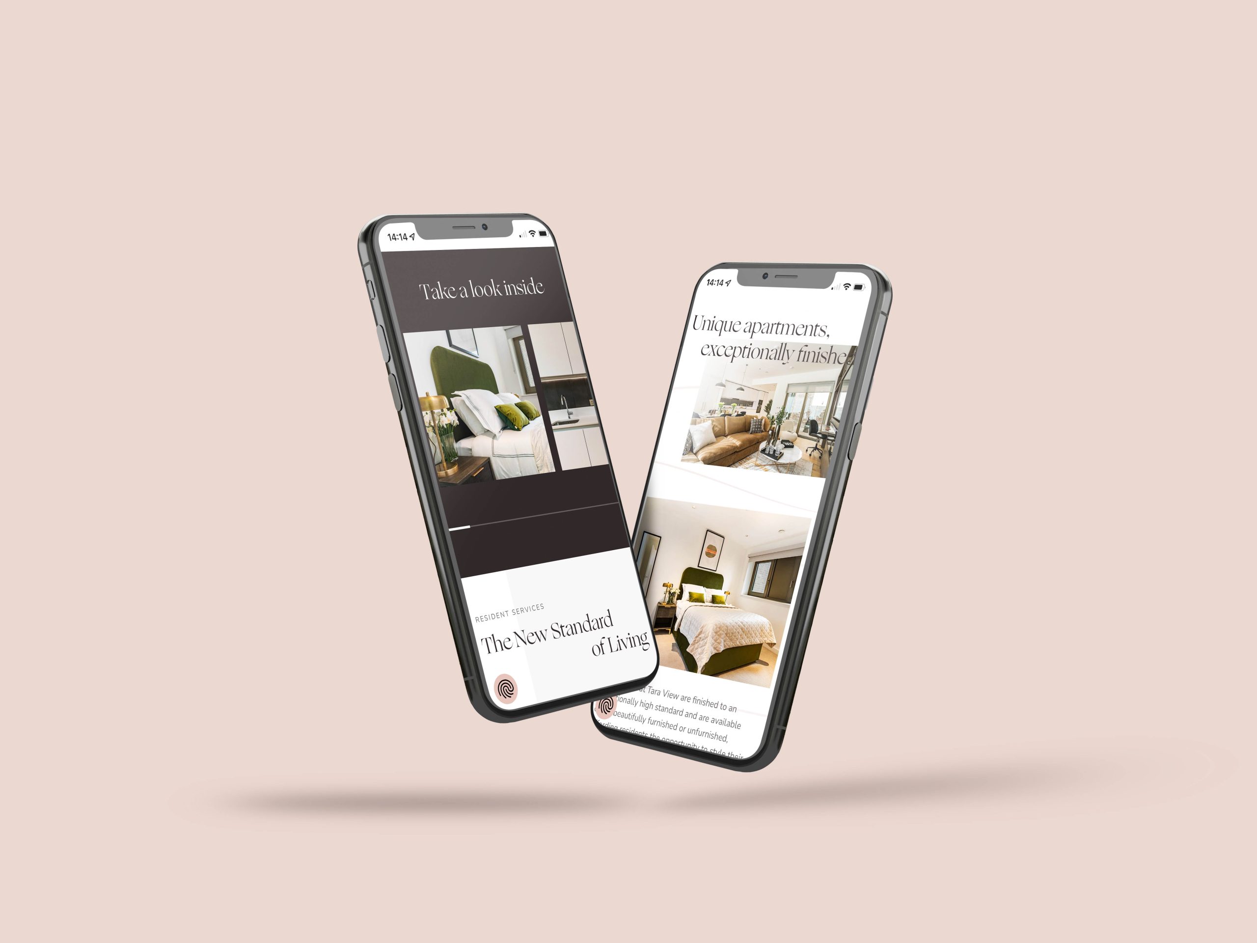
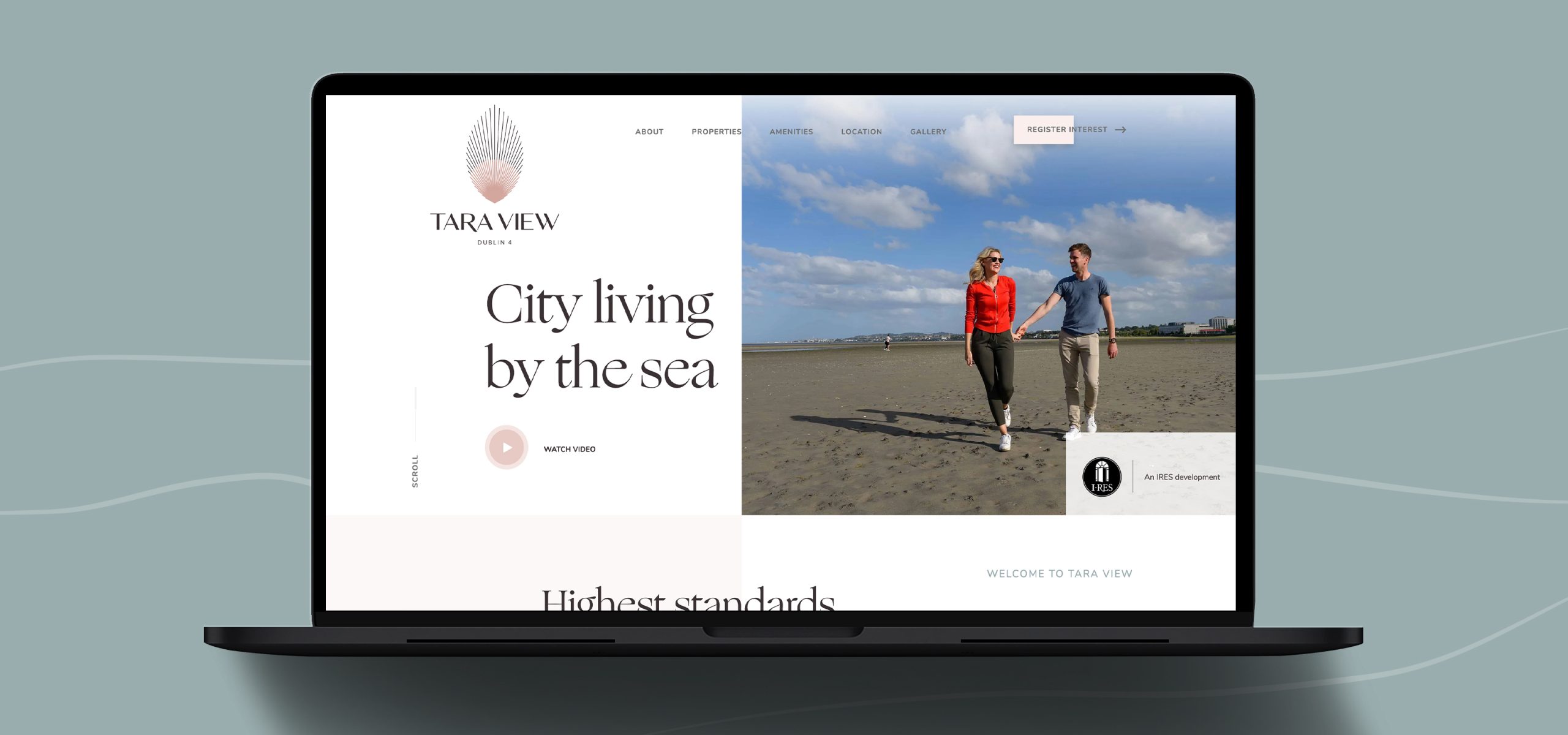
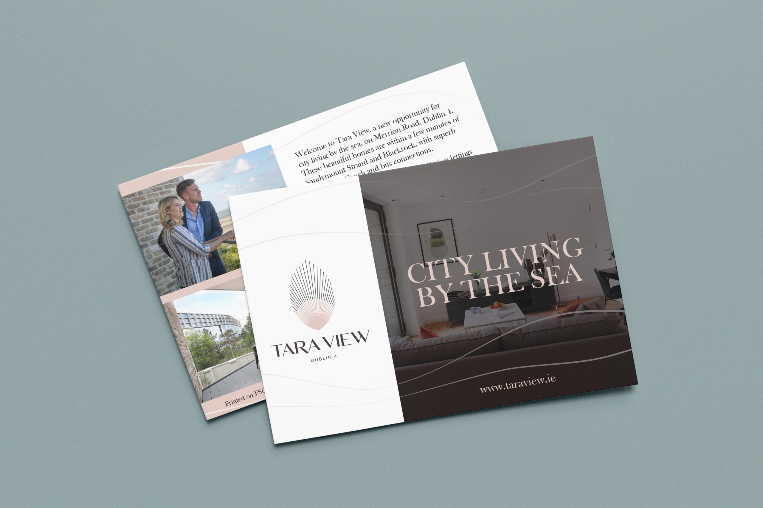
Tara View is a brand-new development of apartments to rent. Designed and built with the highest standards of comfort and sustainability in mind, each Tara View home is unique.
Idea worked with the team in IRES as strategic marketing partners from the creation of the brand identity, right through to the implementation of marketing tactics pre and post-launch.
Idea worked with the team in IRES as strategic marketing partners from the creation of the brand identity, right through to the implementation of marketing tactics pre and post-launch.
Brand Identity
The inspiration for Tara View was taken from the stunning scapes that surround the development, from the sea at Sandymount to the Dublin Mountains of Wicklow. We wanted to design a symbol that captured the nature of these views and so created a device that could represent a seashell, a sunrise, a feather. What we created was an identity that felt more a piece of art than a logo symbol which feels entirely appropriate for a development of this quality in such a stunning setting of Dublin 4, city living by the sea.
TaraView.ie
The website was created to reflect the brand and portray the sophistication of the development and the brand identity. We developed a one page scrolling website that showcased the apartments and the extensive offering within a simplified user flow. Photography was presented amongst generous white space, giving a light and airy feel, echoing the experience one has living at Tara View. The main goal of the website is to generate leads, and drive traffic to the register your interest form.
You can view the website at TaraView.ie
You can view the website at TaraView.ie
Strategic Marketing Partners
We worked with the team in IRES to implement their marketing tactics, delivering impactful design and marketing collateral, in line with the Tara View brand to generate leads for this development. A key part of working on this project with the IRES team was collaboration. This allowed us to ensure the creative was representative of the company’s and the development’s brand.
What the client had to say
Idea approached the project with skill and creativity and were great partners for us on Tara View!
Claire Percy, Head of Marketing & Communications,
IRES
IRES
Related Case Studies

Services
- Digital Strategy
- UI & UX Design
- Responsive Design
- User Journey Mapping
- SEO Optimisation
Overview
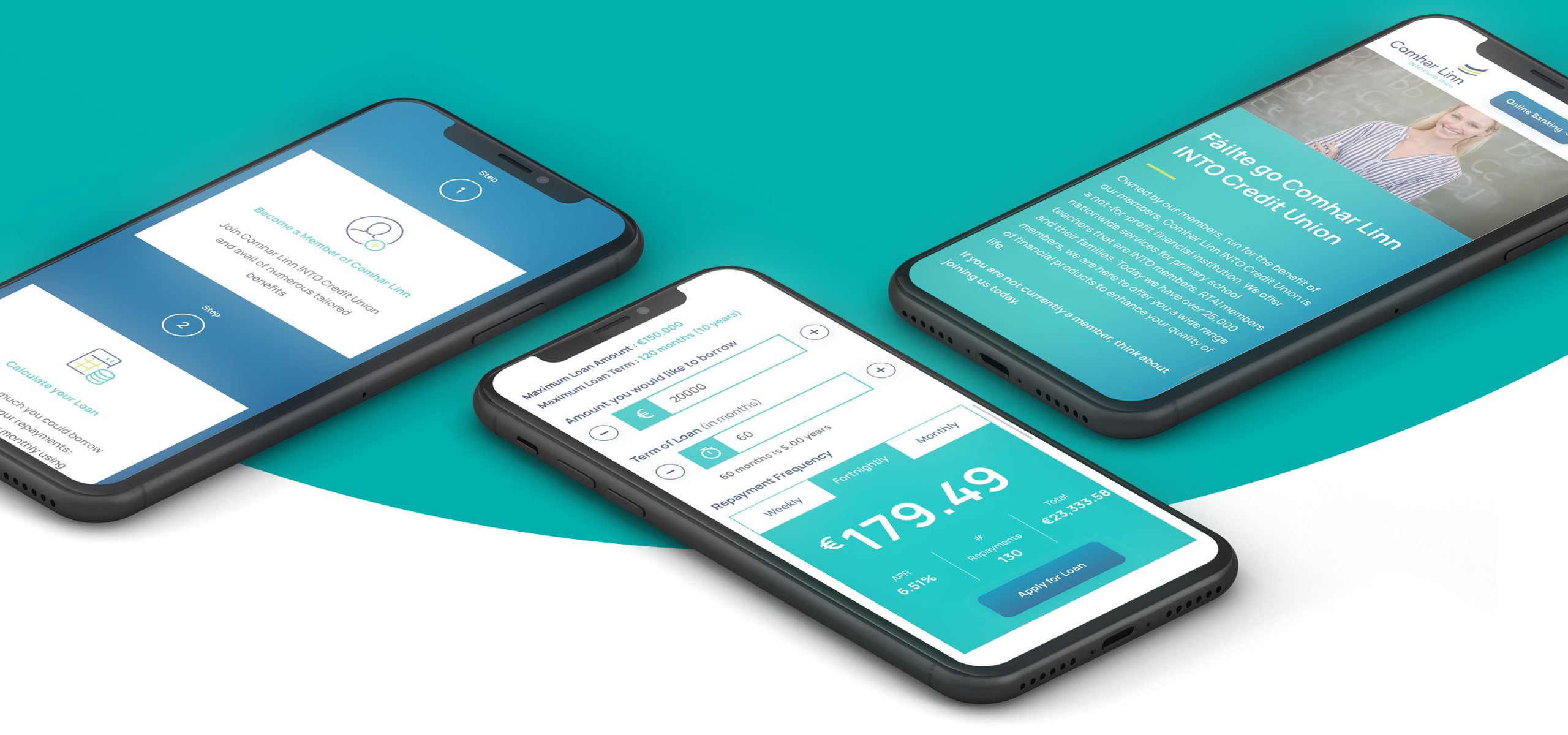
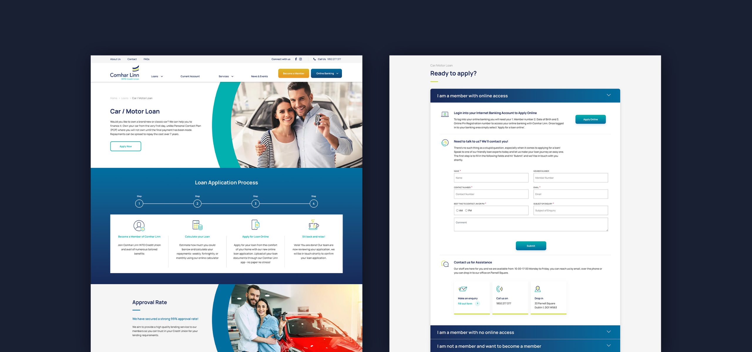
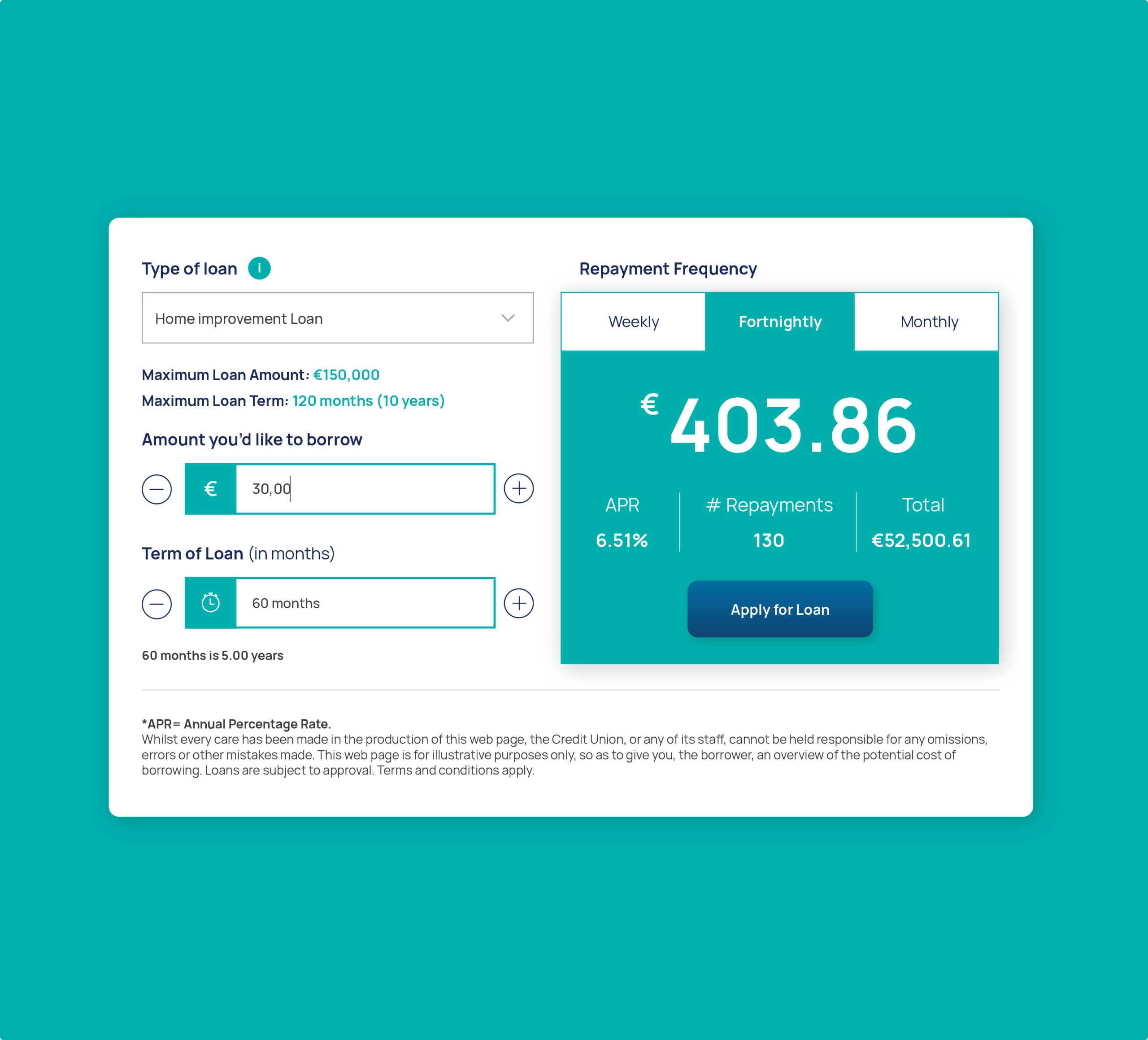
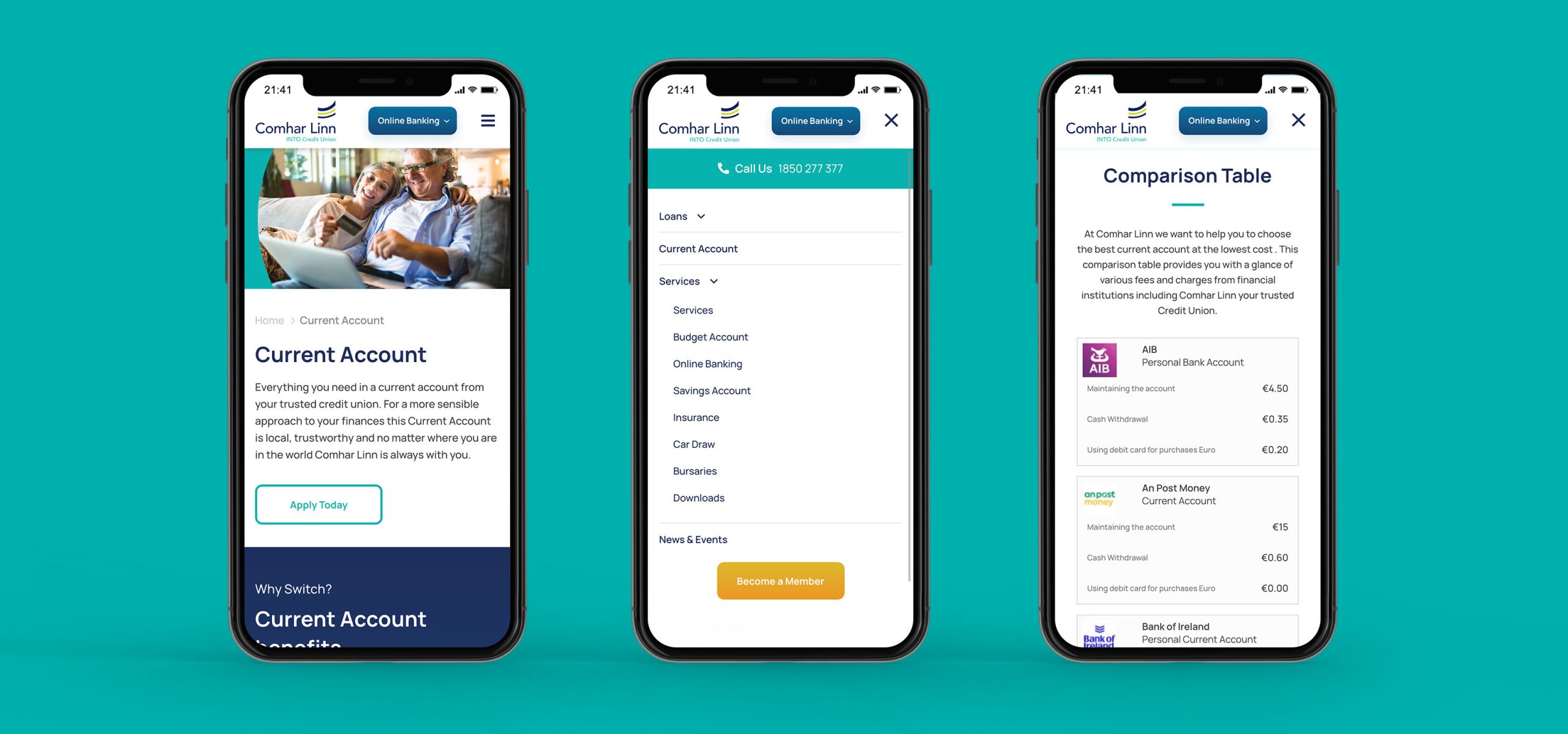
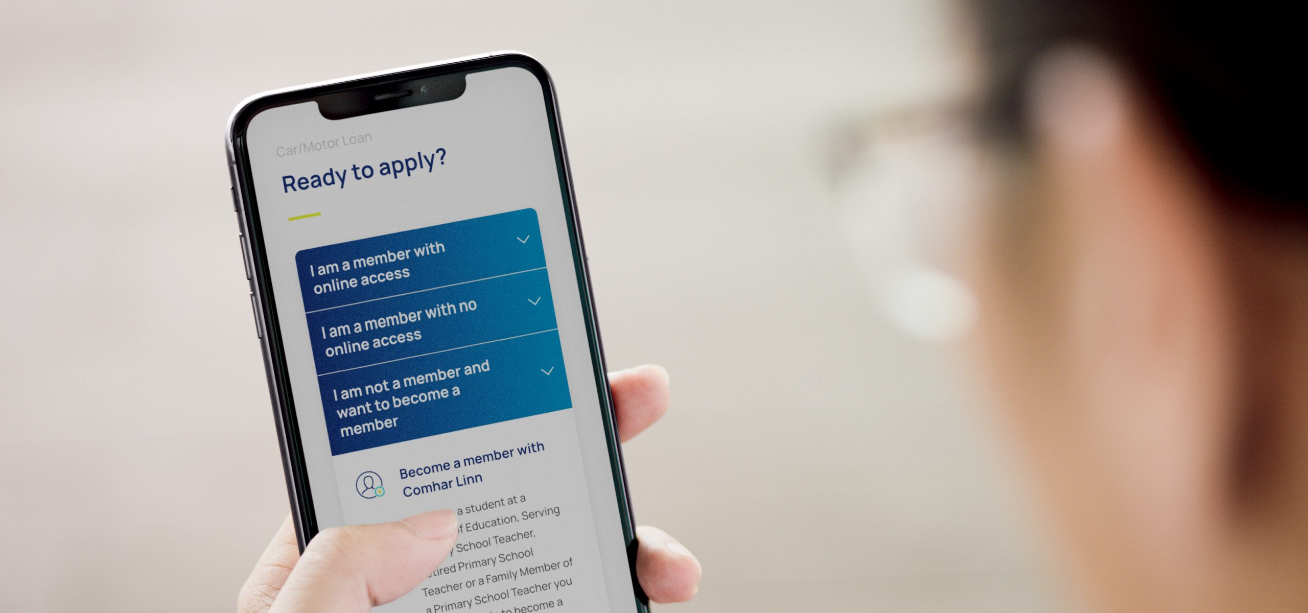
Comhar Linn INTO Credit Union is a financial institution owned by its members. It offers competitive loans and day to day banking services to over 25,000 teachers and their families. Having gone through a full rebrand in 2019 with Idea, the Comhar Linn team approached us again about the design of a new website which more accurately reflected their new, friendly, progressive brand. The primary goal of the new site was to make it easier for teachers and members to apply for loans.
Research informed the strategy
This was a complex website with a huge focus on both user experience and security.
The first step was to ensure the strategic direction was on the right track, we carried out extensive research including; delivering multiple workshops with different staff members, stakeholder groups and users, interviewing users 1-on-1, writing and analysing results from an online user survey and auditing the existing online presence. We created lo-fi wireframes through to hi-fi layouts, design patterns and prototypes. We continually iterated based on UAT from our superuser group.
The first step was to ensure the strategic direction was on the right track, we carried out extensive research including; delivering multiple workshops with different staff members, stakeholder groups and users, interviewing users 1-on-1, writing and analysing results from an online user survey and auditing the existing online presence. We created lo-fi wireframes through to hi-fi layouts, design patterns and prototypes. We continually iterated based on UAT from our superuser group.
Simplifying User Journeys
When creating the site map, key consideration was given to all of the functionality required and ensuring that the design and layout had a clear focus on the user experience.
One of the key goals was to simplify the user experience, reduce the number of clicks a member had to make before getting to key pages, establishing clear call to action points and highlighting the key products Comhar Linn offer their members.
This was a collaborative process with the Comhar Linn Team, Progress and Blue Sky PM.
UI Elements
Each stage of the user experience was considered, how the look, feel, and interactivity of the site worked to enable users to get the information they needed with the least number of clicks. It was developed to be as intuitive as possible which meant carefully considering each and every visual and interactive element the user might encounter.
A coherent design system
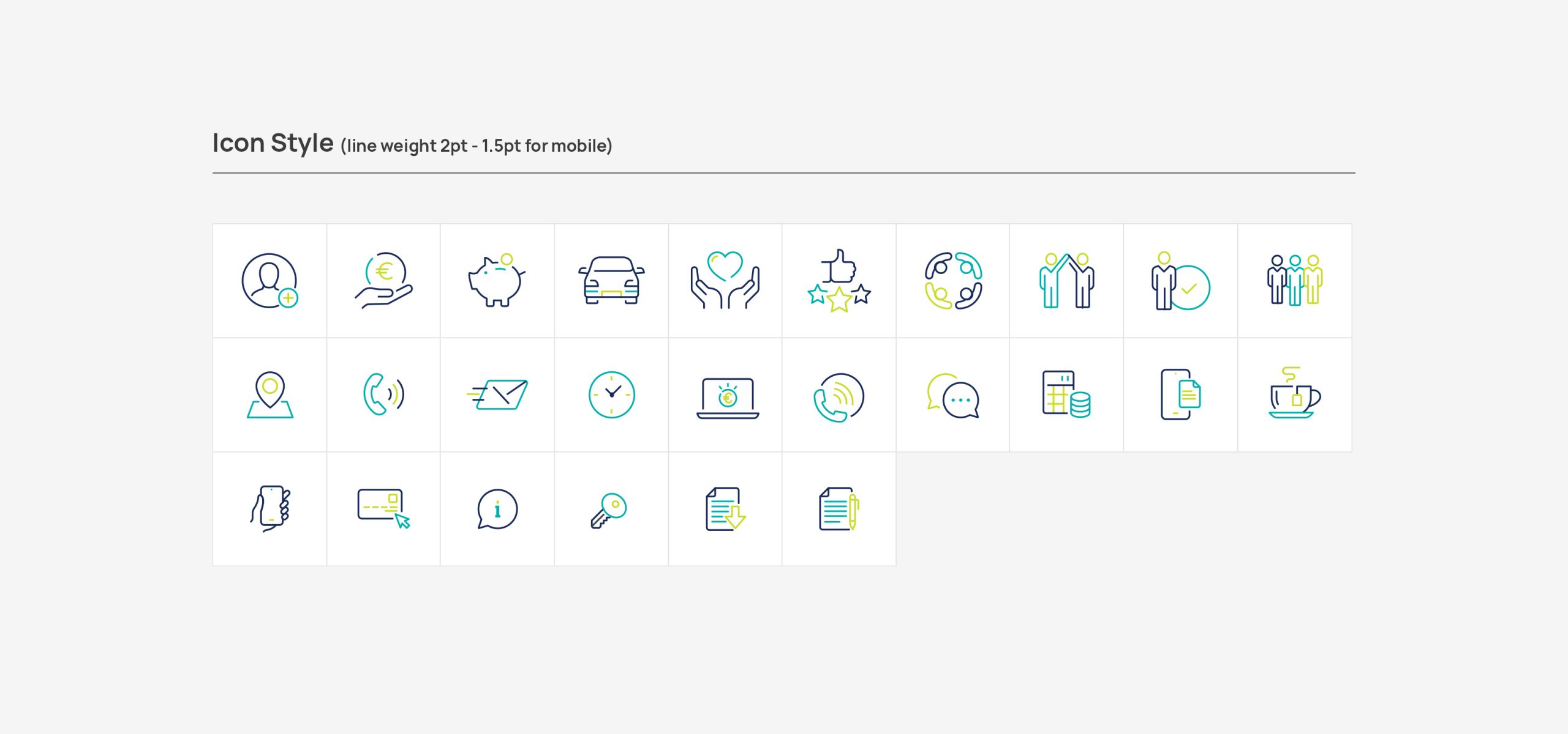
We created a clear design system, carefully considering the hierarchy of information and the selection of images that accurately depicted the target audience ensured that the site reflected the members needs. The use of simple, elegant iconography throughout the site also enabled visual cues to lead members on a journey.
The new website can be seen here Comharlinnintocu.ie. It has been instrumental in growing the Comhar Linn brand and business.
The new website can be seen here Comharlinnintocu.ie. It has been instrumental in growing the Comhar Linn brand and business.
What the client had to say
It has been super working with the Idea team. Their work on the Comhar Linn website was crucial to our year and this is having a good impact on our business.
Sean Murray,
CEO, Comhar Linn
CEO, Comhar Linn
Related Case Studies

Services
- Branding
- UI & UX Design
- Responsive Design
Project Overview
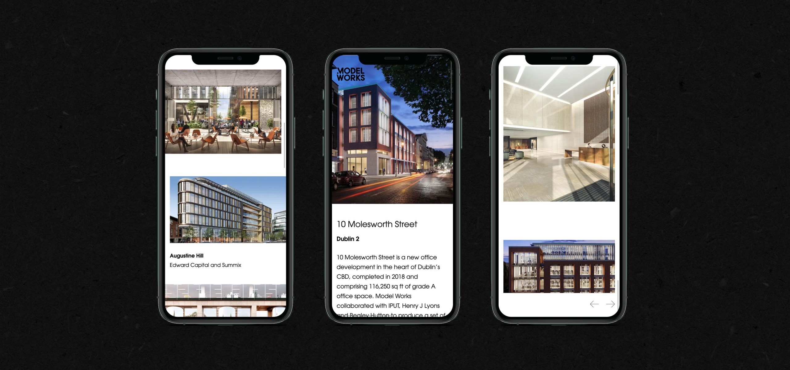
For over 30 years, Model Works have been creating amazing, architectural visualisations for the design, planning and marketing of property. Their team is led by Architects and Engineers and they realised the need for change with a brand that had served them well for 20 years. The Model Works brand needed to be invigorated, evolved, and reworked.
Looking at the bigger picture
Model Works was at a crossroads, a highly regarded, established business, with strong brand equity but with a visual identity and marketing communications that no longer reflected their offering.
Through a combination of workshops, client interviews, research, and digital reviews a decision was made to retain the Model Works name but to ensure that the new brand identity reflected the dynamic and innovative nature of their business.
Through a combination of workshops, client interviews, research, and digital reviews a decision was made to retain the Model Works name but to ensure that the new brand identity reflected the dynamic and innovative nature of their business.
'Best in the Business'
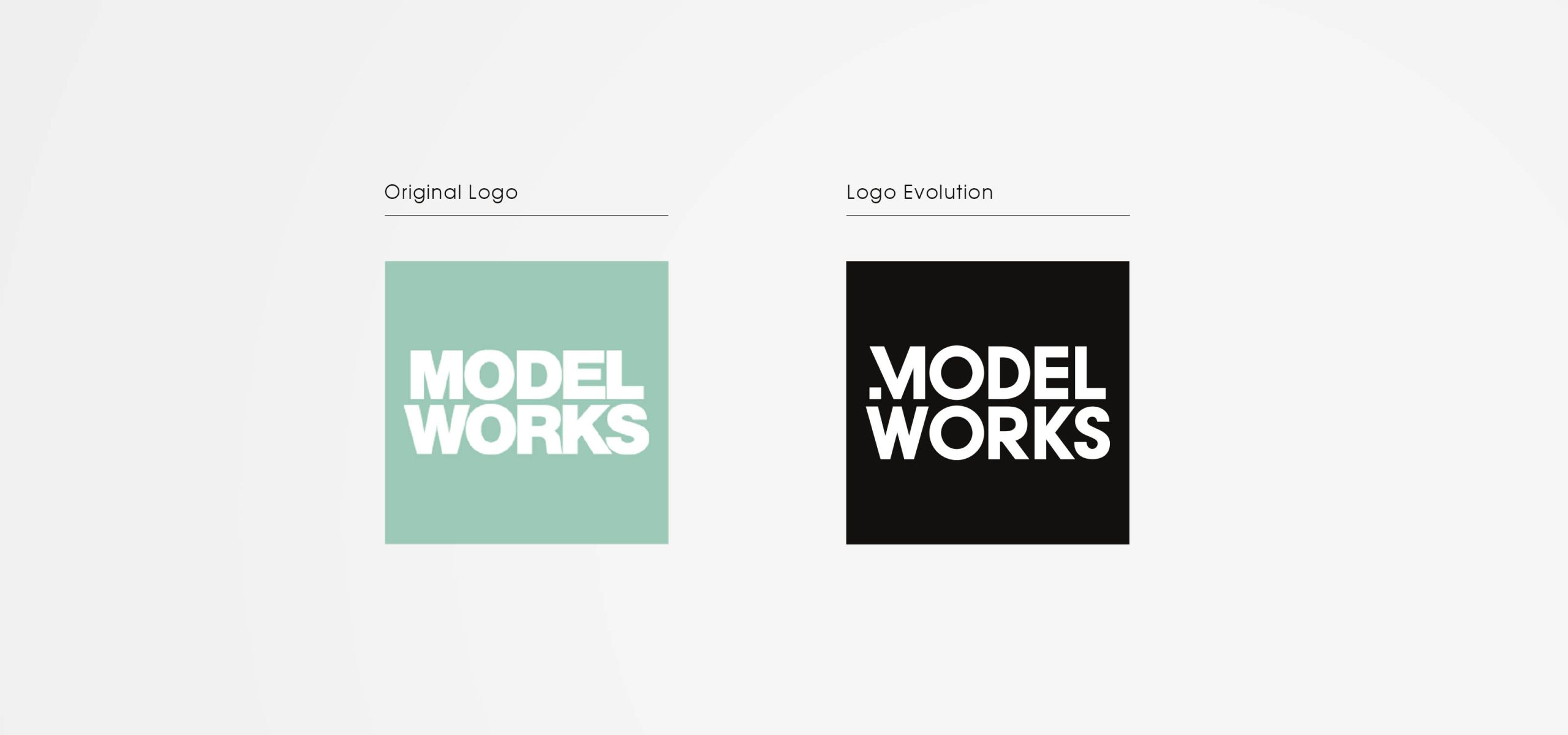
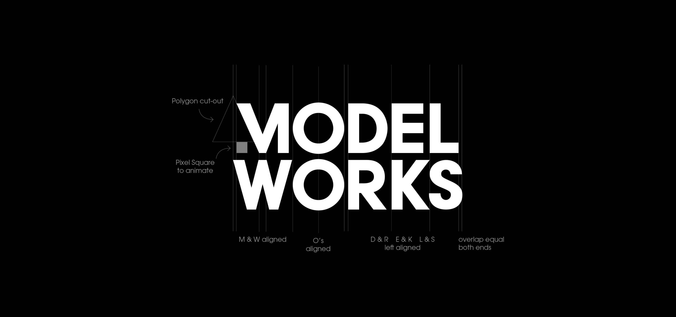
It emerged that there was great brand equity in the Model Works name, they are regarded by their clients as ‘the best in the business’, it was our challenge to ensure that their brand and marketing collateral reflected this. We started with an evolution of the brand identity, the words ‘Model’ and ‘Works’ are well balanced in terms of size and similarity and were well suited to stacking the name. The M reflects well with the W, aligning the O’s and the stems of the remaining letters to create a well-contained logo that exudes confidence and legibility at large sizes such as signage and small digital communications.
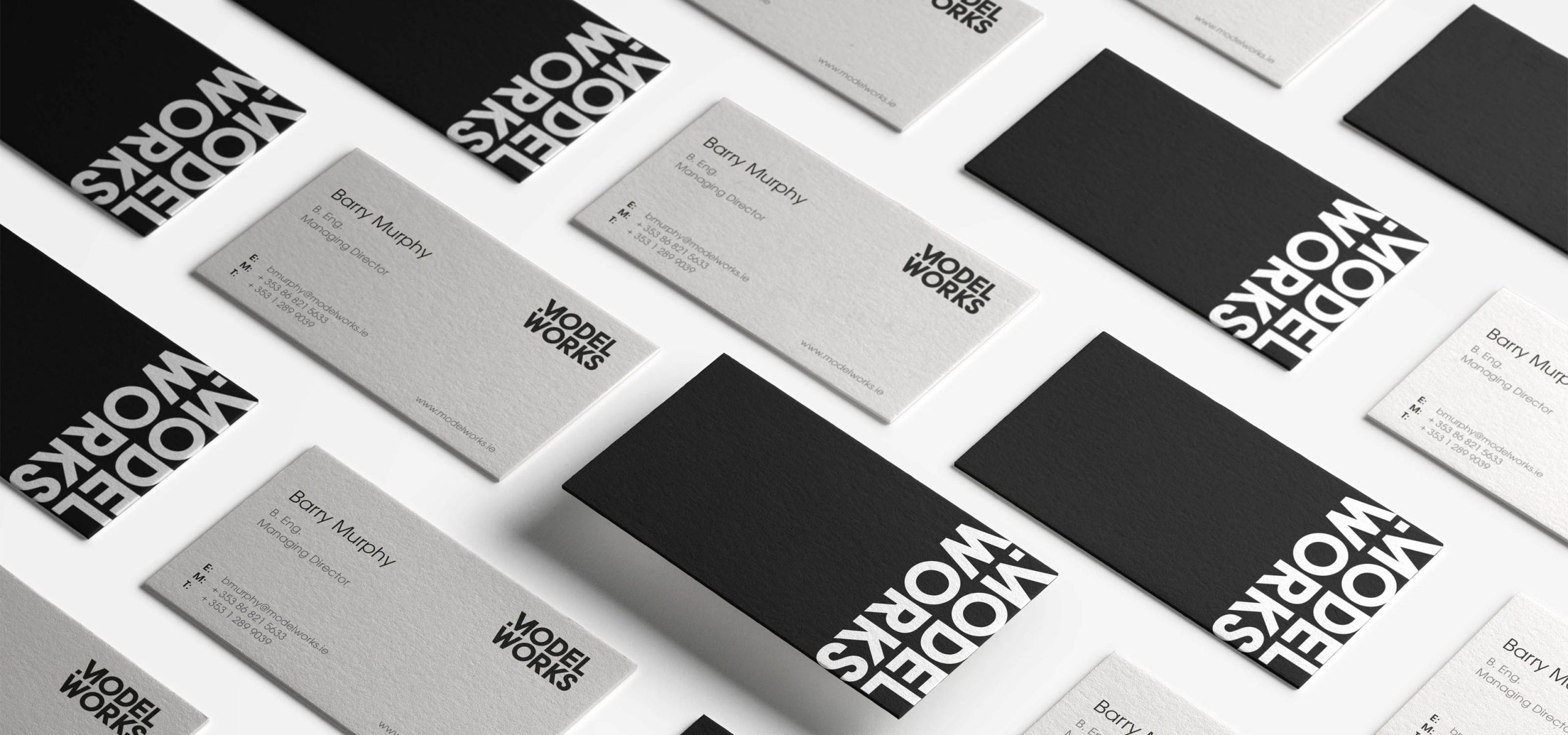
The start of the M was reduced to a pixel-like square to reflect the digital nature of much of their work. We also looked at how The Model Works logo could be represented with the MW abbreviation for social channels. The result was a visually strong, fresh and confident brand identity that better reflected their innovative nature. We then rolled this out across digital, product
We also looked at how The Model Works logo could be represented with the MW abbreviation for social channels.
The result was a visually strong, fresh and confident brand identity that better reflected their innovative nature. We then rolled this out across digital, product
A digital refresh
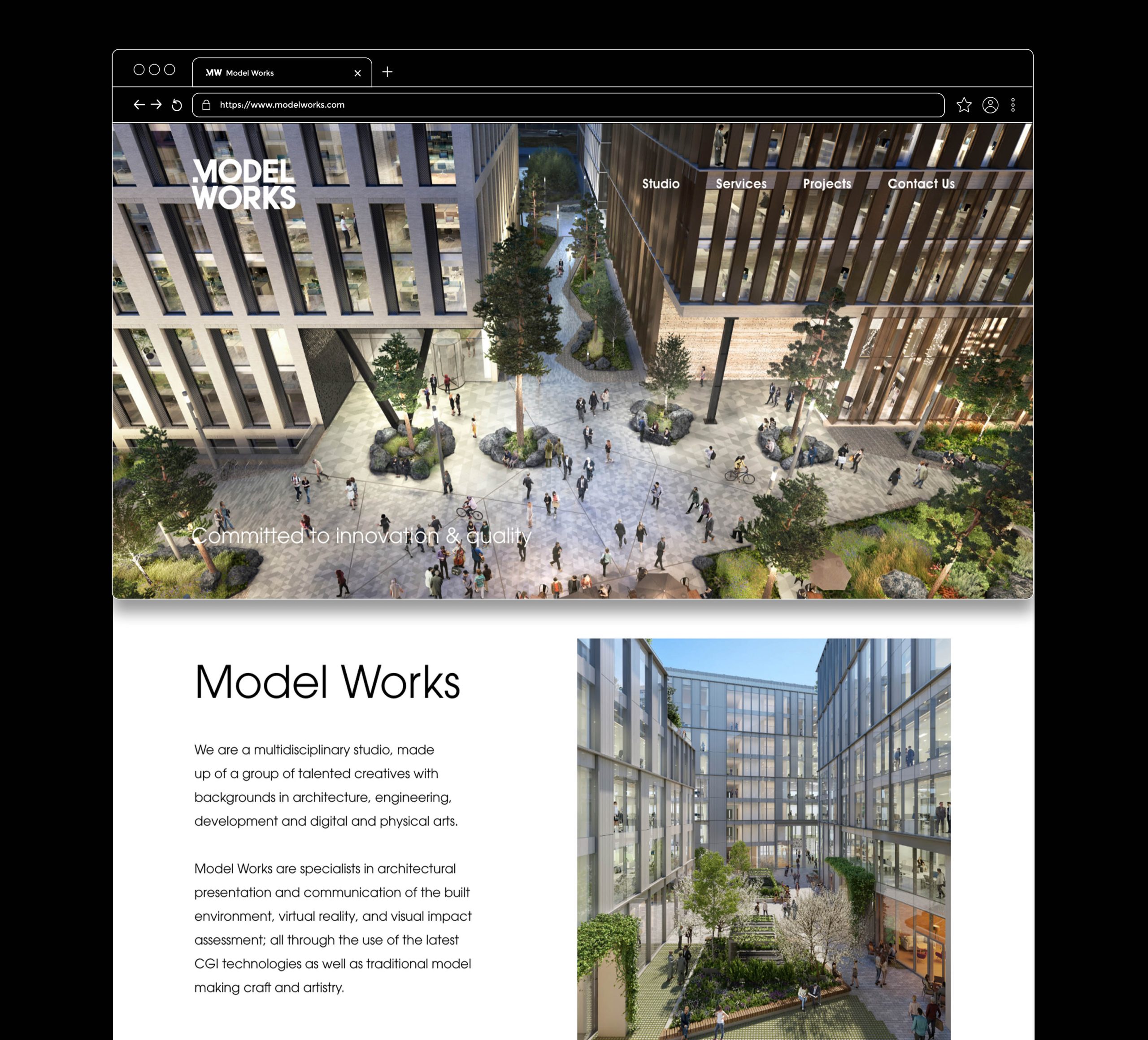
Following on from the branding, a website was needed to showcase the range, scale, and beauty of architectural projects at their best. The portfolio-style bespoke site is image-led and showcases the wow-factor of the Model Works CGIs.
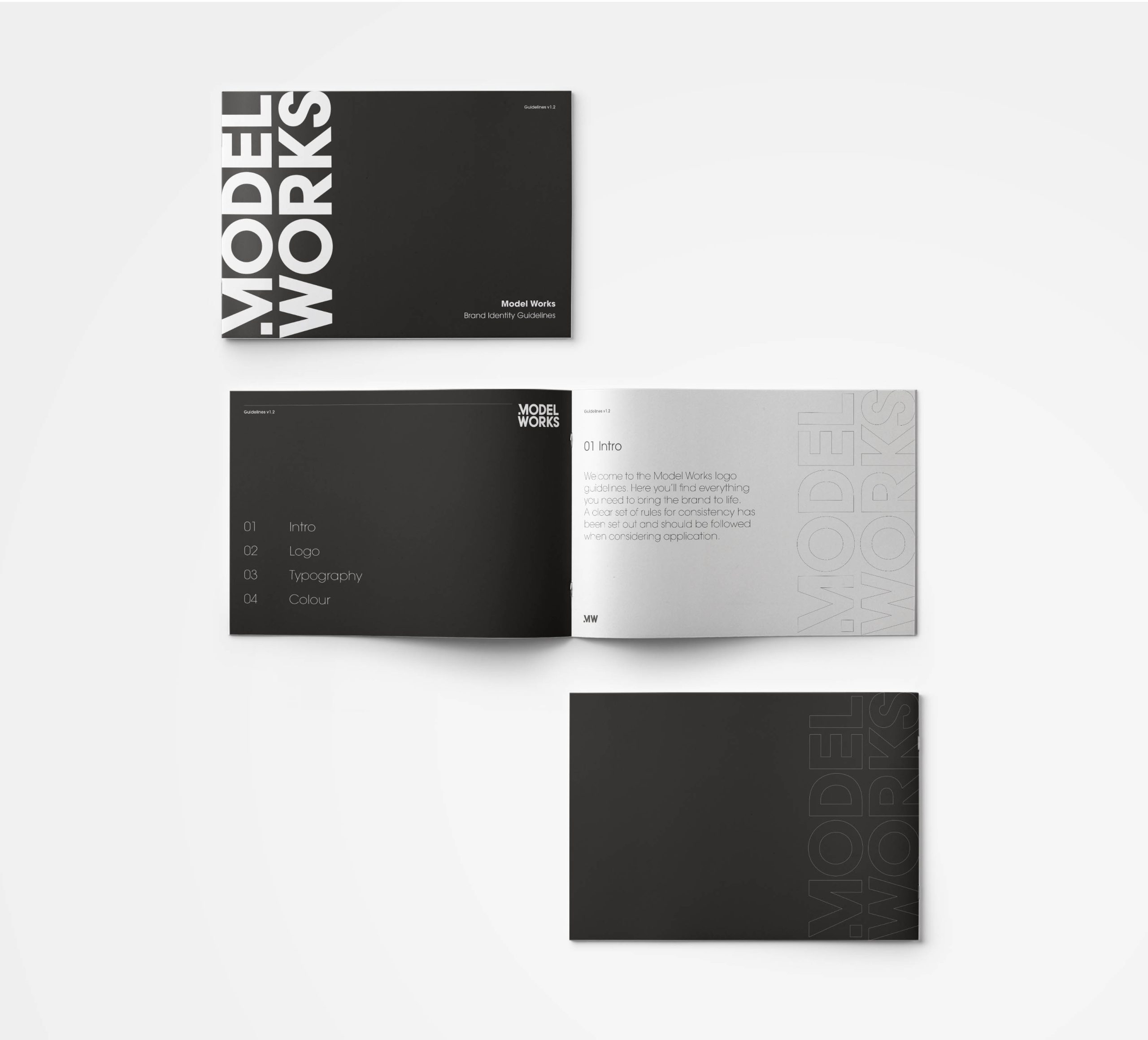
A cohesive set of guidelines
A set of identity guidelines were created to ensure consistency and legibility across all brand application. With the primary colour palette consisting of black and white, it was imperative to illustrate how to effectively communicate this minimalist approach.
What the client had to say
Idea's in-depth knowledge and understanding of the construction industry was invaluable in guiding us through the process of developing our new branding and website. Their creativity and artistry shone through as the design evolved, and I still recall the excitement when they revealed our new logo! The professionalism, experience, and creativity of the team, made it a pleasure to work with Idea.
Barry Murphy, Managing Director,
Model Works
Model Works
Related Case Studies
Services
- Brand Strategy
- Branding
Project Overview
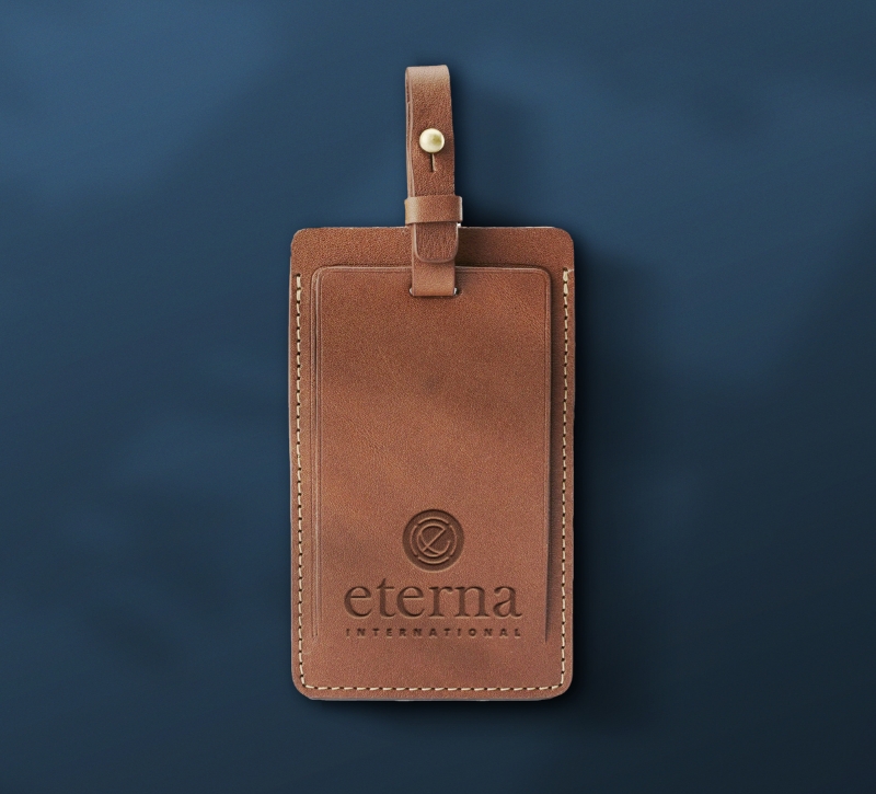
Eterna is an Immigration and Wealth Management Consultancy helping successful investors and entrepreneurs since 1928. Eterna International helps clients to increase their global mobility, to safeguard their wealth and to seize unique business opportunities across continents. Eterna came to us with the task of evolving their brand identity. They felt their previous identity was outdated and didn’t express the brands overall message. With the global nature of their business, it was important to the client for their brand to reflect this.
A fresh look and feel
We started with the shape of the globe and the letter ‘e’ from the Eterna name. We worked on combining the two before adding a circular device surrounding them, divided into four shapes to symbolise North, South, East and West. Pushing the whole global messaging of the brand further.
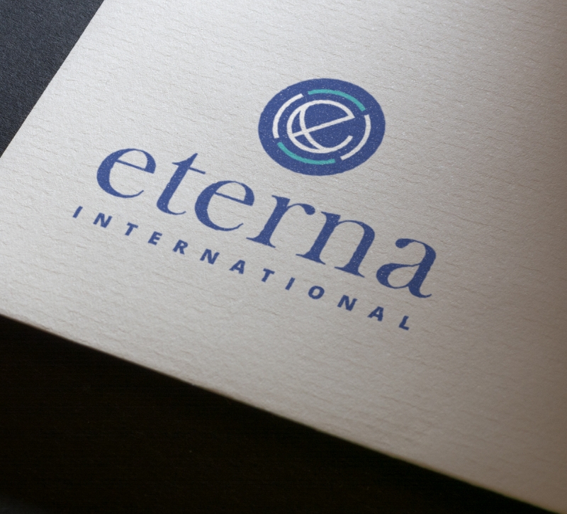
Global Citizenship
Using a lower case ‘e’ creates a more approachable identity and gives a nice balance between the word-mark and icon. Creating a distinct and memorable logo.
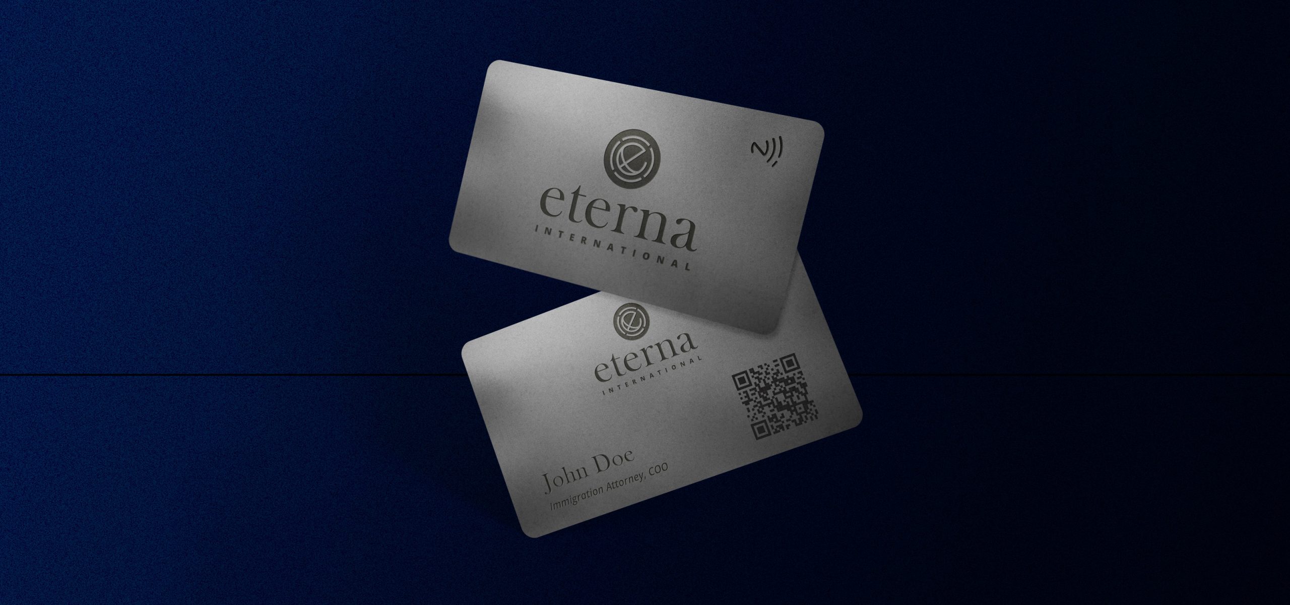
Modernise
The colour palette also needed to reflect their brand values. Choosing a bright navy colour as the master brand colour, chosen because of the significance of navy conveying importance, confidence, power, and authority, as well as intelligence, stability, unity, and conservatism.
Related Case Studies
Services
- Branding
- Strategic & Tactical Digital Planning
- UI & UX Design
- SEO
Overview
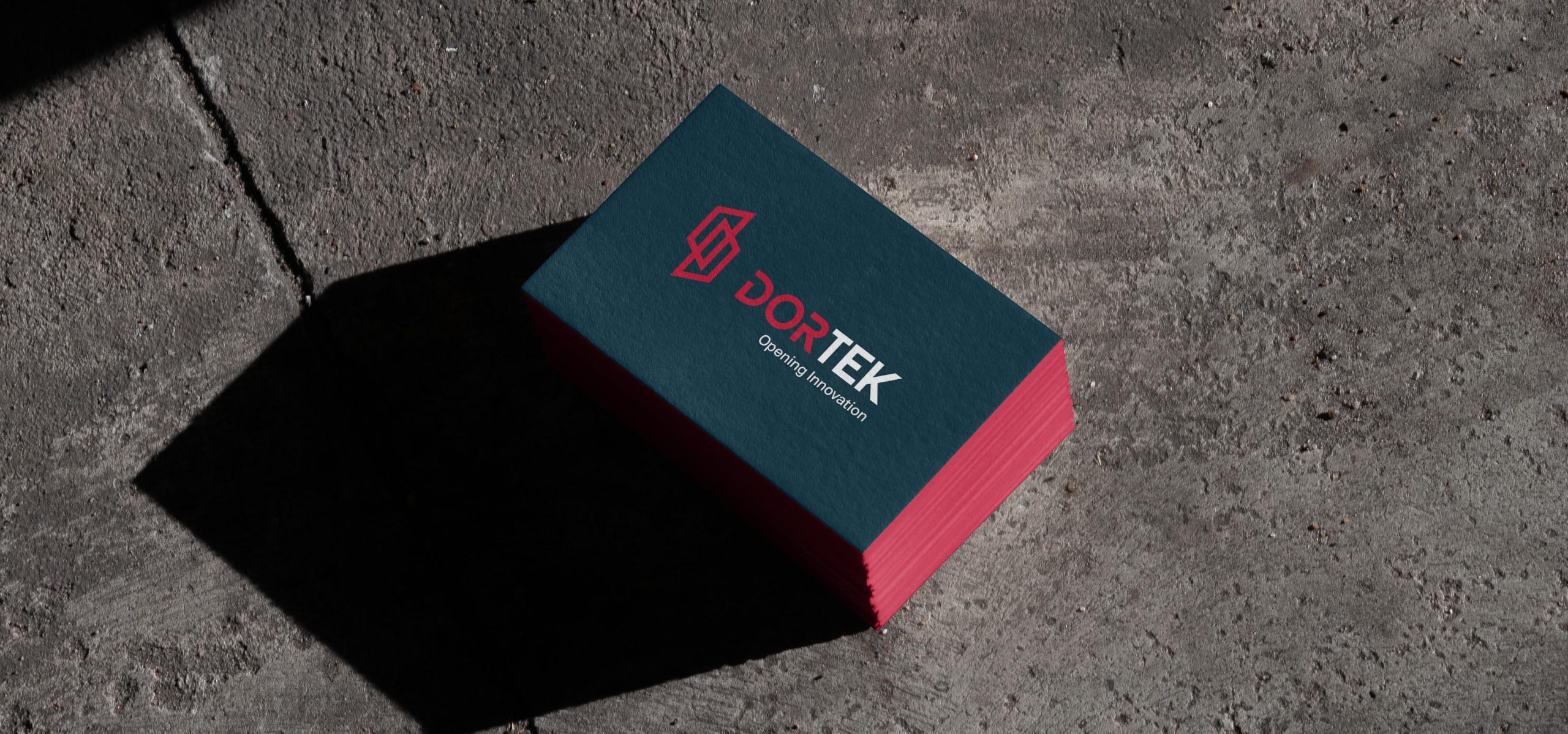
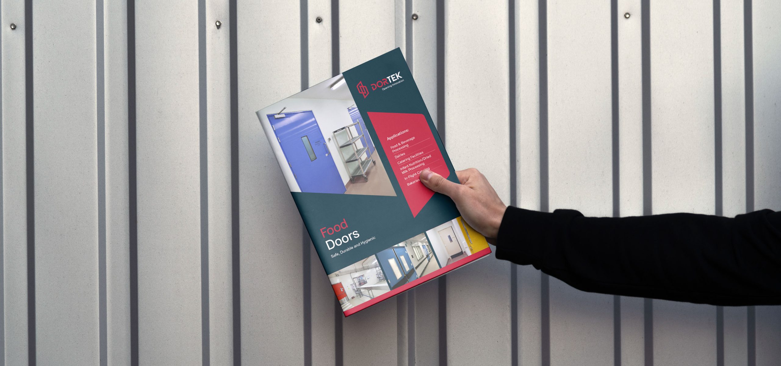
For over fifty years Dortek have been at the forefront of ‘opening innovation’, from their original Wicklow, Ireland location - expanding to serve the needs of clients worldwide. As they entered a new phase of growth, Idea were commissioned to examine the visual identity and branding and develop a website that fully supported the business goals and clients needs.
Re-Branding
Our first task was an examination of the DorTek brand, with a history spanning over 50 years the company name and identity was well established and recognised in their market - but could benefit from a refresh and modernisation that improved it’s legibility and presence (particularly in an online environment).
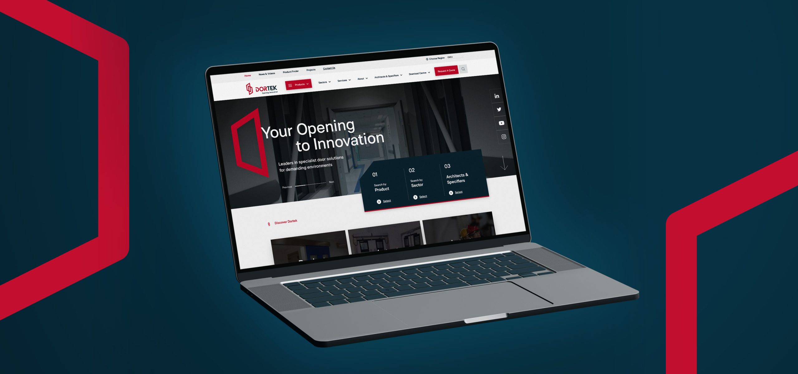
A fresh digital experience
We were tasked with overhauling their site so that their products and technical information was easier to find and understand for their various personas.
To the untrained eye, all of their products visually look very similar with many only distinguished by small technical details or certifications - this added to the complexity. We worked collaboratively with the client to unpack and map all of their requirements for what was a very large site. We worked on many iterations of sitemaps, wireframes and user journeys to ensure that the site would be easily navigable by their audiences. The site is now excelling as a self-serve platform for architects specifying for construction projects.
To the untrained eye, all of their products visually look very similar with many only distinguished by small technical details or certifications - this added to the complexity. We worked collaboratively with the client to unpack and map all of their requirements for what was a very large site. We worked on many iterations of sitemaps, wireframes and user journeys to ensure that the site would be easily navigable by their audiences. The site is now excelling as a self-serve platform for architects specifying for construction projects.
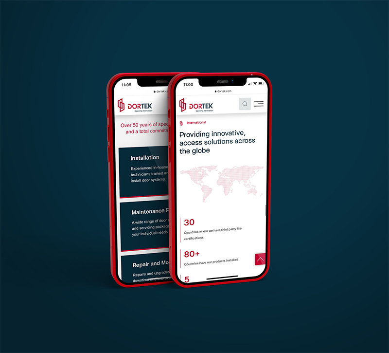
Reinforcing of the brand
It was important to showcase the new brand on the site and give it highlight and standout. We introduced and incorporated the new colours and brand assets to engage the user and immerse them in the updated brand identity. We used the brand red the red for certain call to actions and buttons, whilst being careful not to overuse.
Related Case Studies


Services
- Branding
- Design
- UI/UX Design
- Responsive Web Design
Project Overview
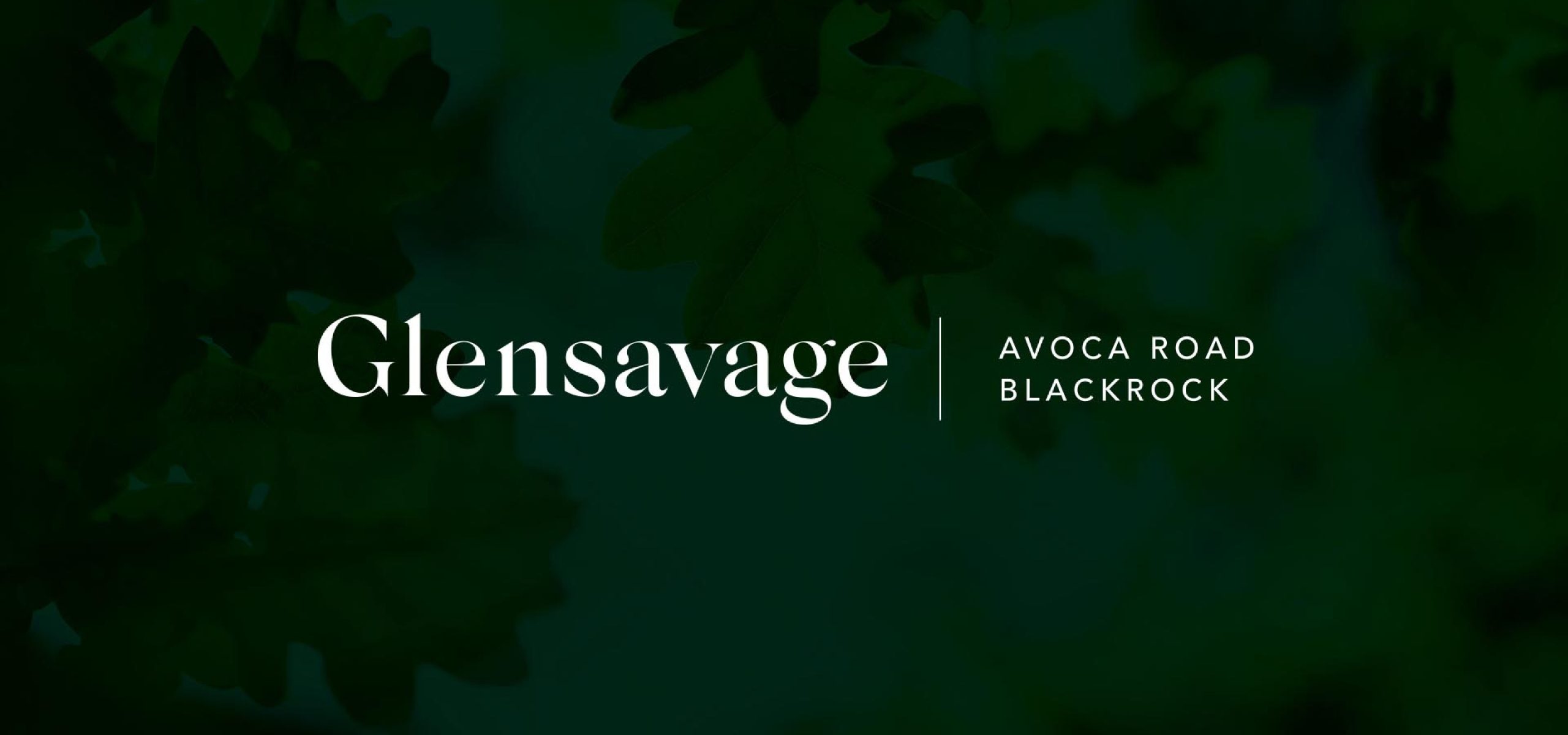
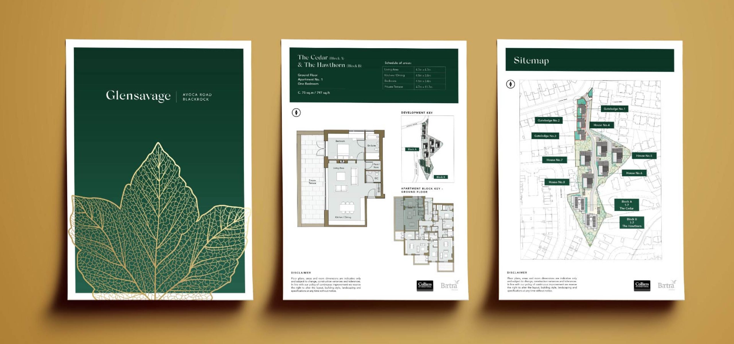
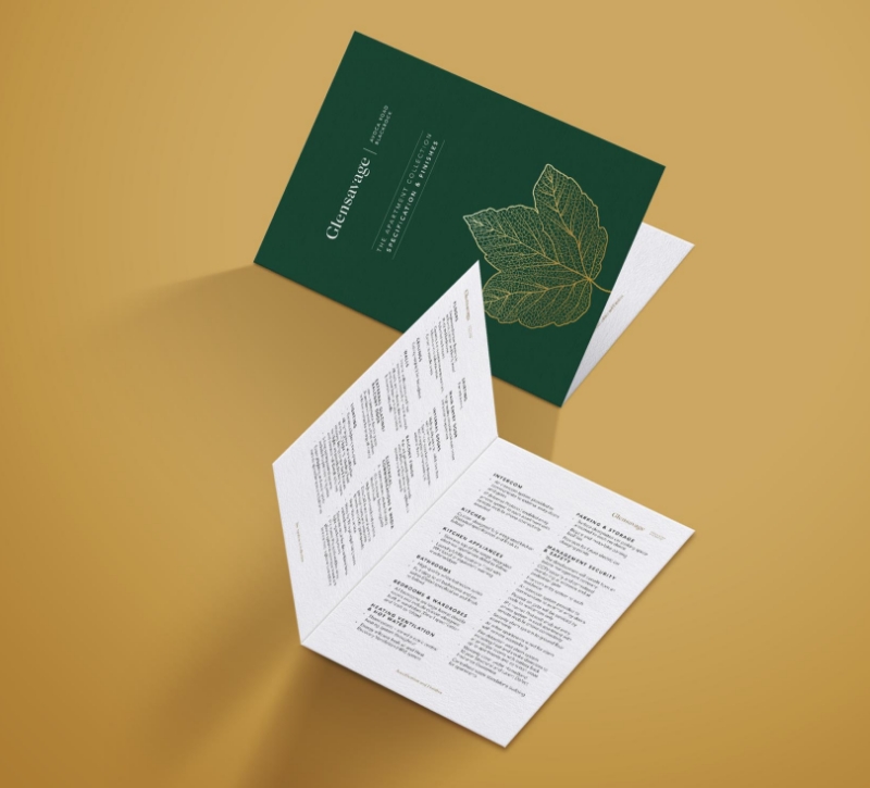
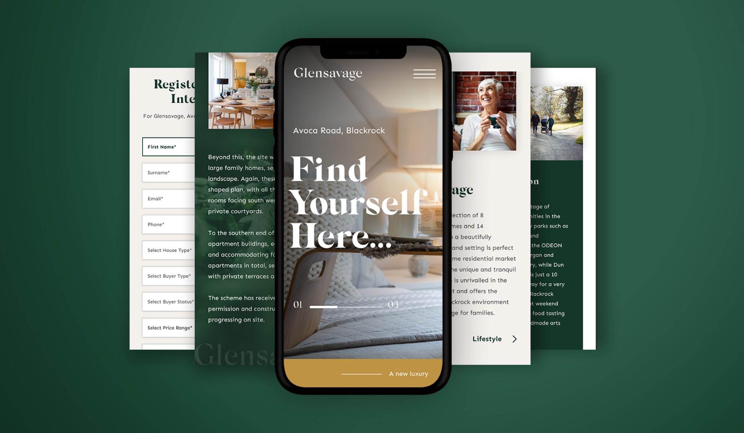
Glensavage is an exclusive residential development in south Dublin, launched by Bartra. Located in a beautifully landscaped woodland setting in the prestigious area of Blackrock, with stunning apartments, houses & gate lodges for sale.
High-end design
We were tasked with creating a brand that communicated the development’s elegant, luxurious yet simple nature. We worked with Bartra on the branding of Glensavage, creating a premium look and feel to reflect the quality of homes and location of the scheme.
Sophisticated Simplicity
An approach of sophisticated simplicity allowed the focus to fall on the strength of the project itself – highly considered architectural design and natural surroundings being at the heart of the Glensavage brand.

Luscious Landscapes
We incorporated palettes of monochrome with accents of green, denoting the lush landscapes the houses will be situated amongst. Characteristics of nature/foliage were used to give prominence to the surroundings, and give the impression of living that simple life in ‘a world away’.
Special Printing
We used special methods when printing the marketing collateral in order to create an enhanced and tactile feeling at every touch point of the brand. Gold foil and embossing techniques were used to give emphasis to the luxurious nature of the properties.
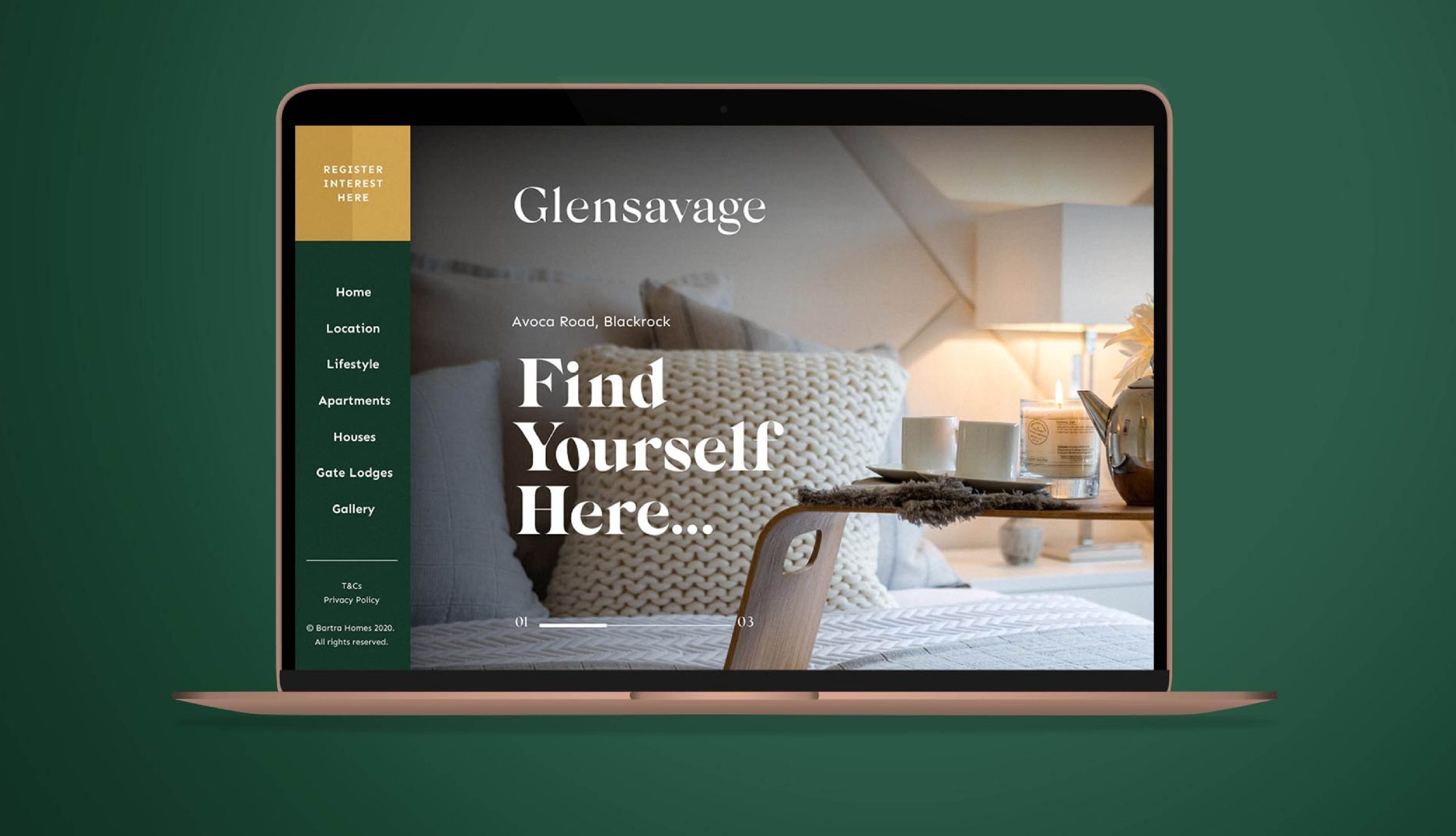
Web Design
Awareness of the apartments needed to be created online. We designed and built the Glensavage website, showcasing the prime location, surrounding amenities, and unique Scandinavian design of the homes through visual elements, strong photography, and clear, simple copy. The website design was carefully aligned with the Glensavage branding to maintain the consistent message that this is a housing development of the highest quality.
Related Case Studies
Services
- Design
- Annual Report
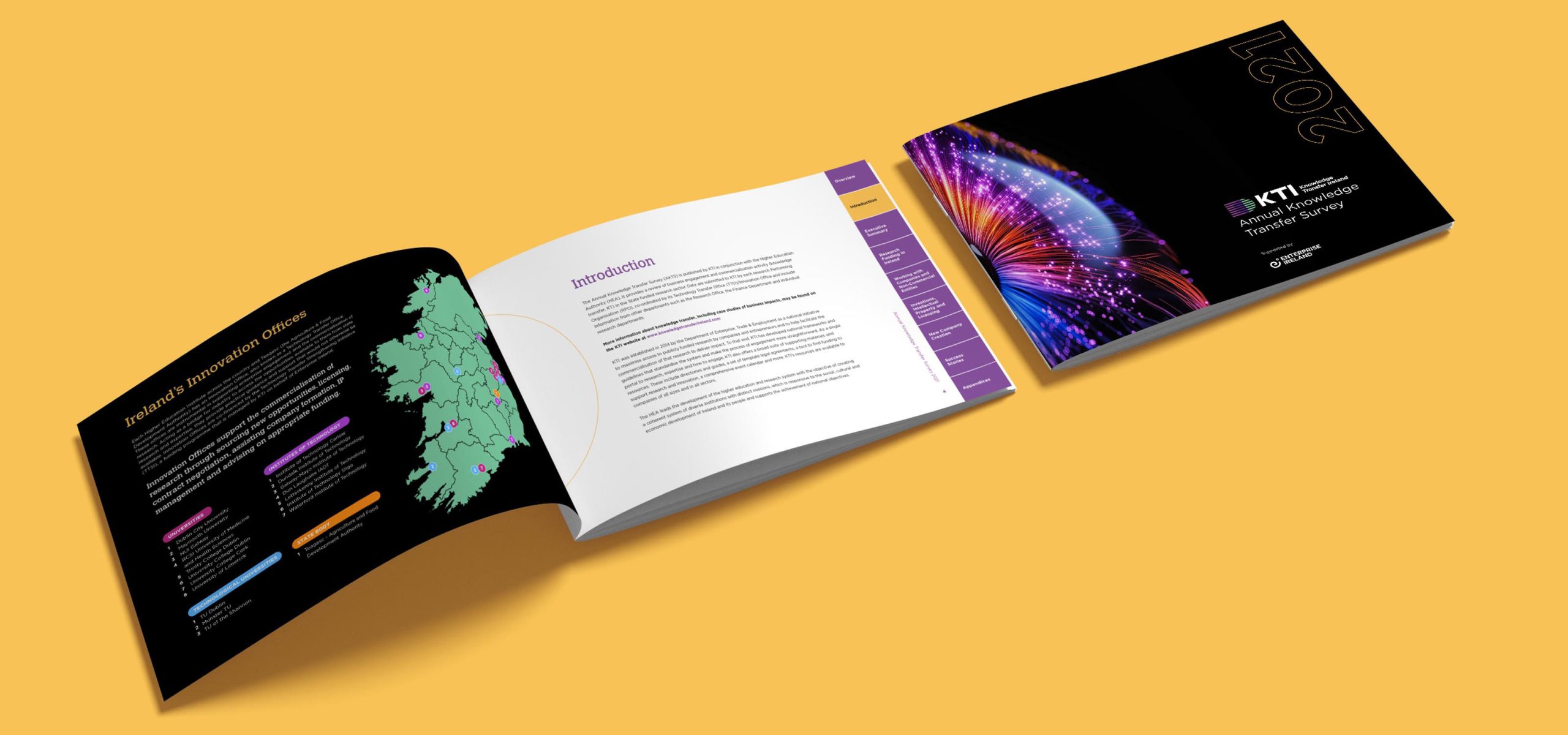
Project Overview
The Annual Knowledge Transfer Survey provides a year-on-year report on the vital engagements between academia and industry, to deliver success to not only individual endeavors - but as a key element putting research and innovation at the heart of Ireland's continuing economic success.
'Data Heavy'
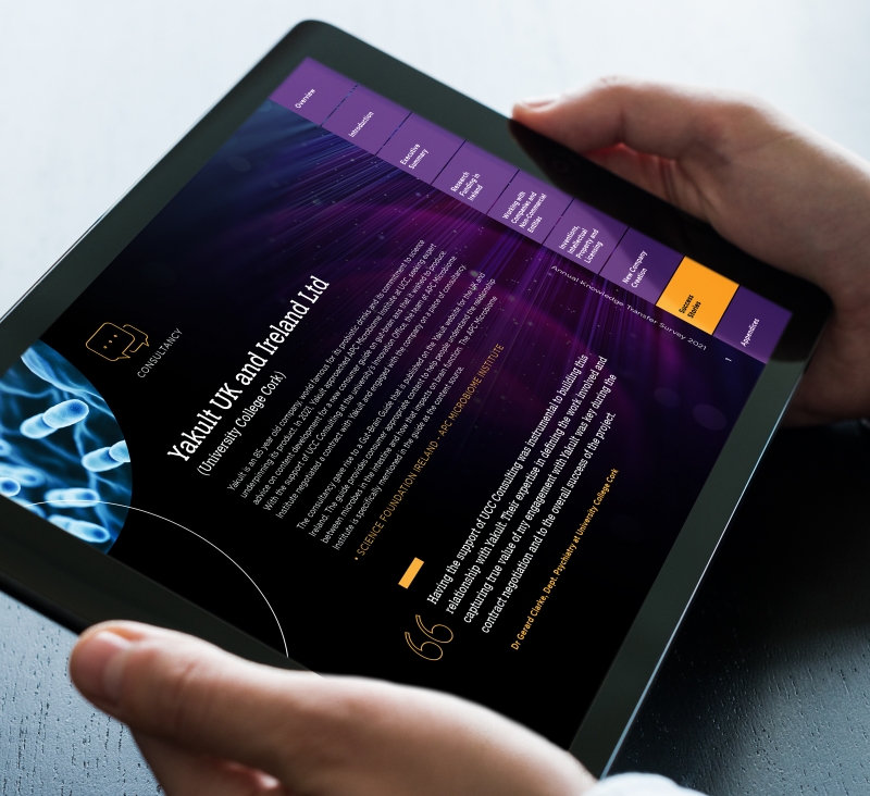
By it’s content nature the Annual Knowledge Transfer Survey (AKTS) was quite ‘data heavy’, akin to an Annual Report there was a need to detail quite a lot of financials, results, Model Agreements, Spin-out Agreements etc. So our first priority was to ensure a layout and presentation of data that highlighted using concise infographics the impact AKTS initiatives make to the wider Irish economy.
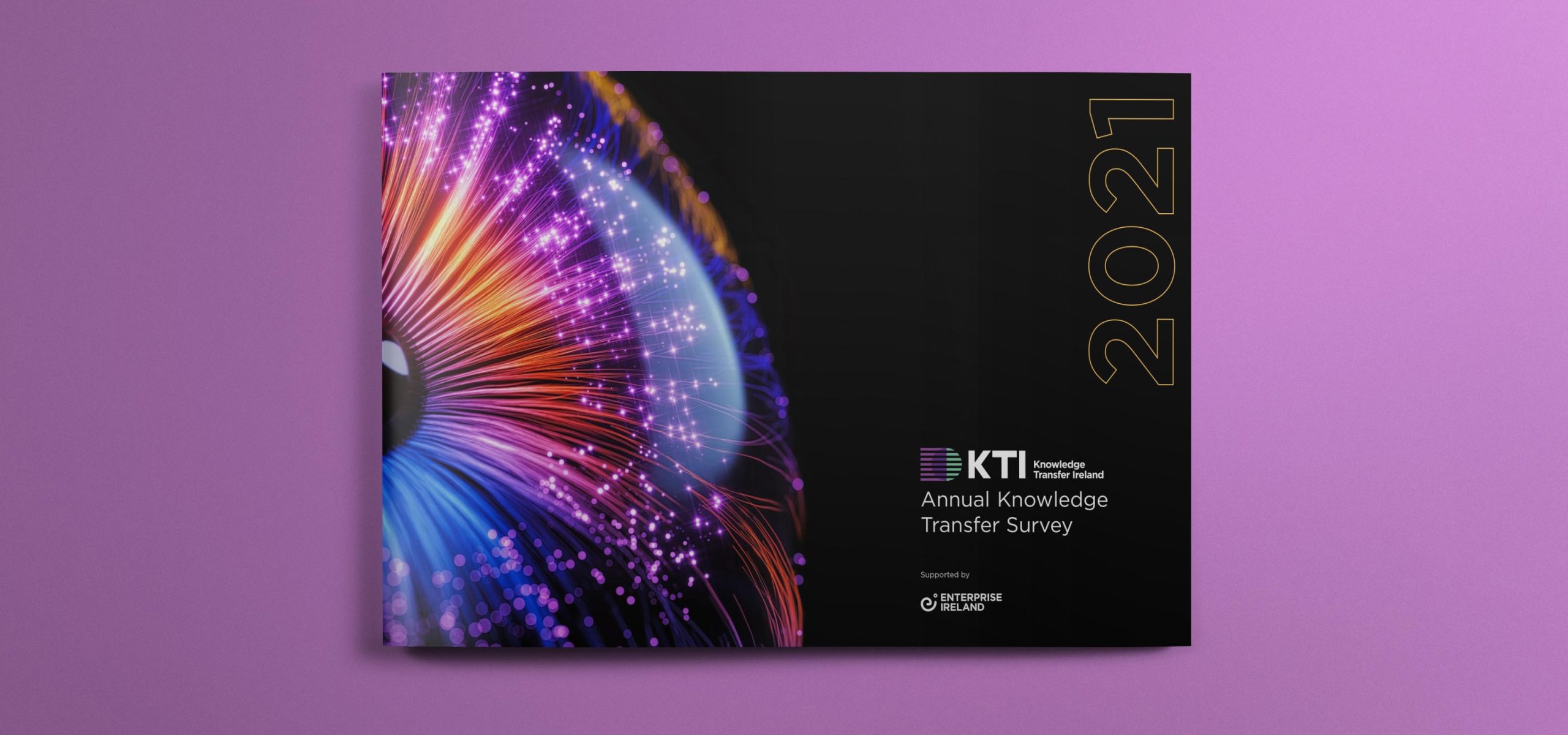
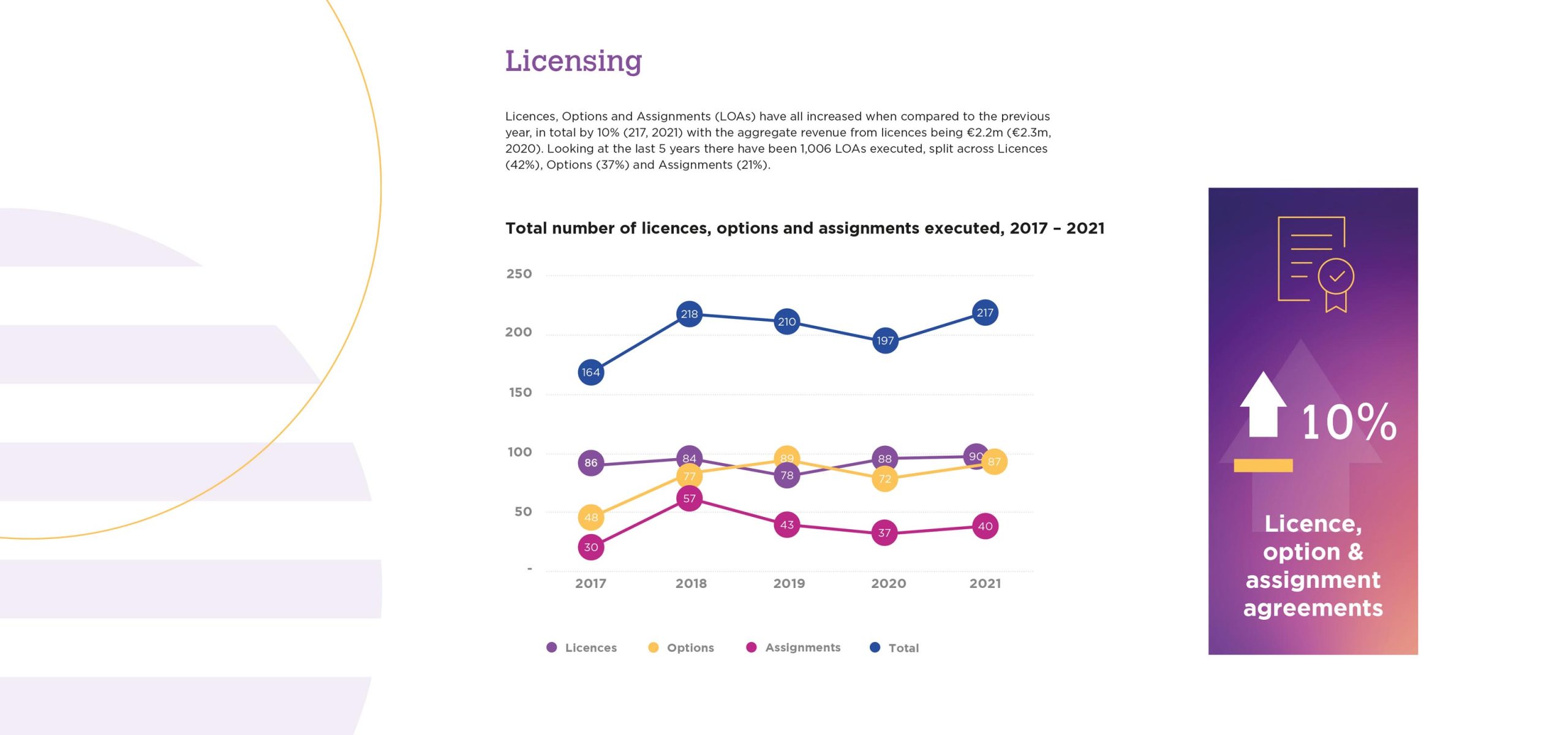
Accessible PDF
Clean charts, used in a landscape layout, in screen-readable interactive PDF form - maximised the use of colour and space to provide a document easily shared among key local and international audiences.
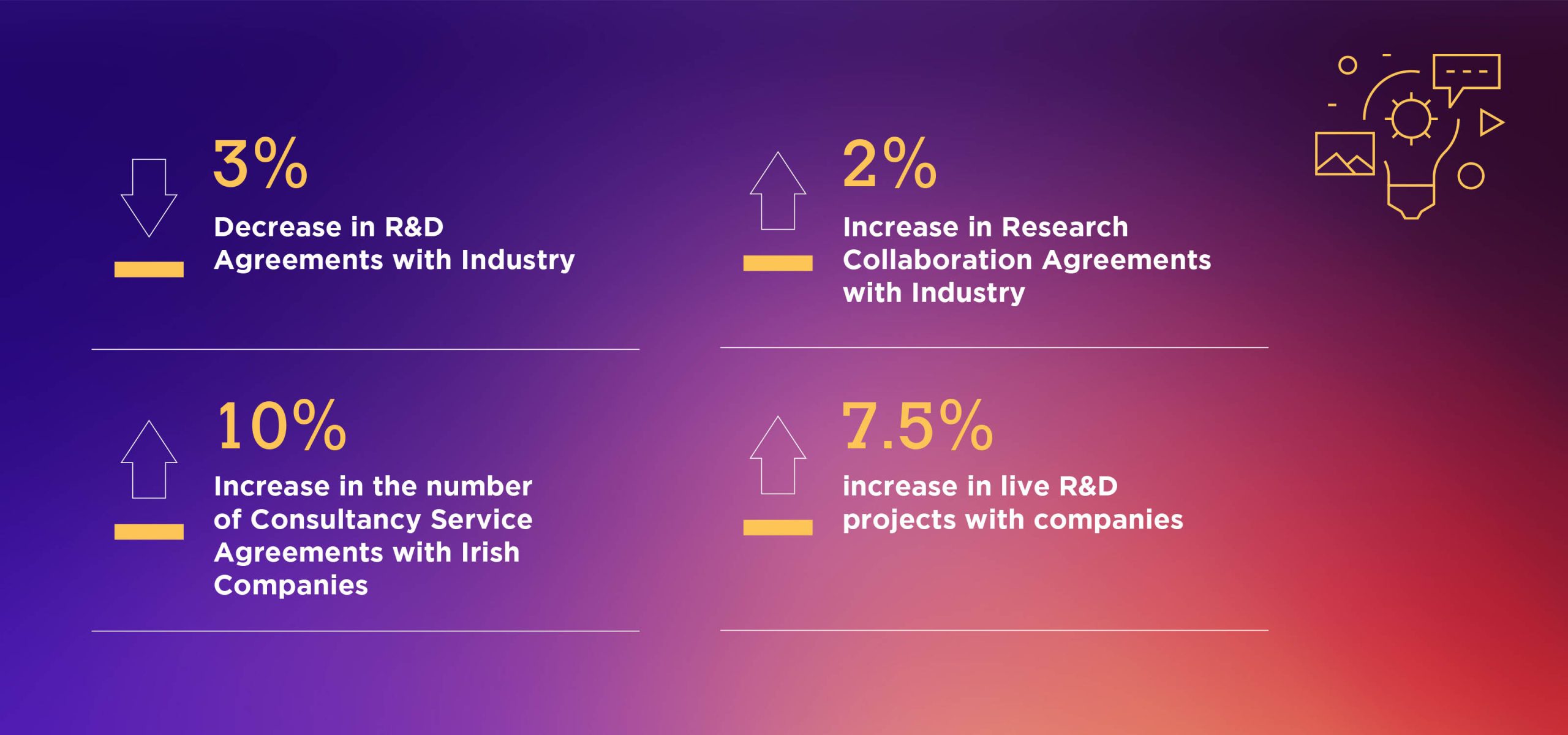
Highlights
Using chaptering allowed highlighting of key sections, including a dedicated “Success Stories” Chapter, a key element in promoting the benefits of the robust and well established Knowledge Transfer ecosystem in Ireland which delivers real results to local and international recognition.
Related Case Studies

Services
- Brand Development
- Digital Strategy
- Website
- Social Media Assets
- Marketing Consultancy
Project Overview
Elaine and Barbara have over 50 years experience in the area of Gut health. They approached Idea with the vision of sharing their vast Gut Health expertise to help women get a healthier, happier gut.
Brand Discovery
Elaine and Barbara wanted to create a brand that would truly represent them both and reflect the depth of knowledge they had in Gut Health. They had high aspirations for the brand, were writing a book and were also busy, highly regarded professionals in their respective fields.
Idea performed the initial research and discovery work including the detailed competitor analysis needed to start to create and build a brand for The Gut Experts.
Idea performed the initial research and discovery work including the detailed competitor analysis needed to start to create and build a brand for The Gut Experts.
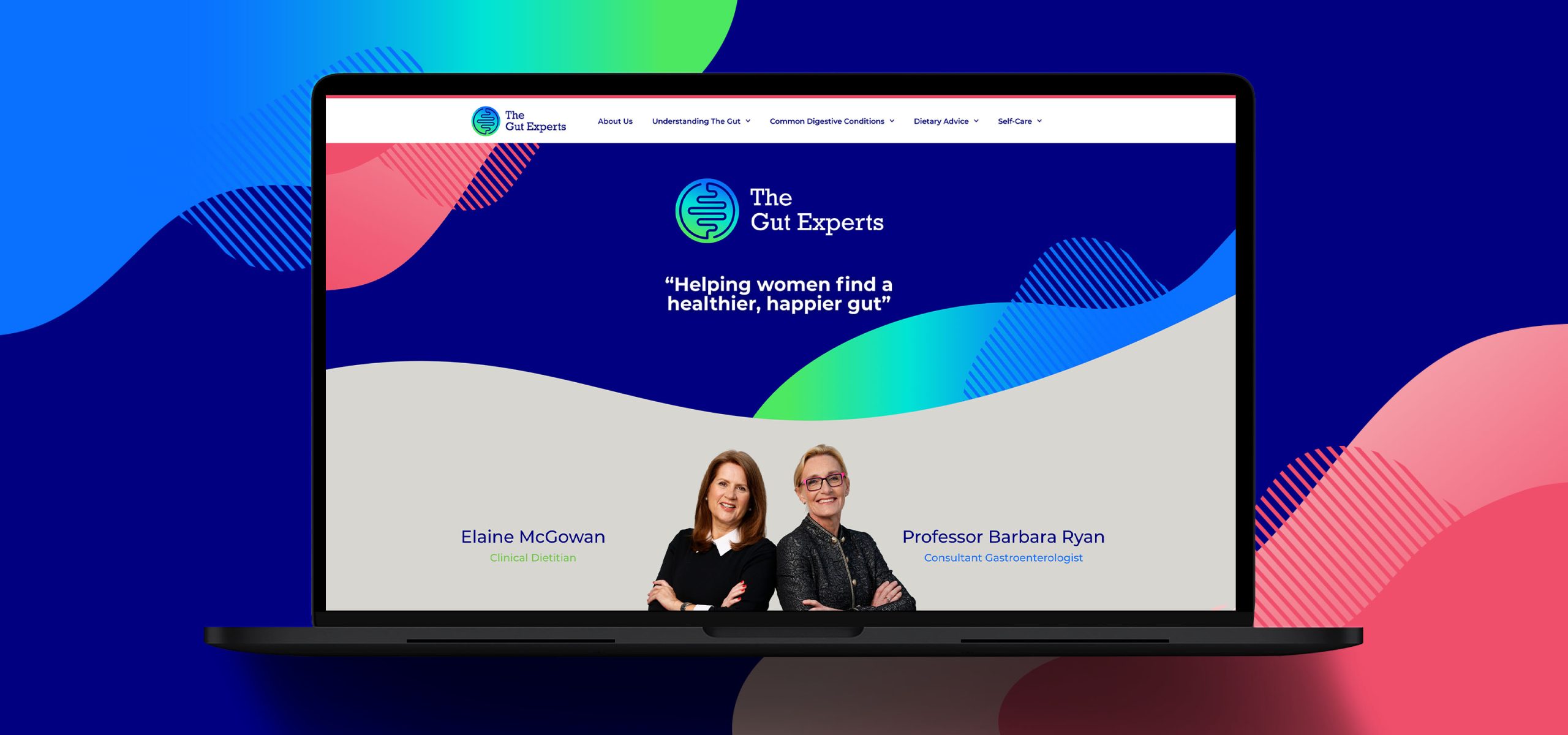
A really good gut feeling about a special brand
In our initial brand workshop we worked with Barbara and Elaine to establish the core values behind the brand. It was to be accessible, trustworthy, empowering, friendly and positive. Everything we developed from this point on had to reflect these values. The important first step was to finalise the name, The Gut Experts.
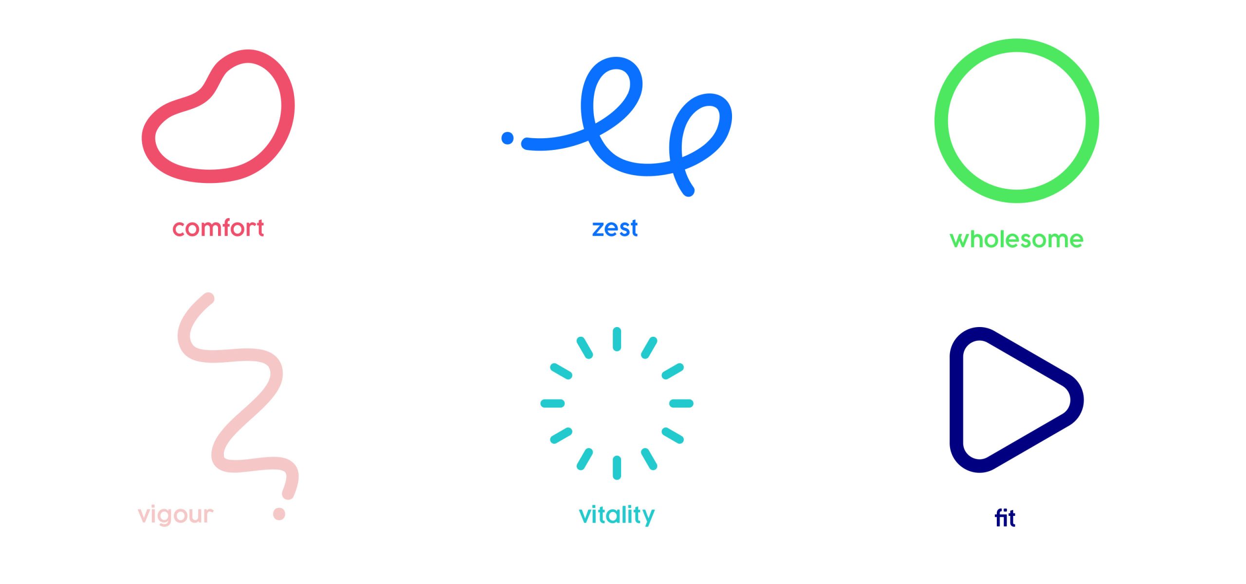
We felt this was confident, accurately reflected their expert position, was trustworthy and friendly so we started work on the development of their Brand Identity. The logotype we developed is confident, approachable and informed, when combined with the symbol, a visual representation of the gut, it gives it a vibrancy and dynamism that reflects the passion of the client. The large colour palette and dynamic mix of graphic shapes, designed to represent different qualities of a healthy lifestyle, brought a freshness and zest to the brand with particular attention given to how they would work digitally to achieve real standout for The Gut Experts.
We felt this was confident, accurately reflected their expert position, was trustworthy and friendly so we started work on the development of their Brand Identity. The logotype we developed is confident, approachable and informed, when combined with the symbol, a visual representation of the gut, it gives it a vibrancy and dynamism that reflects the passion of the client. The large colour palette and dynamic mix of graphic shapes, designed to represent different qualities of a healthy lifestyle, brought a freshness and zest to the brand with particular attention given to how they would work digitally to achieve real standout for The Gut Experts.
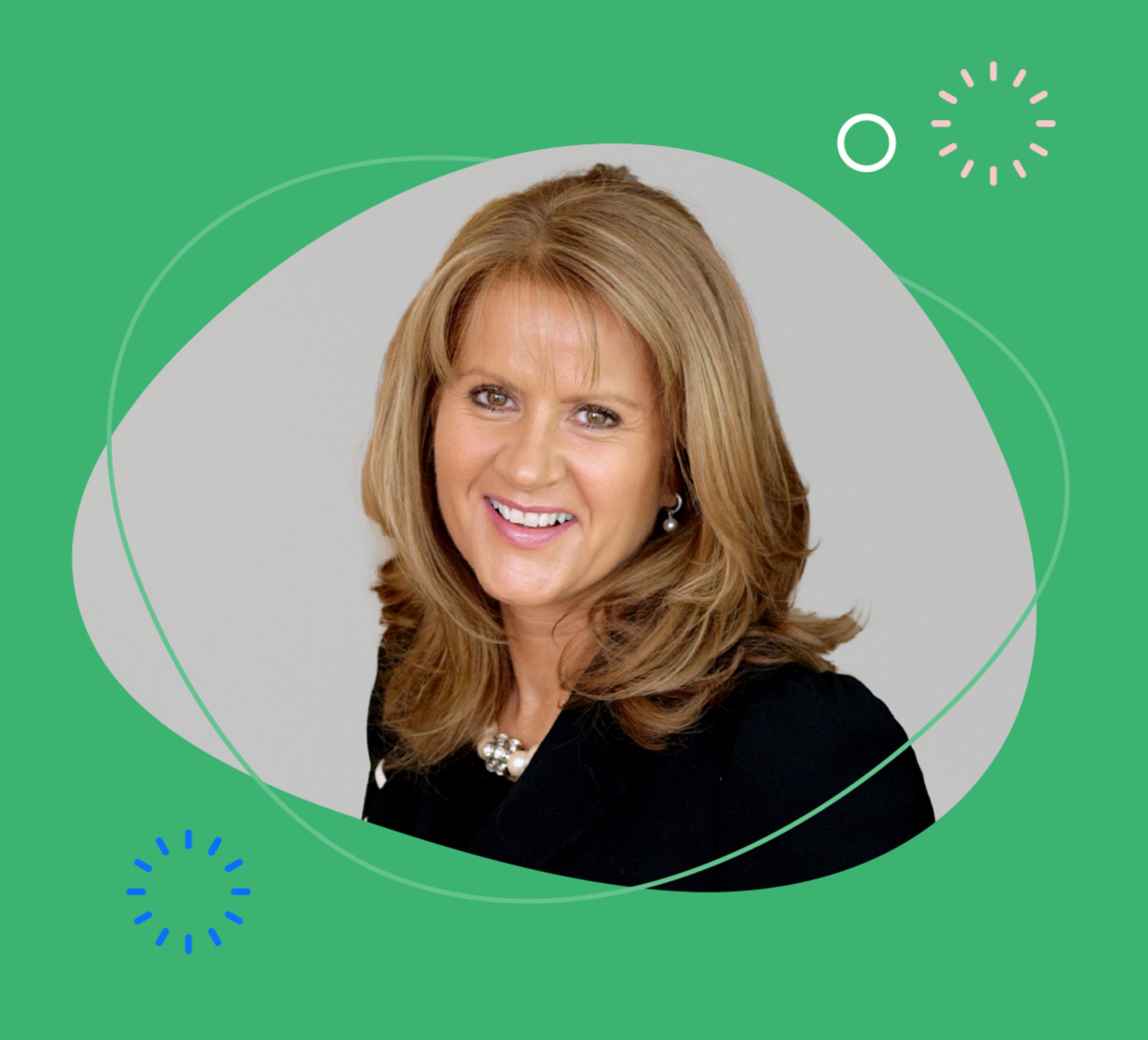
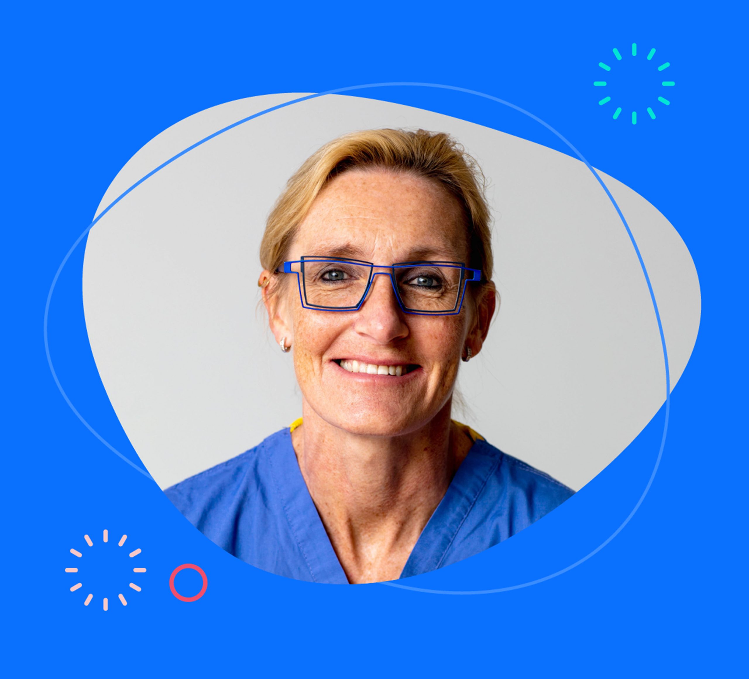
Highlighting the Experts
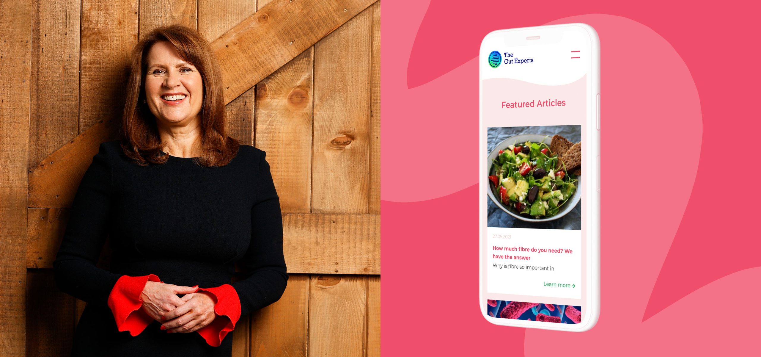
Elaine McGowan is one of Ireland’s leading private healthcare Dietitians and Clinical Nutritionists and has been at the forefront of providing dietary solutions for IBS patients for over 35 years. She is based primarily at the Hermitage Medical Clinic and also at the Beacon Consultants Clinic, Dublin and Bons Secours Hospital, Limerick.
Highlighting the Experts
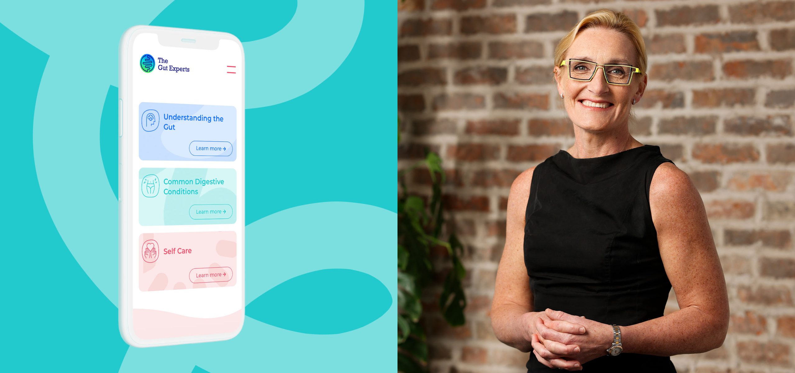
Professor Barbara Ryan is a Consultant Gastroenterologist in Tallaght University Hospital and the Hermitage Medical Clinic Dublin. She has been working as a gastroenterologist for 25 years and is also a Clinical Professor of Gastroenterology at Trinity College, Dublin.
Building awareness to help women find a healthier, happier gut
With a brand identity and a strong suite of photography we started to look at their digital strategy for growth. We focused on positioning The Gut Experts as the leading brand in the digital space for gut related advice and nutritional information. Within the strategy was consideration for the selling of potential future courses and products.
One of the key aims in creating and building awareness of The Gut Experts brand was to drive traffic to the website and to their social channels. Content and Social Media Marketing formed a large basis for this. We also worked closely with The Gut Experts team on their social media strategy, design direction and guidance on how to grow their audience on Instagram.
One of the key aims in creating and building awareness of The Gut Experts brand was to drive traffic to the website and to their social channels. Content and Social Media Marketing formed a large basis for this. We also worked closely with The Gut Experts team on their social media strategy, design direction and guidance on how to grow their audience on Instagram.
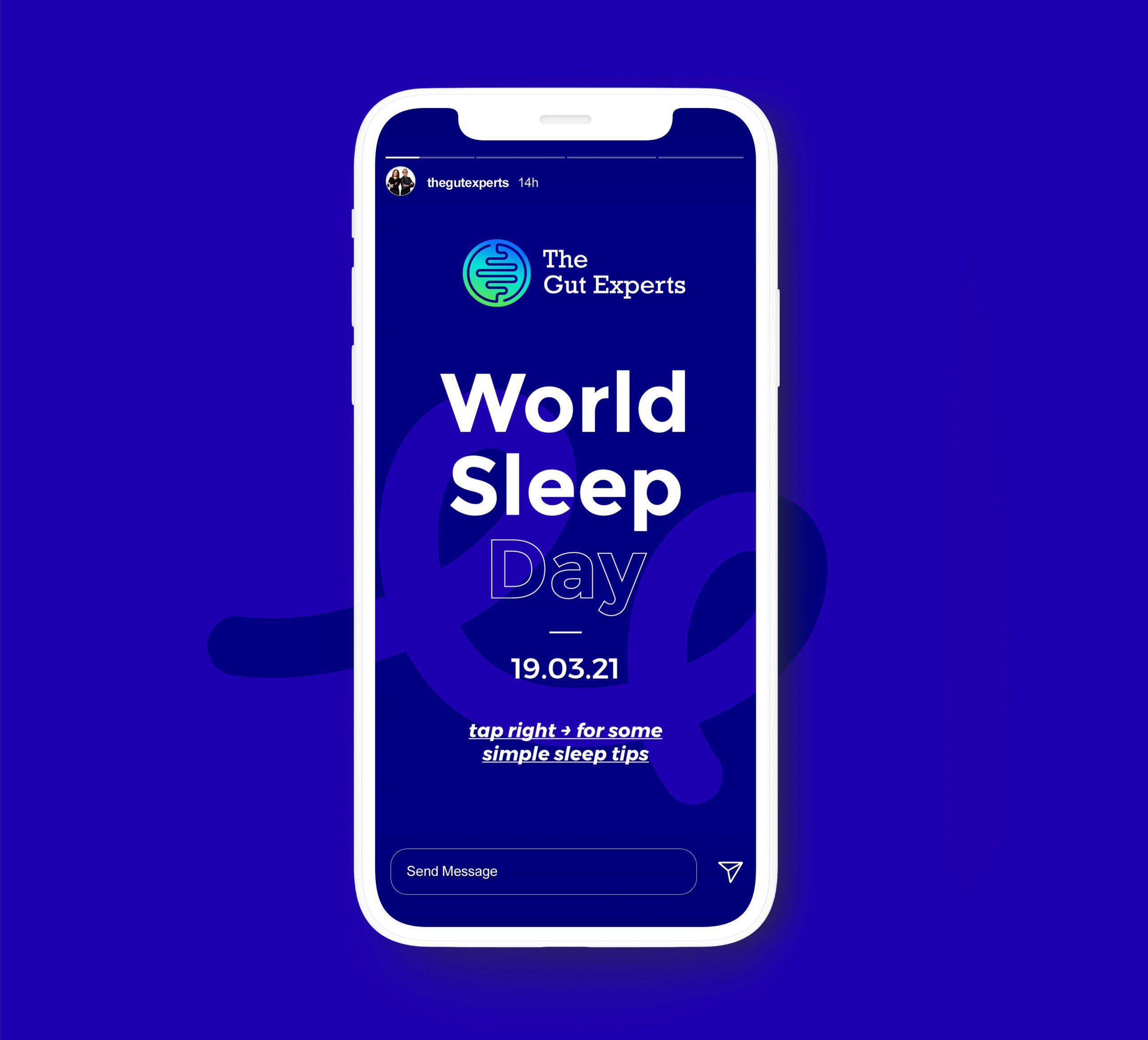
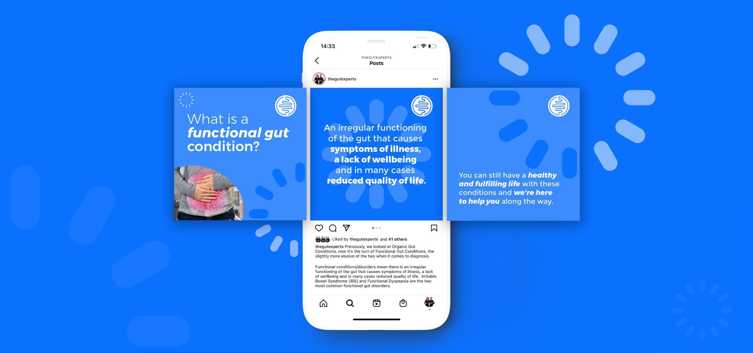
Instagram Stories
We put an emphasis on Instagram Stories when creating The Gut Experts' social assets which acted as a powerful medium to engage with their audience.
A visually vibrant website with powerful content
We also created The Gut Experts Website, it was designed to help women learn more about their own health while aiming to establish The Gut Experts as the leading thought leaders in this space. We got The Gut Experts online quickly with a temporary website landing page which we designed and built ahead of the introduction of their main website. The main website is a powerful resource for women looking for advice on gut related issues as well as nutritional information. The strong imagery and vibrant colours and graphics work alongside the powerful content, to create an engaging and informative online resource for anyone with gut issues.
Check it out at thegutexperts.com
Check it out at thegutexperts.com
Conclusion
The Gut Experts are going from strength to strength, having built brand awareness through their social channels, website and blogs as well as numerous radio programmes, podcasts and press appearances in addition to launching their book, ‘What Every Woman Needs to Know About Her Gut’ in April 2022 (which was a bestseller in the non-fiction category) as they continue with their mission to help women improve their gut health.
What the client had to say
Thank you to Idea for all your expertise and support in guiding the brand vision, which I think is fabulous! I have loved the workshops and the journey so far. We are so happy with our website, our branding across all platforms and the vibrancy and energy of our social channels.
Elaine McGowan,
Clinical Dietician
Clinical Dietician
Related Case Studies
Services
- Branding
- Brand Strategy
- UI / UX Design
- Responsive Web Design
Project Overview
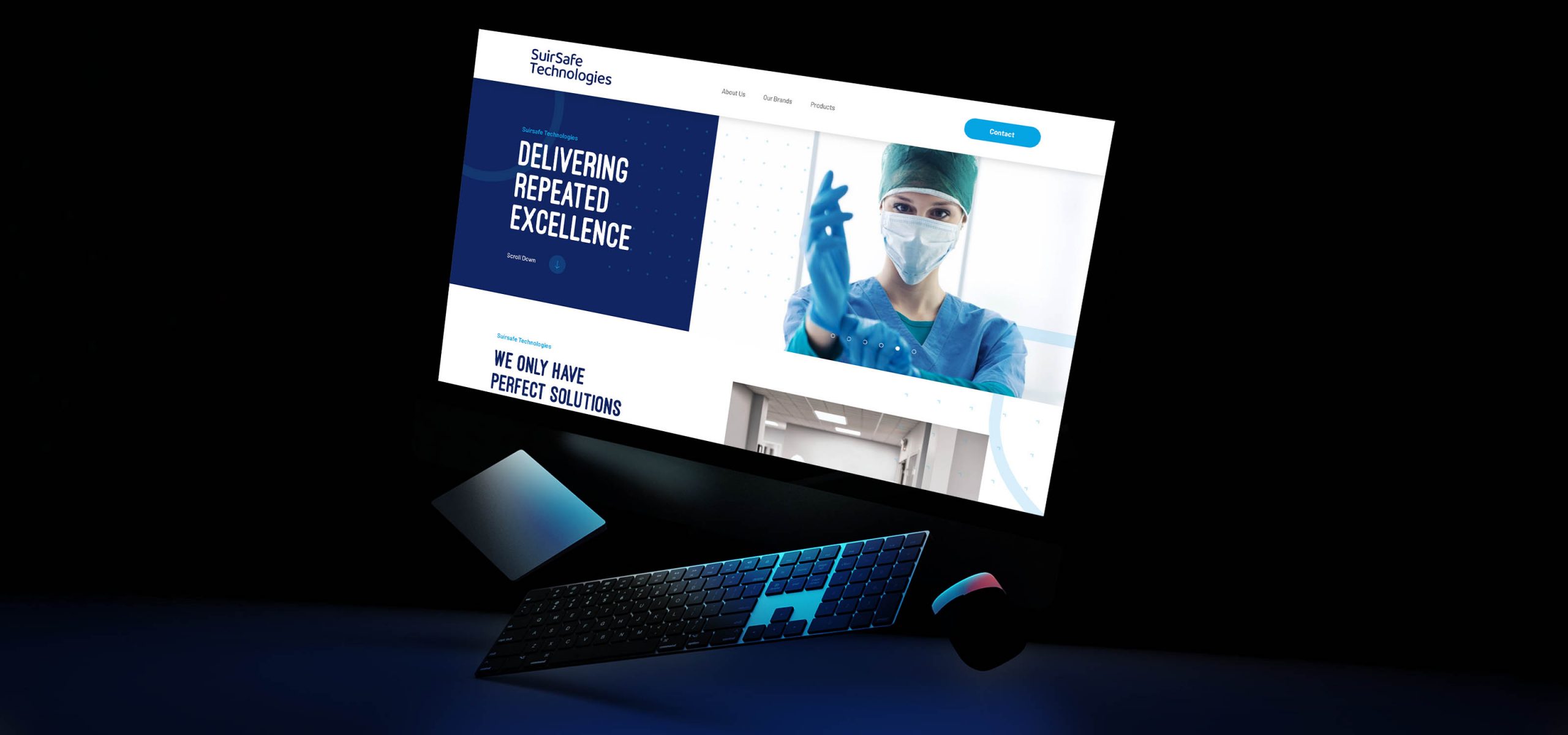
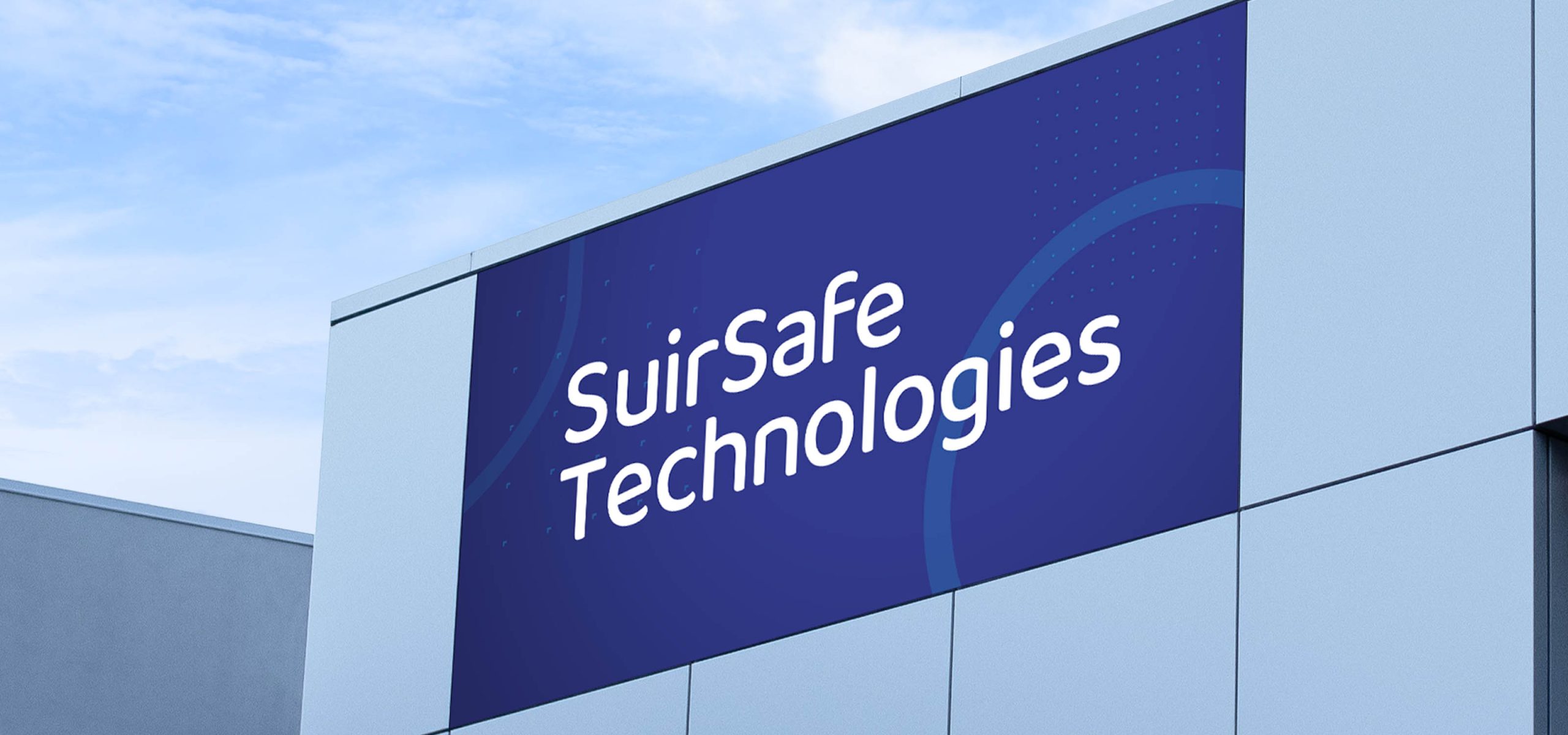
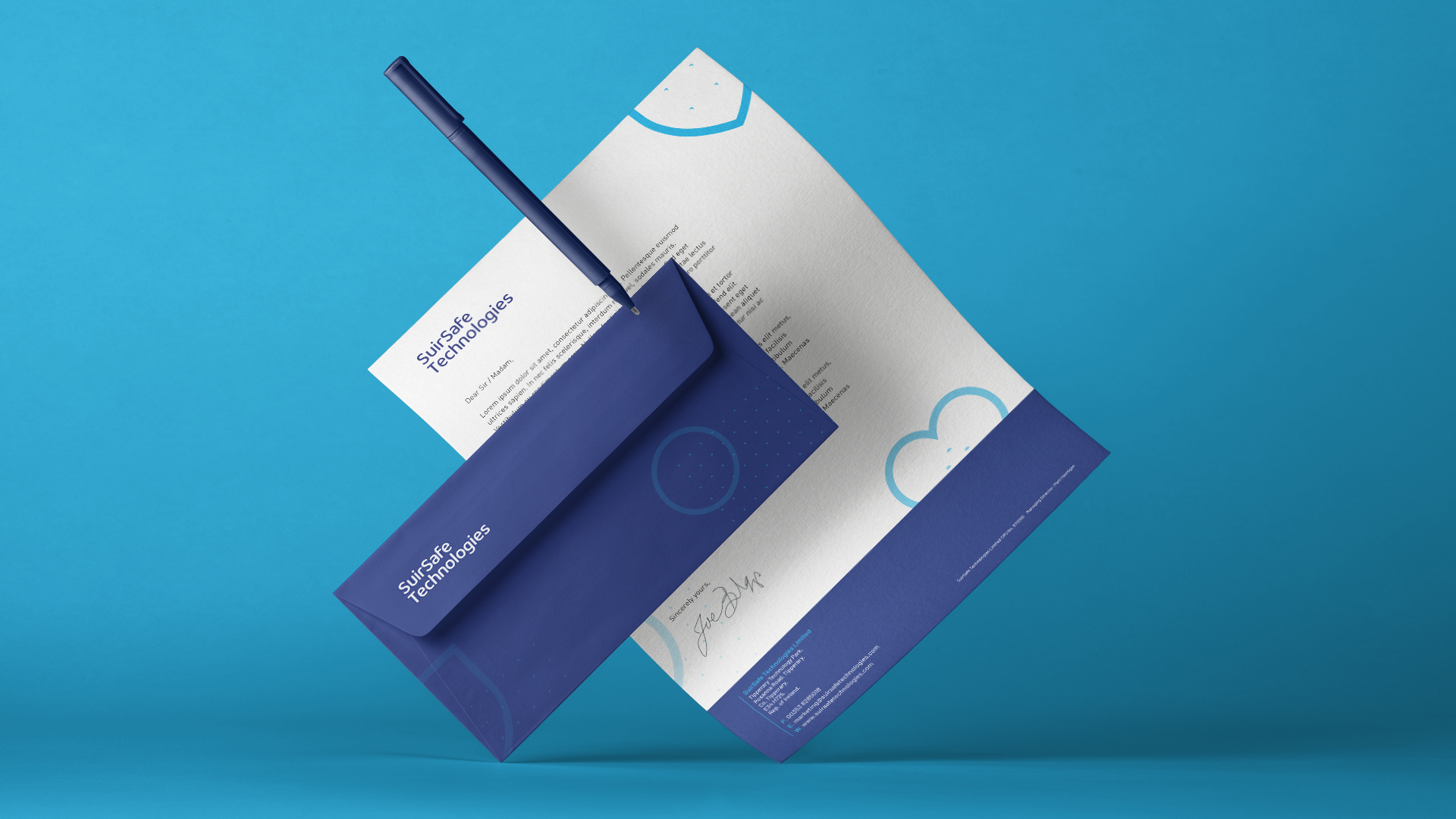
SuirSafe Technologies is a European based supplier of PPE and medical products, with vast knowledge and experience across several industries.
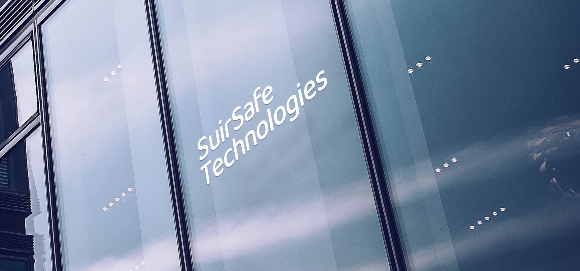
Brand Identity
We developed an identity that reflects and communicates Suirsafe’s reliability and trustworthiness. The colour palette brings to life the focused, professional and forward-thinking personality of Suirsafe Technologies. The brand and visual language suite created for SuirSafe Technologies is a versatile toolkit that will allow the brand to visually grow and expand as their product offering does.
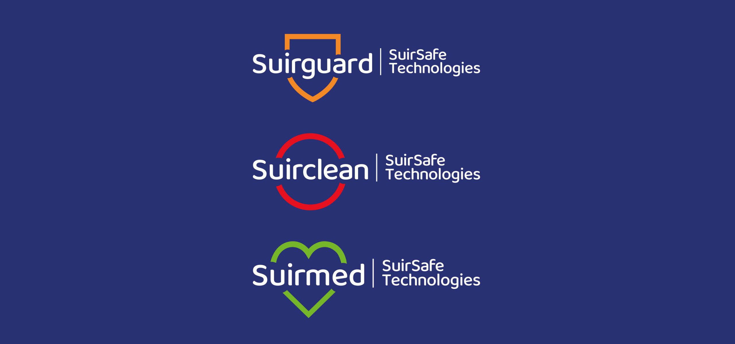
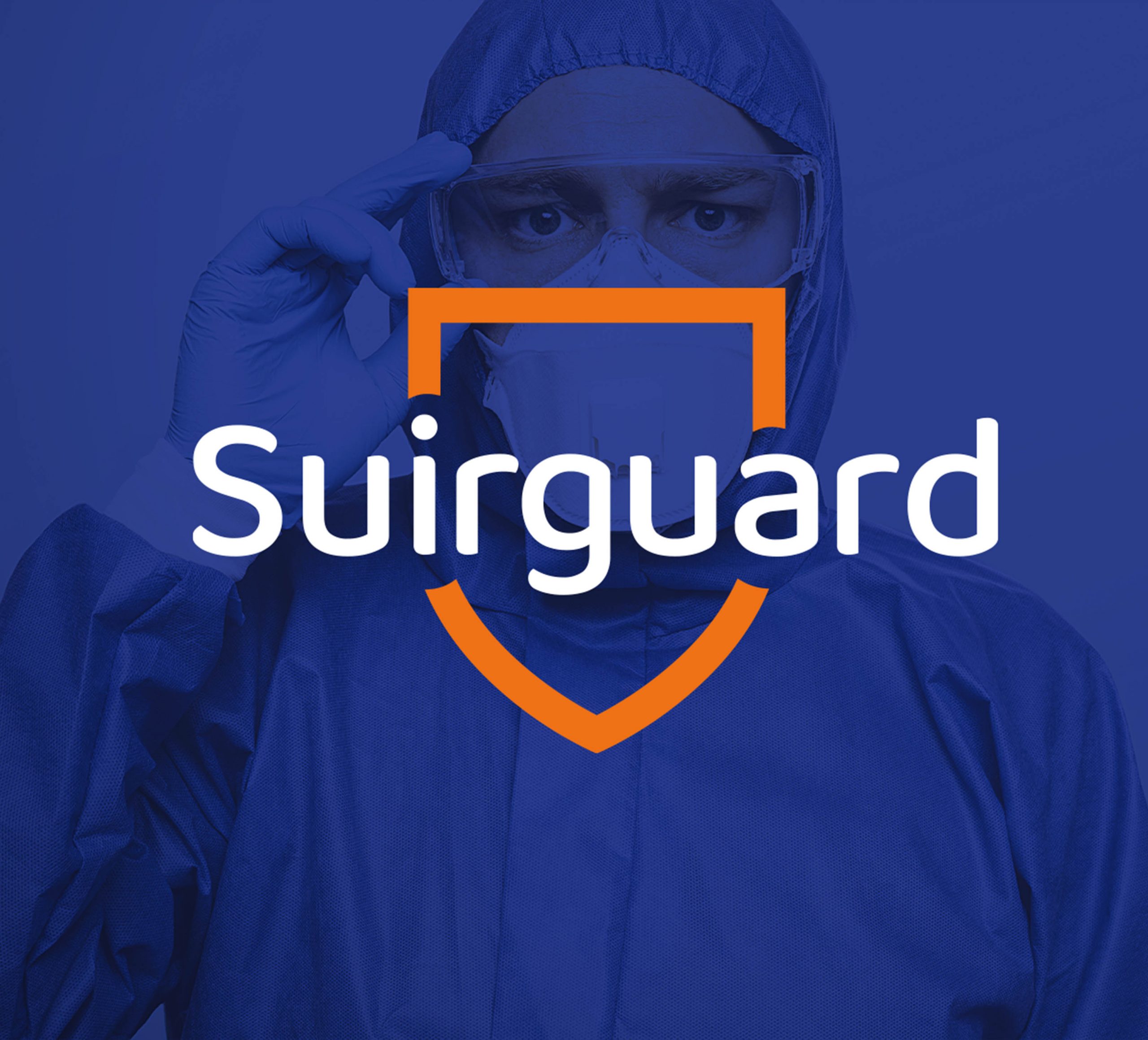
Suirguard
Suirguard is a sub-brand of products for personal protection that includes disposable PPE products from coveralls to respirators.
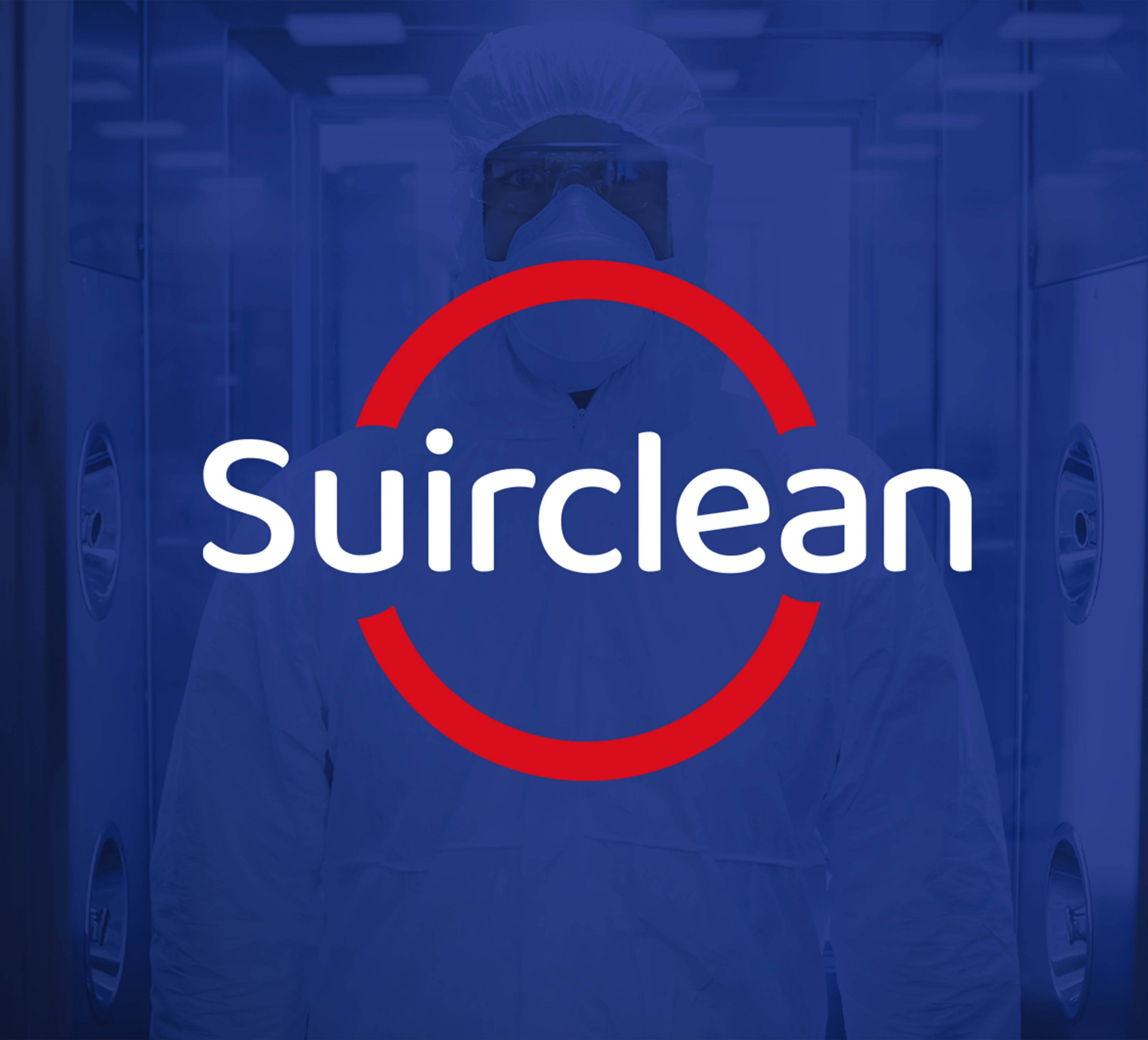
Suirclean
Suirclean is a sub-brand of cleanroom products, made in cleanroom for use in cleanrooms to protect the integrity of client process and products.
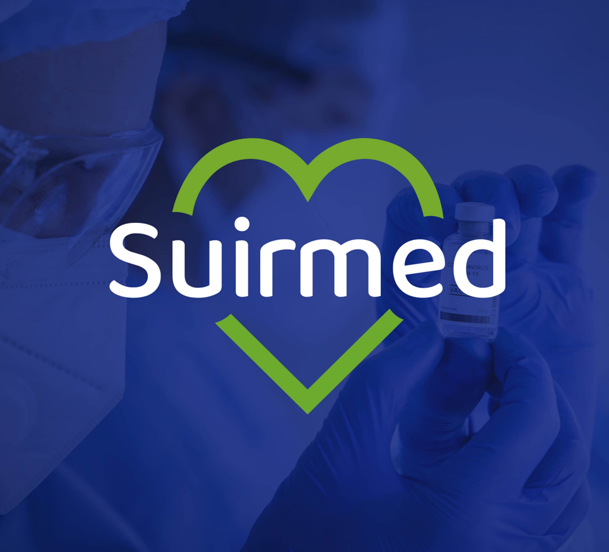
Suirmed
Suirmed is a sub-brand of medical products used mostly in healthcare facilities including masks, gowns and garments.
Product Website
We were tasked with creating an informative website that also needed to be intuitive and clearly highlight both the range and quality of PPE Suirsafe can supply. We created a professional and humanistic site that included the use of rounded typeface for headlines, imagery that reflects the brand colour palette and the integration of the visual language, creating a consistent digital brand representation.