Tag: Works by idea digital
Branding and Marketing Works Done by Idea Digital
Idea is a leading branding & digital marketing agency in Dublin, Ireland. Checkout all the work/projects done by us for various brands and businesses.
- Simply Blue Energy
- Payac
- The Gut Experts
- Savills
- Barretstown
- Niche Living
- Attestor
- Bord Bia Bloom
- Broadcasting Sustainability Network
- Comhar Linn INTO Credit Union
- Tara View
- Model Works
- Enterprise Ireland
- Eterna International
- Darmody Architecture
- Dortek
- Glensavage by Bartra
- SuirSafe Technologies
- KTI
- Bartra Healthcare
- RocDoc
Services
- Branding & Logo Design
- Digital Strategy
- Web Design & Development
- Presentation
Project Overview
Attestor approached Idea to develop their brand and digital presence. We kick started the project with a creative workshop with both their UK and Irish teams to establish their values and clarify their goals. Our challenge was to translate all of this into their brand story and communicate it across their identity, website, presentations and marketing collateral.

Branding & Logo Design
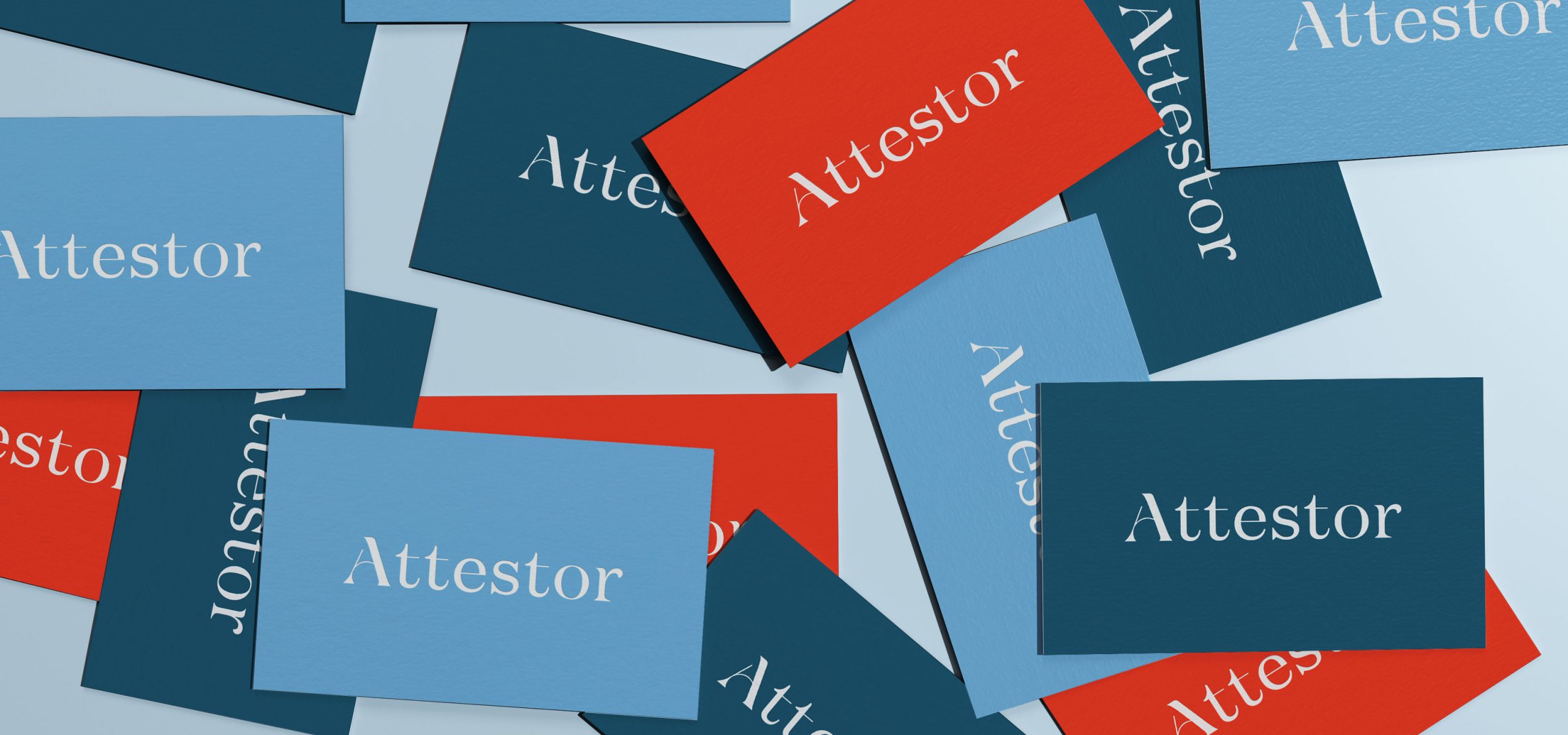
Trust, partnership and integrity are key to everything Attestor do. The brand we were to create needed to convey the positive, human, understated nature of how they work. Simplicity and brevity are at the core of everything they do. With this in mind we wanted to create a bespoke, brandmark, uncomplicated, straightforward and approachable, whilst still being confident and trustworthy.
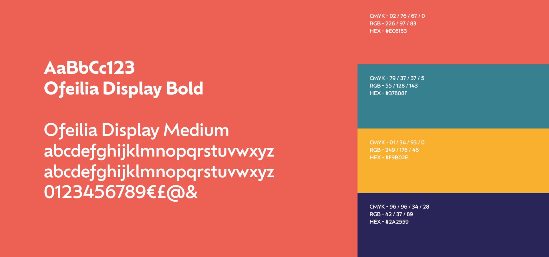
We developed a unique logotype, sophisticated and understated at first glance, but on closer inspection, attentive to the details. We started with a classic Didone style typeface which we personalised and made unique to Attestor, which gives an overall sense of subtle luxury.
We developed a unique logotype, sophisticated and understated at first glance, but on closer inspection, attentive to the details. We started with a classic Didone style typeface which we personalised and made unique to Attestor, which gives an overall sense of subtle luxury.
Balancing the font
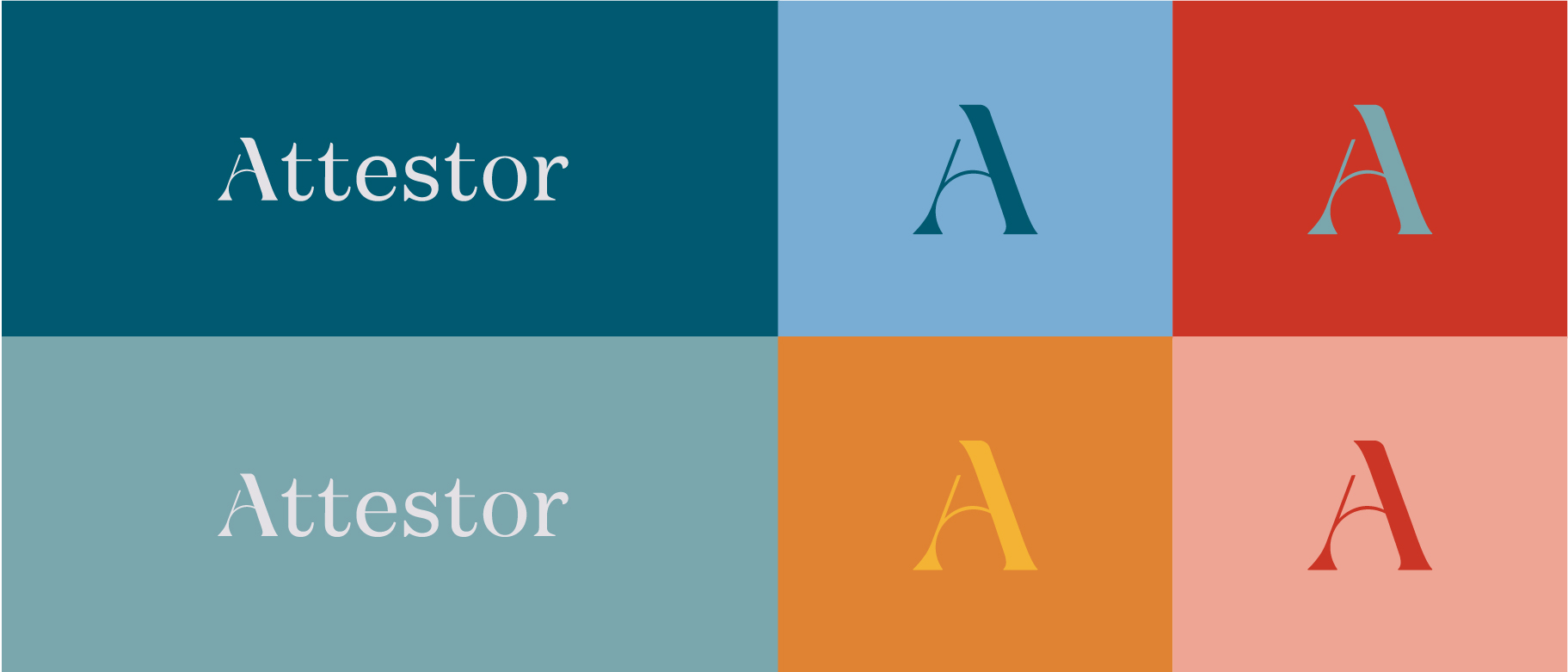
The chosen type style contained some sharp edges, which we balanced by bringing elements of roundness and softness to the individual characters, evoking Attestor’s diligence and rigour when it comes to their work, but also calling to their brand values of being approachable and human. This not only reflects the methodology of the firm, but brings to mind their unparalleled attitude in the field of investment.
Their unique A ‘ascends’ and stands out above the rest.
Their unique A ‘ascends’ and stands out above the rest.
Curvature of letters
We carefully crafted each curve, space and line of each letter of the brand to ensure that the letters worked together cohesively to create the brand identity that reflected their true values.
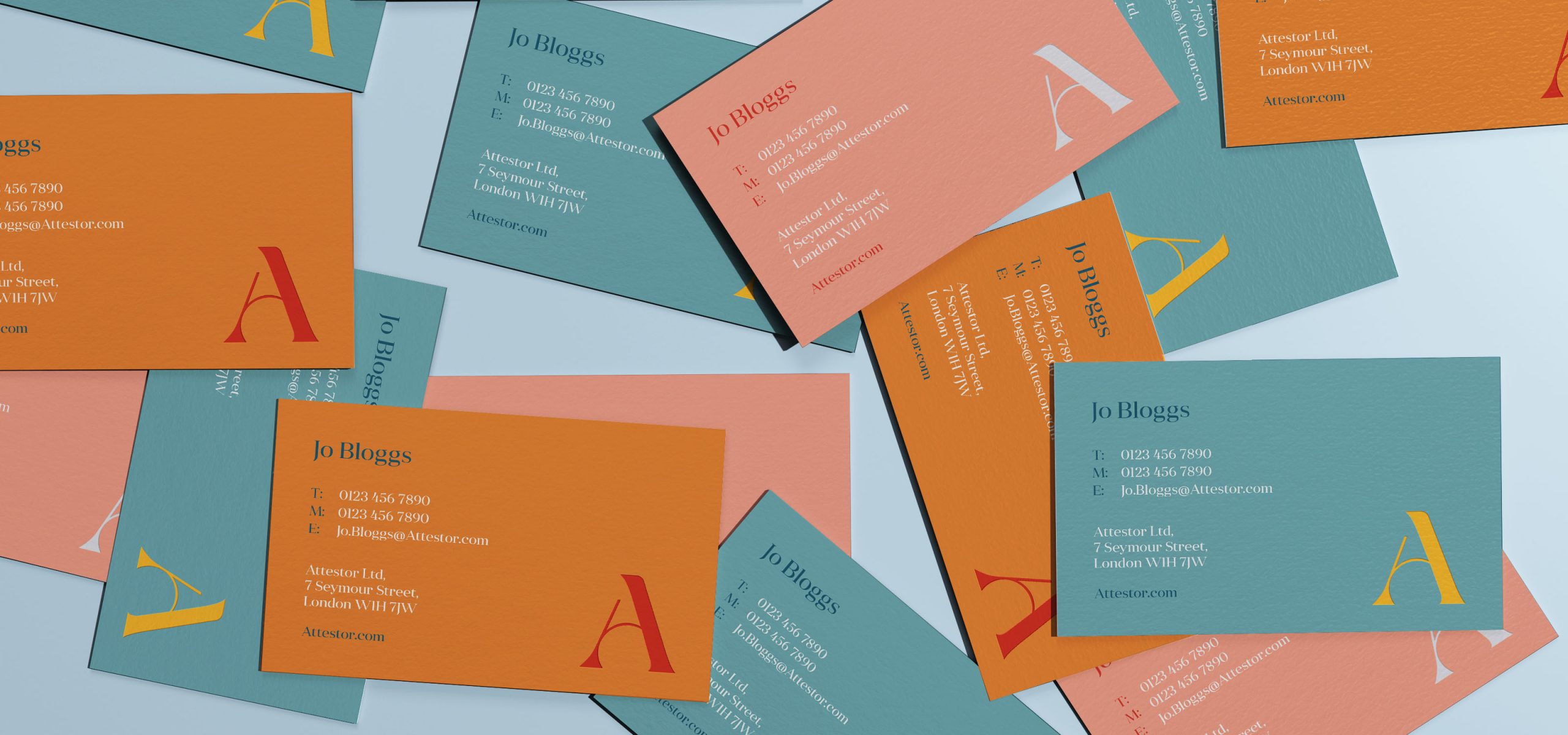
Dynamic Colour Palette
Through collaboration with the client, the final colour palette that was organically reached through our workshop process. This ensured that Attestor had a brand that truly reflected the company they had become.
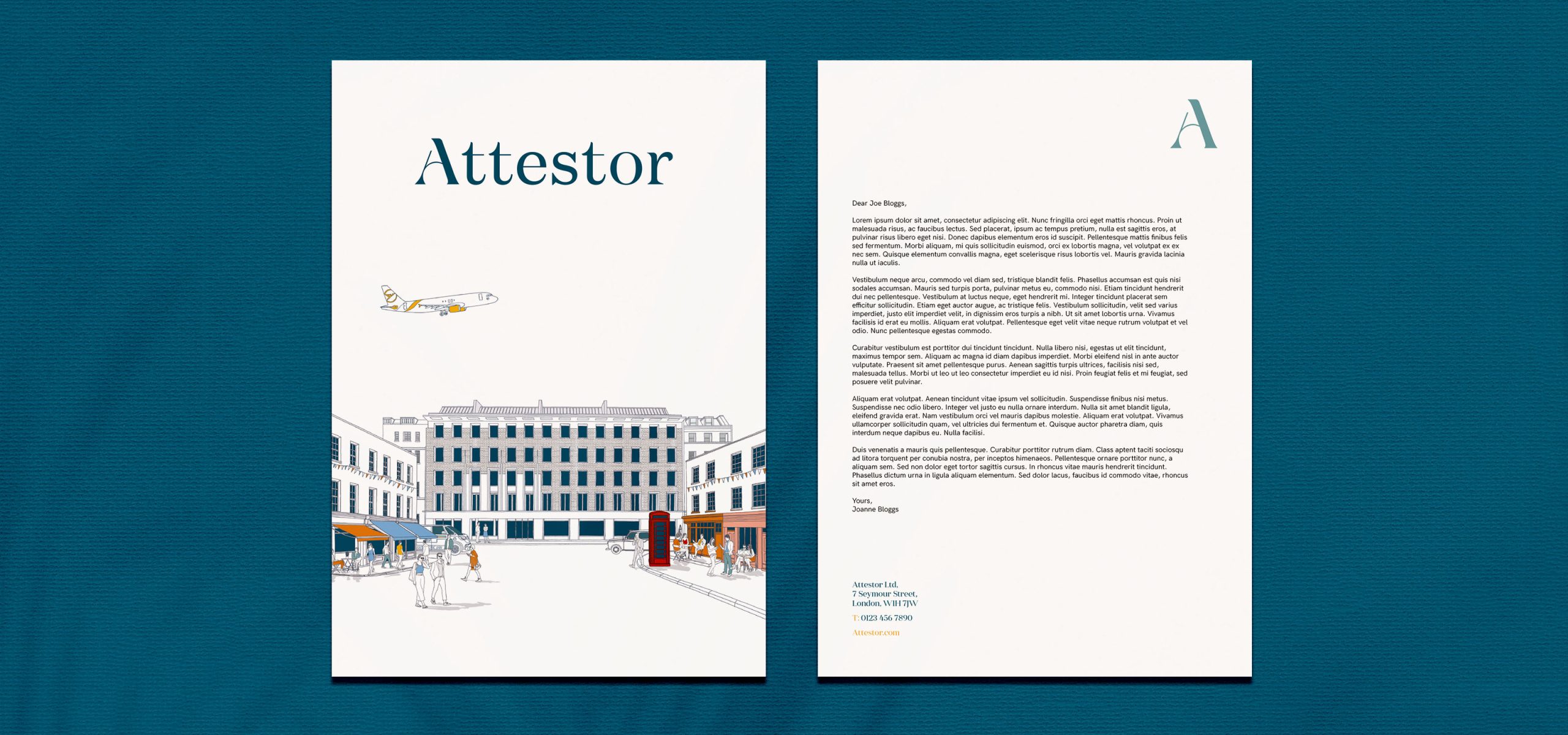
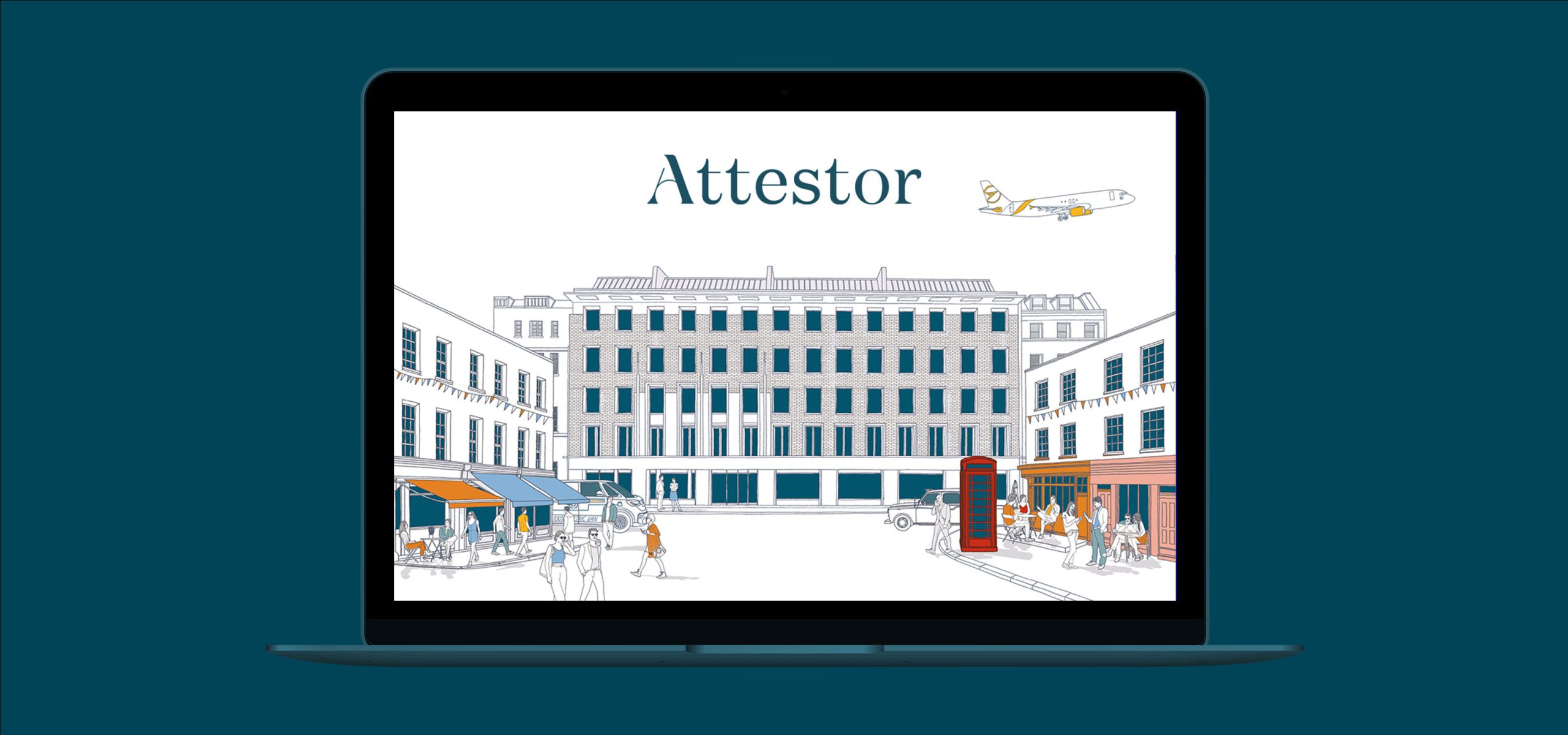
Digital Presence
We took to telling their story online, in a very simple visual and interactive way, with a one-page scrolling website. Once the narrative was developed, we storyboarded and worked with illustrator, Jitesh Patel to bring the concept to life as an illustration. Once the style and visual direction were approved we then set to work on activating this in a dynamic way adding interactions and animations to the site, creating an engaging website that was not only strikingly simple, but unique to Attestor.
Check it out at Attestor.com
Check it out at Attestor.com
What the client had to say
Idea took the time to understand us and created a brand and web presence that captures us perfectly. Such a great job on all fronts!
Susannah McAleese,
Partner, Attestor
Partner, Attestor
Related Case Studies

Services
- Brand Strategy
- Branding
- Digital Strategy
- UI / UX Design
Project Overview
The Credit Union movement has been an integral part of communities across Ireland for over 60 years. In 2019, some of the largest Credit Unions in Ireland have come together under the Current Account brand and are now delivering a fully-functioning day-to-day account for Credit Union members.
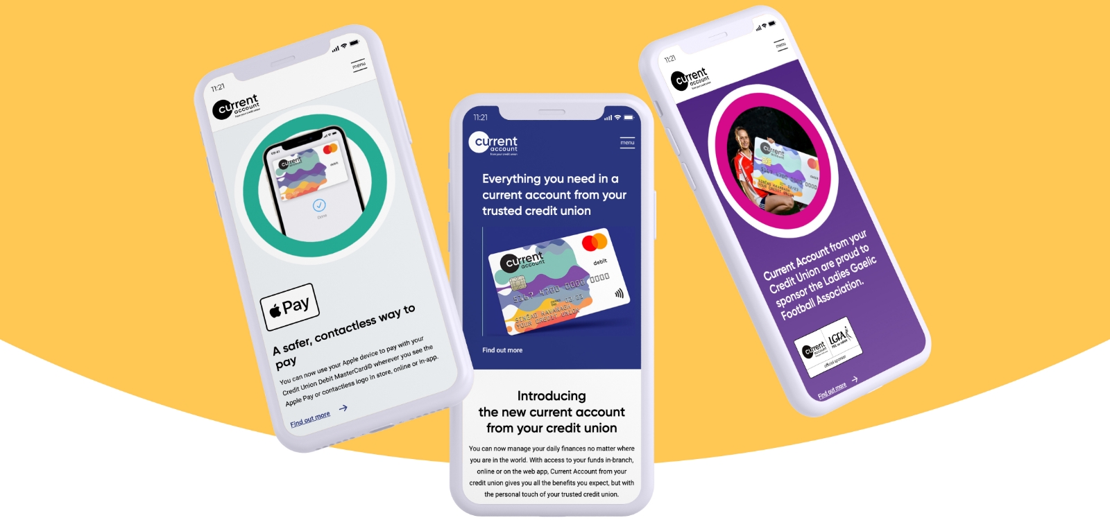
Current Account
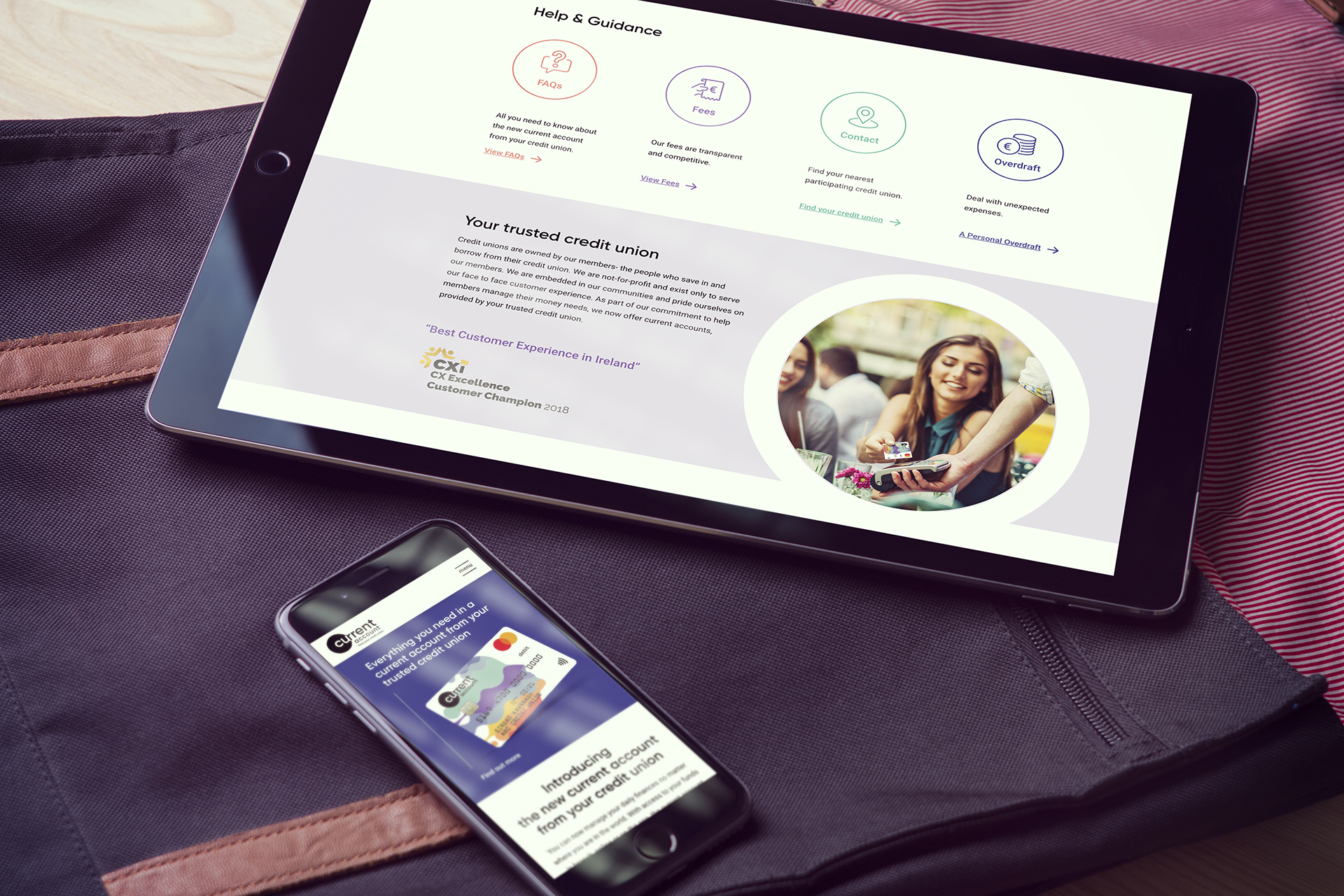
Current Account, from your credit union, is fully approved by the Central Bank of Ireland, includes a globally accepted Mastercard Debit Card with contactless payments, standing orders, direct debits, and an overdraft facility. Credit Union members will be able to open an account online or in person at a Credit Union branch.
This exciting development will see over 30 of the largest Credit Unions in Ireland, with 115 branches throughout the country, offering Current Account to their members. Further Credit Unions are expected to provide the service in 2020. This will enhance Credit Unions’ relationships with their members as prior to the launch of Current Account, there was a gap in the services that credit unions could provide their members.
This exciting development will see over 30 of the largest Credit Unions in Ireland, with 115 branches throughout the country, offering Current Account to their members. Further Credit Unions are expected to provide the service in 2020. This will enhance Credit Unions’ relationships with their members as prior to the launch of Current Account, there was a gap in the services that credit unions could provide their members.
Everything you need from a bank account
The ‘Current Account’ project began with Payac appointing Idea to develop a brand for this new offering. It was important that this brand represented the established brand values of the credit union, whilst also establishing the brand values of this exciting new service – positioning ‘Current Account’ as a unique offering, delivering everything you need from a bank account, but delivered by your local, trusted credit union.
Brand Rollout
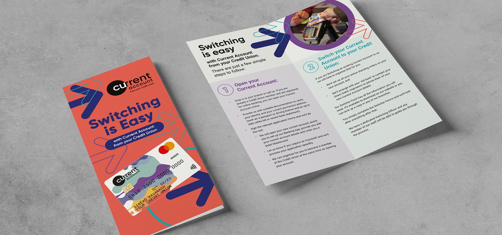
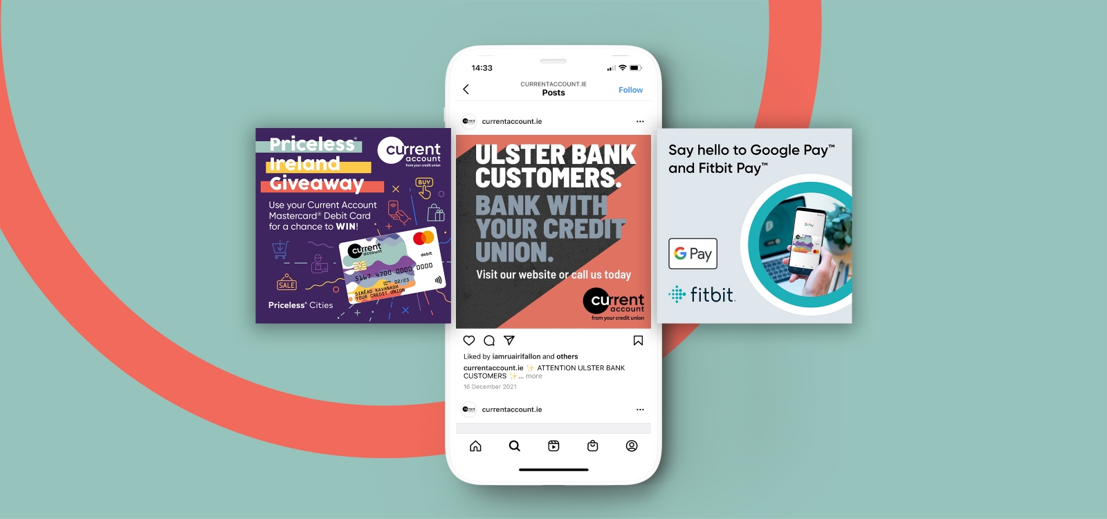
Idea were asked to bring the brand to life and design a full suite of marketing materials and digital assets, that would engage credit union members throughout the country, whilst communicating the brand values and benefits of Current Account. This included a comprehensive suite of creative designs, printed material (such as pull-ups, posters, brochures, card mock-ups), as well as the design and development of the Current Account Website website, digital advertising & social media assets.
Project Objective
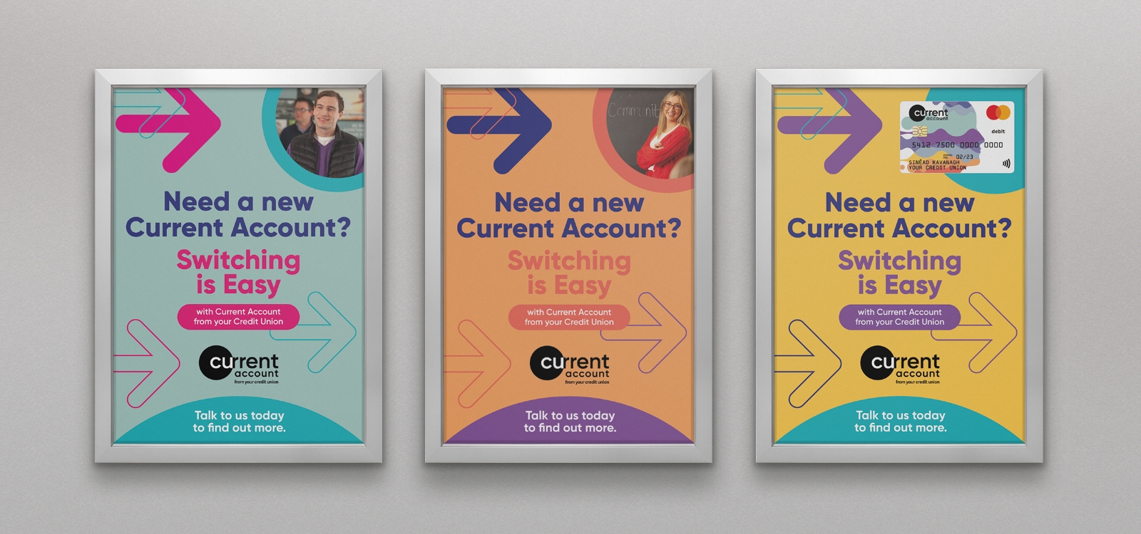
The ultimate objective of this project was to entice existing Credit Union members to sign up to Current Account for their day to day banking needs. Whilst it was important that the Current Account brand was consistently communicated nationwide, it was also important that design & materials were personalised to each Credit Union, as it is Credit Unions themselves who are and will be marketing directly to their members, supported by some nationwide activities.
Brand Execution
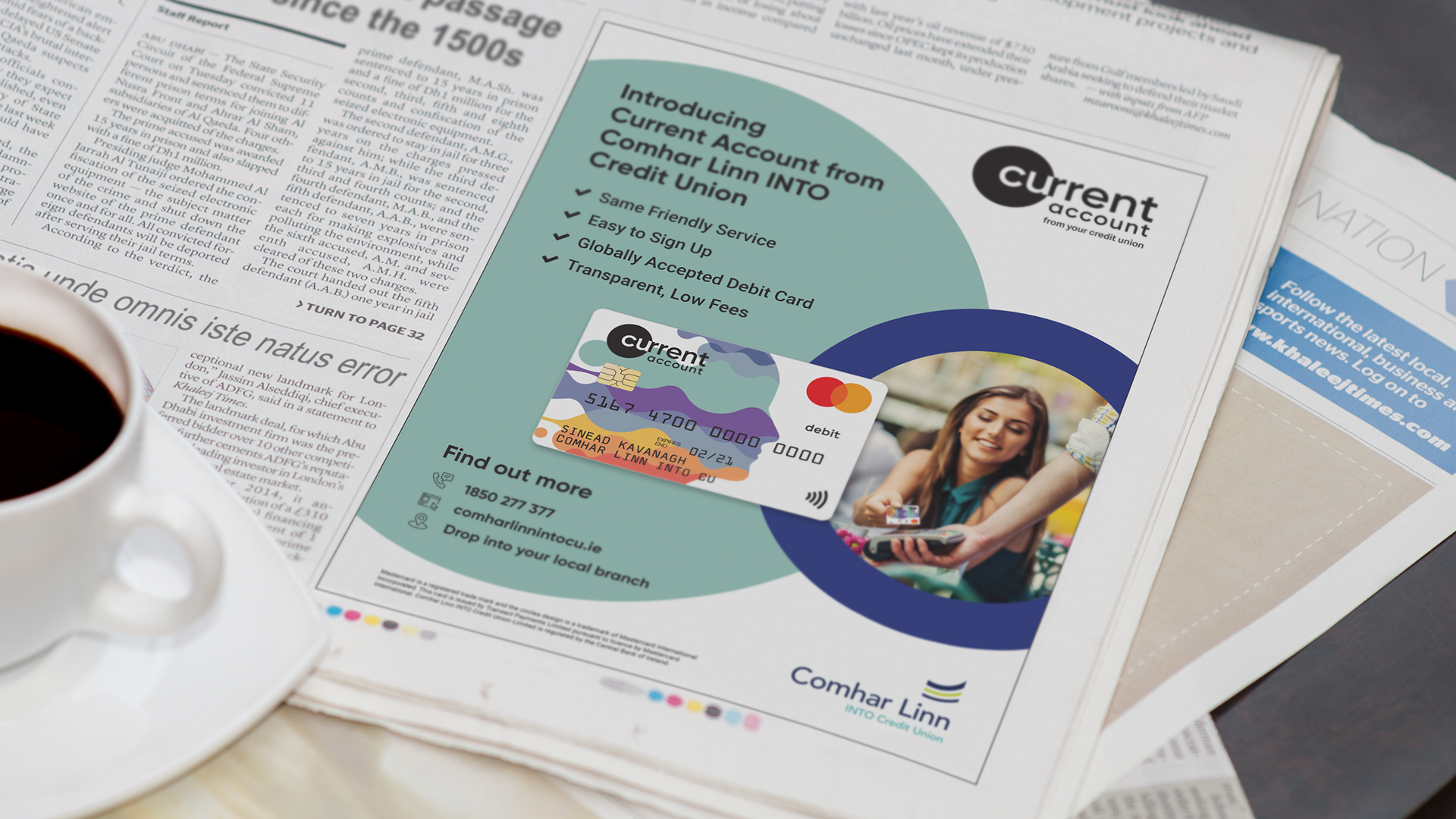
In the development of the Current Account brand, Idea created a name and tagline for Current Account, as well as brand identity, brand definition and pre-launch marketing strategy. We then created the design of the Current Account Mastercard debit card, the most tangible part of Current Account.
Our brand execution approach was the development of a promotional toolkit of design files, guidelines, digital assets and marketing tips for each participating Credit Union to use in the marketing of their new Current Account service. This maintained a consistent national brand whilst also personalising the materials for each credit union allowing them to communicate that it was members’ own Credit Unions that were providing this service.
Our brand execution approach was the development of a promotional toolkit of design files, guidelines, digital assets and marketing tips for each participating Credit Union to use in the marketing of their new Current Account service. This maintained a consistent national brand whilst also personalising the materials for each credit union allowing them to communicate that it was members’ own Credit Unions that were providing this service.
Personalised Marketing Materials
We delivered a Training Workshop to Credit Union Marketing Managers, enabling them to communicate the benefits of Current Account to their members in line with the brand values created by Idea.
We also centrally produced and distributed a suite of personalised marketing materials to each Credit Union so that they could promote Current Account to their members in 115 branches throughout the country. As part of the Current Account digital presence and strategy, we designed & developed the currentaccount.ie website, the objective of which is to filter traffic and drive members to individual credit unions to sign up for this new service.
We also centrally produced and distributed a suite of personalised marketing materials to each Credit Union so that they could promote Current Account to their members in 115 branches throughout the country. As part of the Current Account digital presence and strategy, we designed & developed the currentaccount.ie website, the objective of which is to filter traffic and drive members to individual credit unions to sign up for this new service.
Results
Overall, the reception to Current Account has been great. The Current Account brand has featured heavily in the media since its launch on October 17th, 2019; the display of marketing materials has created a great impact in branches; and the Current Account Website has received high traffic volumes post launch. Participating Credit Unions have incorporated Current Account into their marketing activities successfully and Marketing Management and staff have used their expertise in the promotion of Current Account to their members. Members throughout the country have engaged with Current Account and enquiries and sign ups are continuing at pace.
Related Case Studies
Services
- Branding & Logo Design
- Digital Strategy
- Digital Advertising & Consultancy
- OOH Advertisement Design
- Video
- Website Design & Development
Project Overview
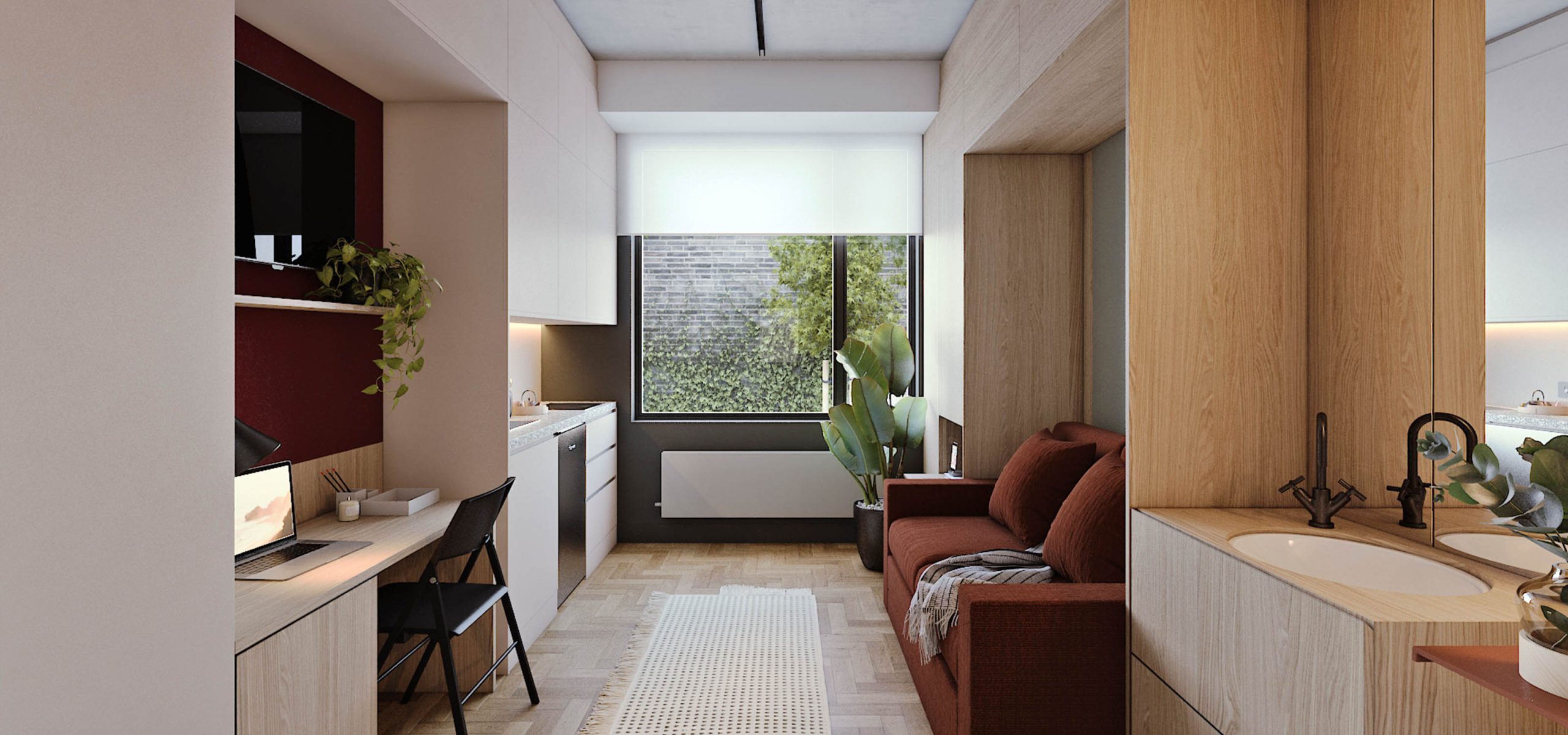
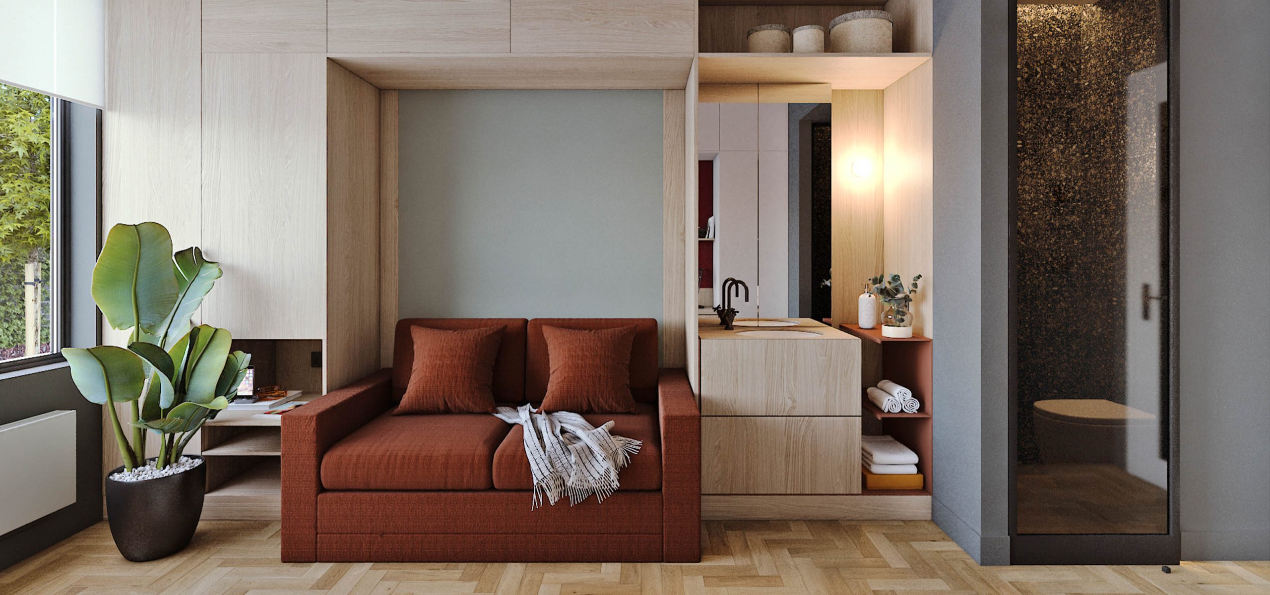
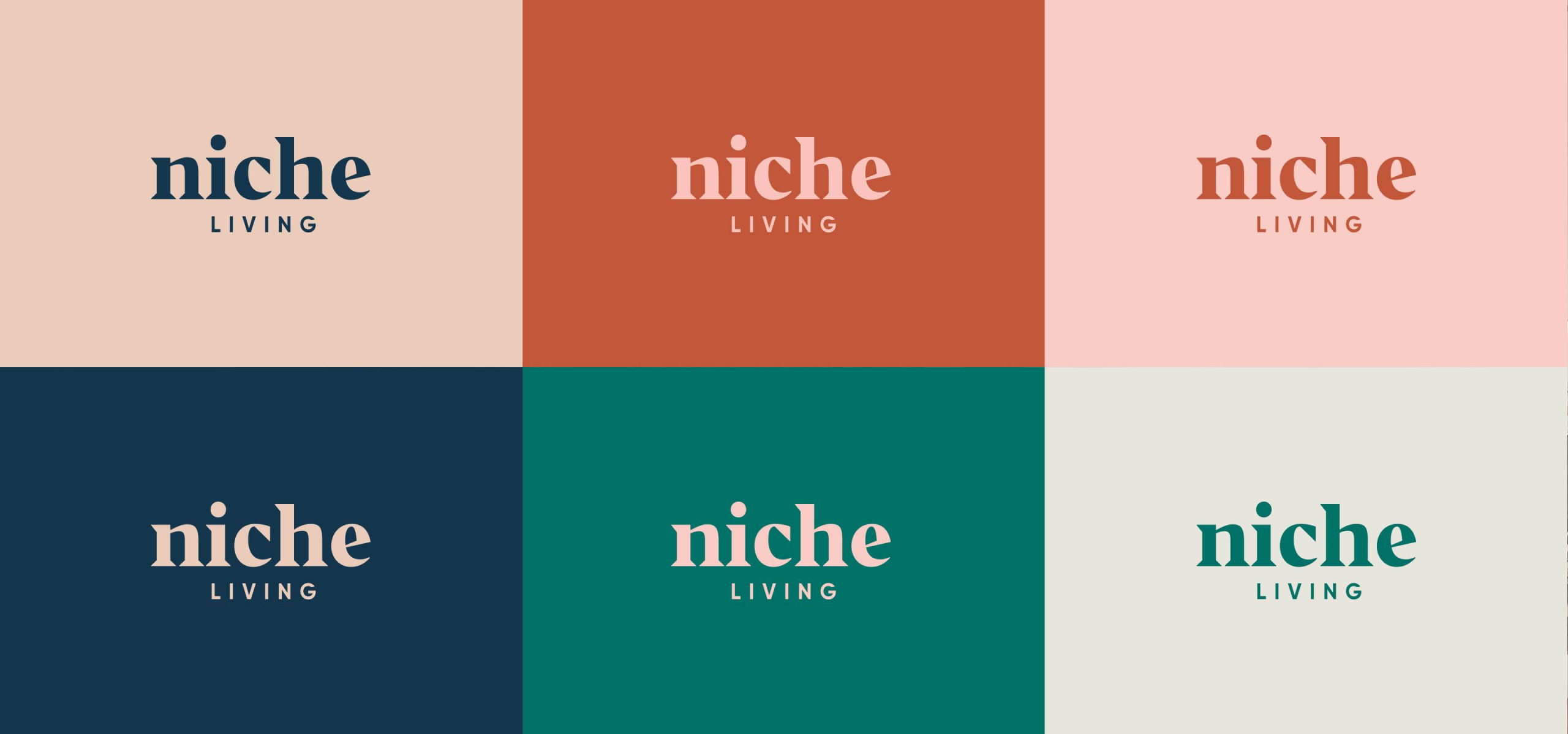
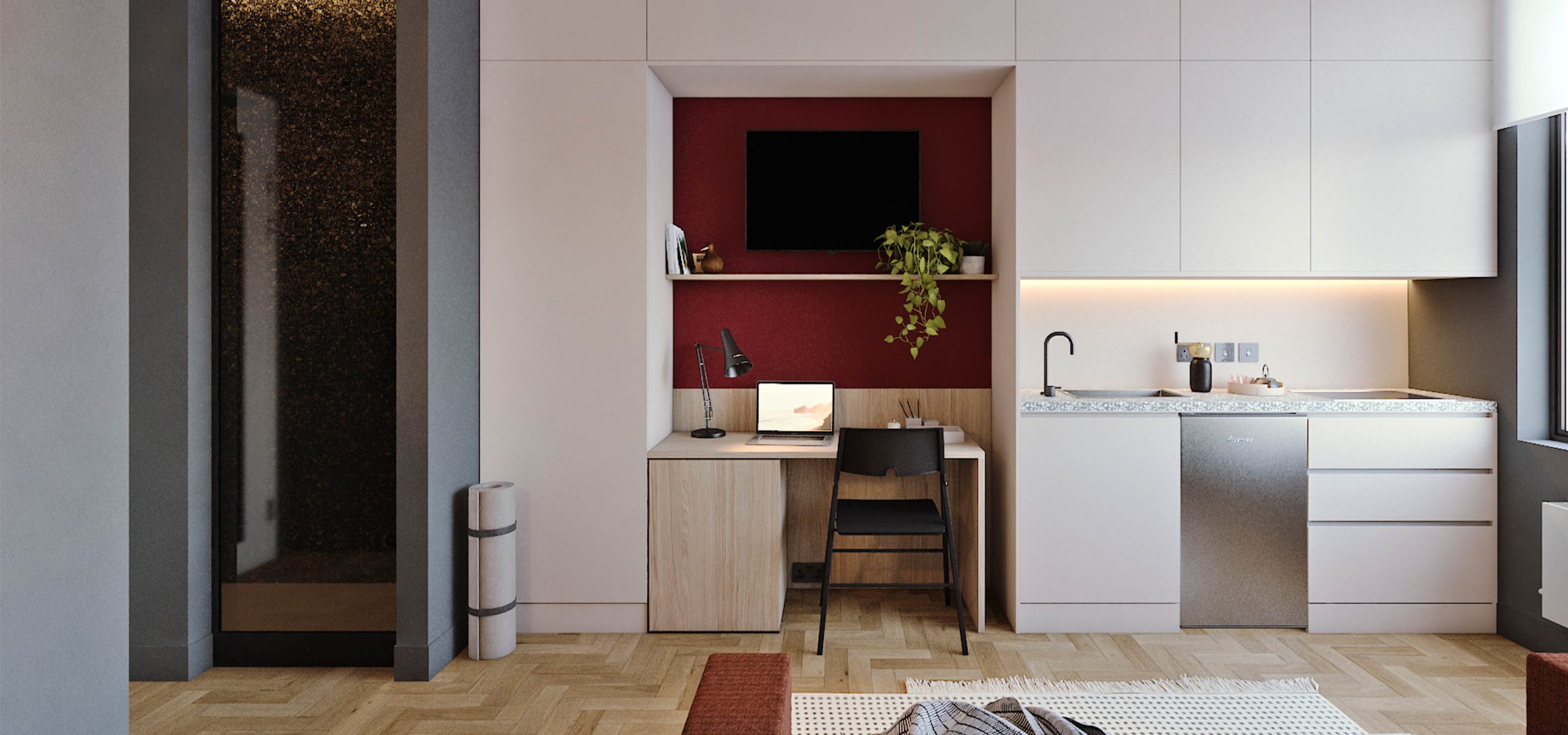
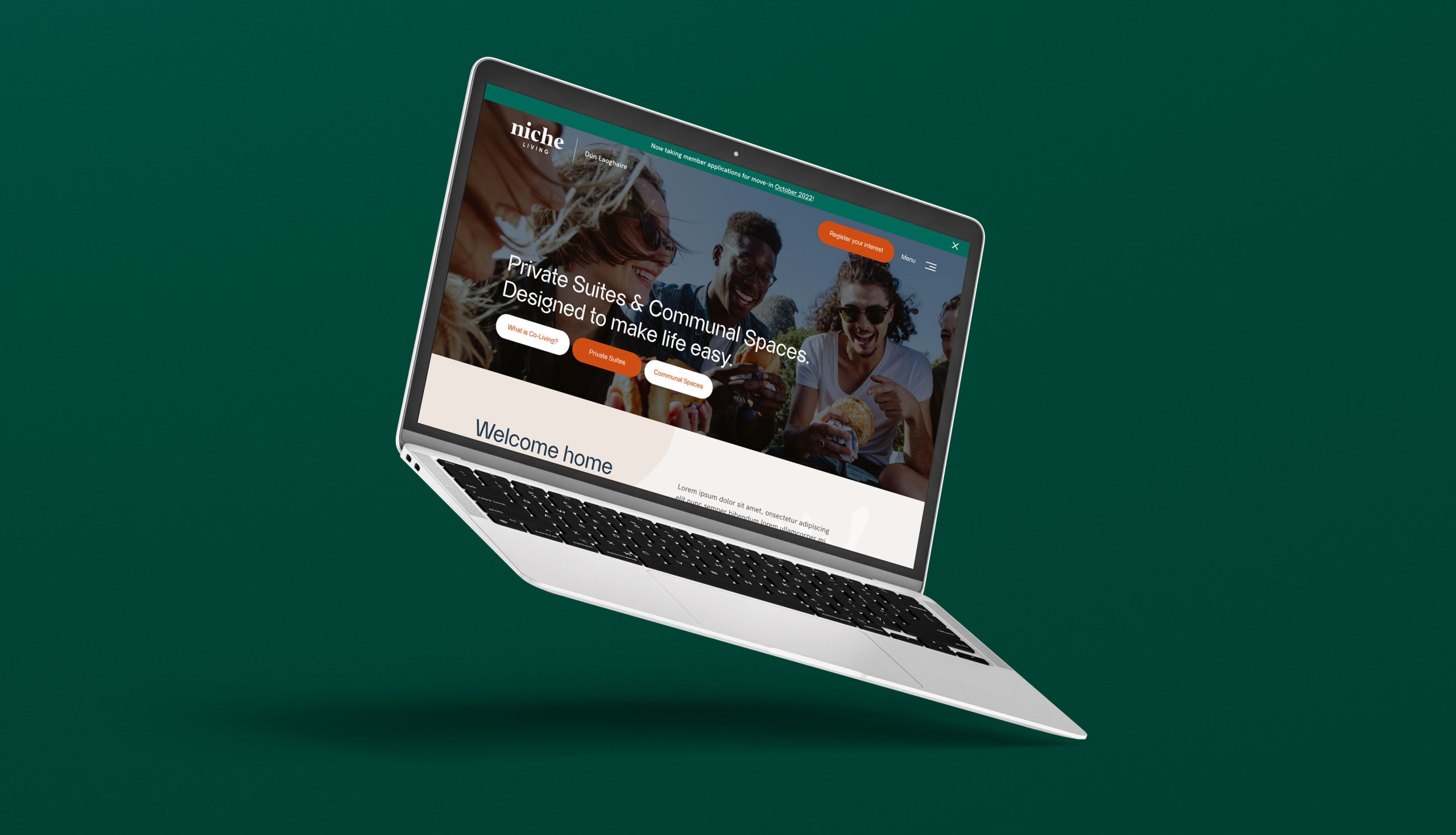
Idea were tasked by Bartra to name, brand, and market this new concept in short term, professional, multi-functional living for Dublin. As the brand evolved and came closer to market, we worked to design and develop Niche Living’s flagship website, which lead to the team creating a digital strategy, primarily focussed around Niche Living’s launch.
Co-Living
Co-Living is an emerging trend in almost every city in the world. Niche Living has introduced a fresh and innovative concept, delivering the first purpose-designed individual shared living suites in Ireland. Niche Living developments are planned for a number of key locations in established neighbourhoods across the capital in areas with extensive social amenities, easily accessible public transport links, and large employer bases, ensuring residents always feel connected.
Co-living isn’t for everyone and it isn’t aimed at the masses. Instead, it is a niche alternative offering short-term accommodation for young professionals interested in living in Dublin for short periods of time due to short-term work contracts or new to the city with a desire to meet people and share with others the very best Dublin has to offer.
Co-living isn’t for everyone and it isn’t aimed at the masses. Instead, it is a niche alternative offering short-term accommodation for young professionals interested in living in Dublin for short periods of time due to short-term work contracts or new to the city with a desire to meet people and share with others the very best Dublin has to offer.
Brand Identity
The developed brand and colour palette had to be professional yet welcoming. This is a brand that represents where people call home, and so, had to have a friendly feel with a bit of edge to appeal to young professionals, early in their careers. A strong contemporary serif font was chosen for the brand mark, and lower case font styling communicates the fun and friendly feel of the Niche Living brand.
Digital Strategy & Advertising
We crafted a digital strategy primarily focussed around Niche Living’s launch. The target market for Niche Living is young professionals, aged between 20-35. With this information, we placed an emphasis on Instagram and LinkedIn, with TikTok also introduced following the opening of Niche Living. The digital strategy included persona development, rationale, approach and tactics for the various channels, content strategy and timelines.
From both a paid and organic perspective, Niche Living handed full control to Idea. We ran organic campaigns in the run up to Niche Living’s launch, while we launched Google Ad campaigns also, to capture interest around shared accommodation and co-living Google searches. LinkedIn and FB/IG campaigns were also launched and successfully managed.
From both a paid and organic perspective, Niche Living handed full control to Idea. We ran organic campaigns in the run up to Niche Living’s launch, while we launched Google Ad campaigns also, to capture interest around shared accommodation and co-living Google searches. LinkedIn and FB/IG campaigns were also launched and successfully managed.
Website Design & Development
Arguably the biggest and most important part of the Niche Living project was the website build. We knew this had to resonate and speak to the target audience. Alongside a copywriter we crafted the language and tone of voice for the Niche Living brand.
The website design itself takes inspiration from the sea, with some 'Matisse' style shapes applied to the site, giving a nod to the seaside town of Dún Laoghaire, where the first development is located. A heavy emphasis was also placed on navigation, as we wanted users to be able to flow through the site and get the information they required, without becoming confused. The website has purposes, and we achieved both to the highest degree; to inform those about Niche Living Dún Laoghaire and act as a lead gen tool, alongside Daft.
The website design itself takes inspiration from the sea, with some 'Matisse' style shapes applied to the site, giving a nod to the seaside town of Dún Laoghaire, where the first development is located. A heavy emphasis was also placed on navigation, as we wanted users to be able to flow through the site and get the information they required, without becoming confused. The website has purposes, and we achieved both to the highest degree; to inform those about Niche Living Dún Laoghaire and act as a lead gen tool, alongside Daft.
Related Case Studies

Services
- Brand Strategy
- Brand Identity
- UI / UX Design
- Digital Strategy
Project Overview
Headquartered in Cork, Ireland, the Simply Blue Group are a leading early-stage developer of transformative and sustainable marine projects in Ireland, the UK, and beyond.
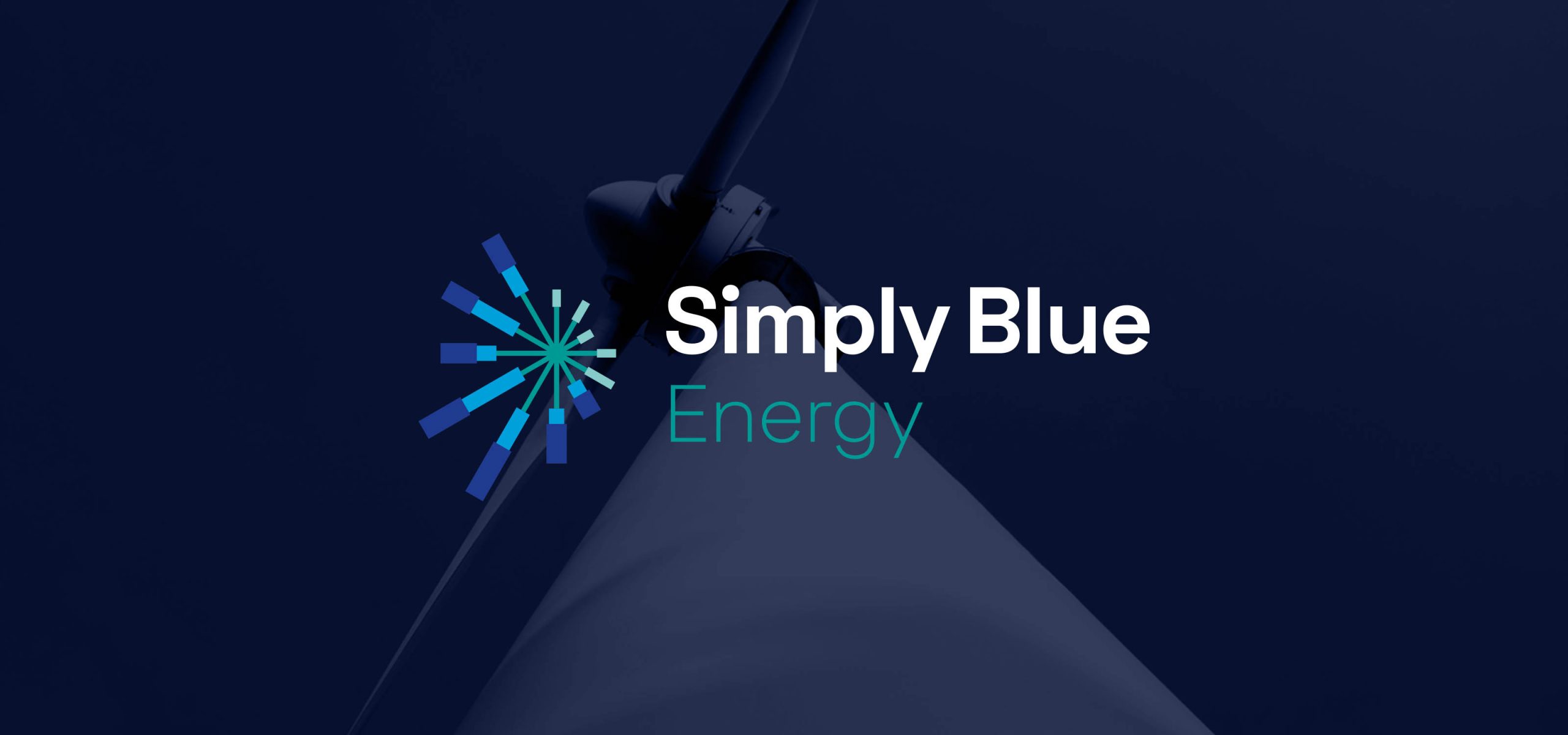
Commitment to Sustainability
As a blue economy project developer, Simply Blue aims to deliver long-term sustainable projects through floating wind and wave energy projects and by developing sites for sustainable aquaculture farms. Passionate about the immense potential of the oceans to provide renewable energy and sustainable aquaculture, Simply Blue’s mission is to raise the awareness of this potential while pioneering marine project development and collaborating with like-minded partners.
Focus on the Future
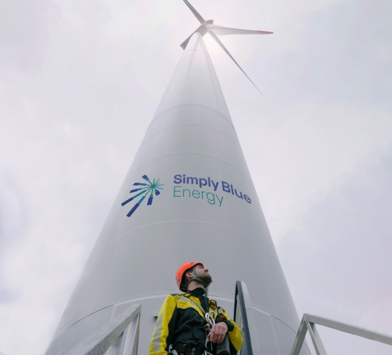
Simply Blue Energy, part of the Simply Blue group of companies, seeks to engage with coastal communities and support stepping-stone developments, to allow local supply chains to flourish, and to create skilled jobs in floating offshore wind projects.
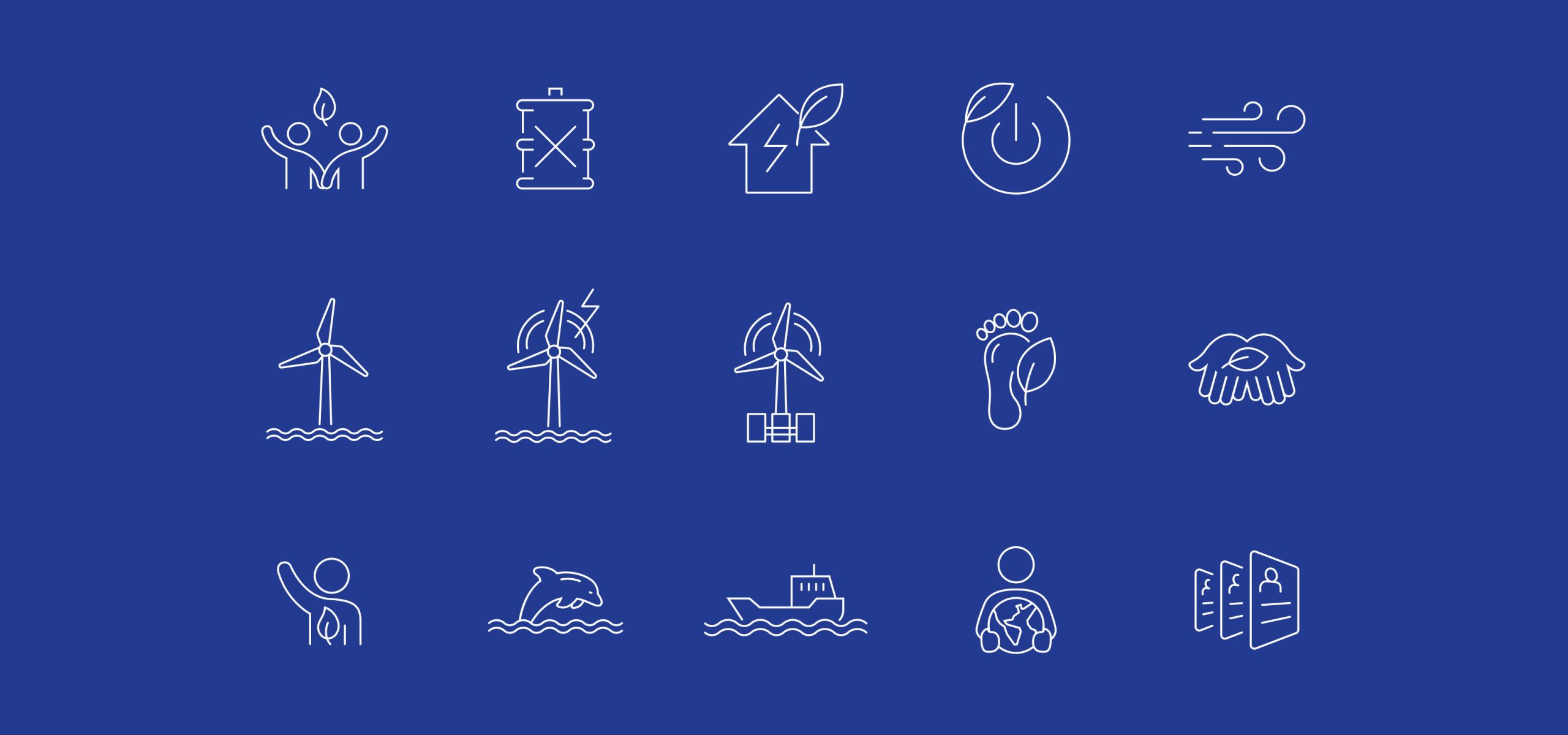
Brand Concept
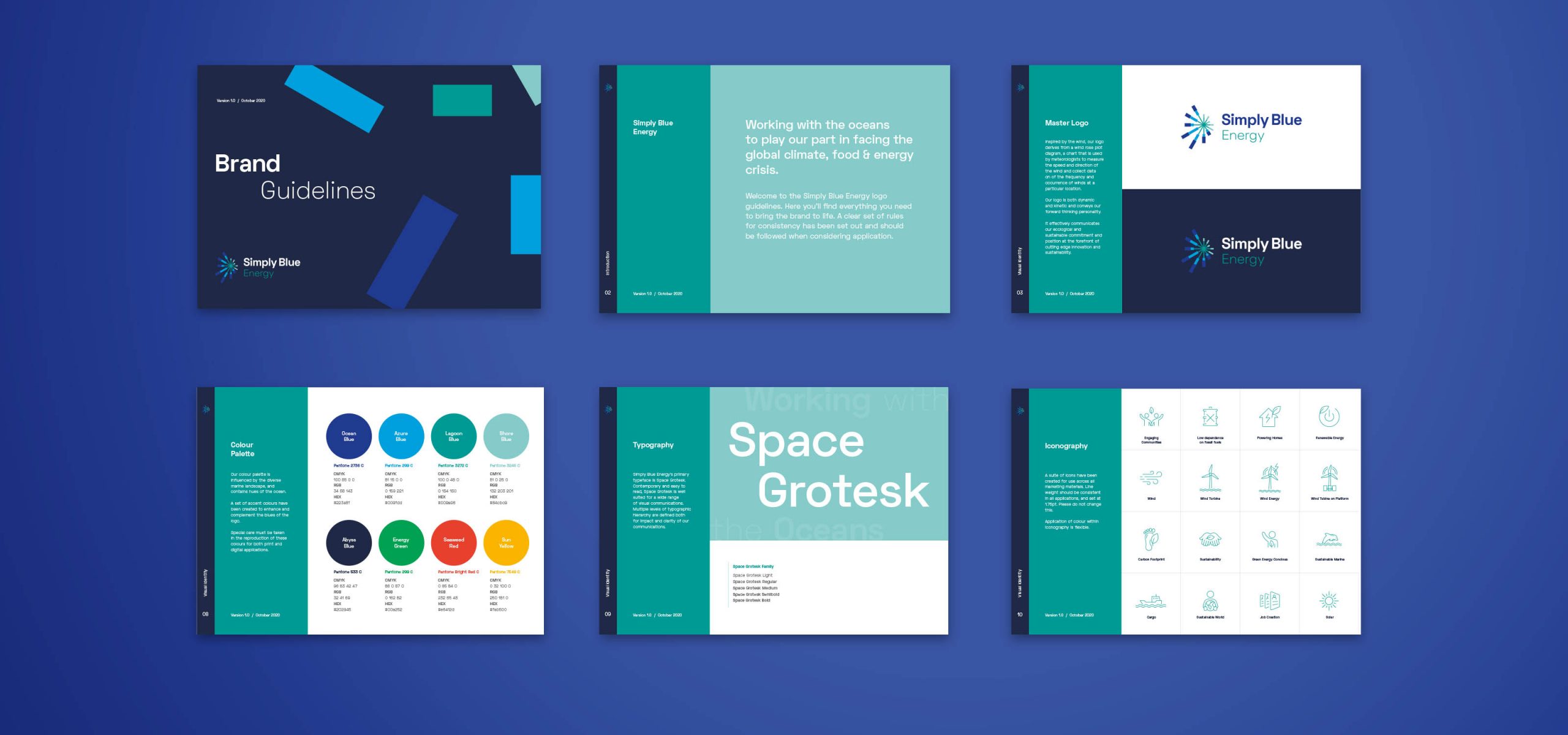
We presented a brand that was inspired by the wind, and takes inspiration from a wind rose plot, a chart that is used by meteorologists to measure the speed and direction of the wind at a particular location. This gave rise to a dynamic and kinetic symbol creating a simple and memorable identity.
Brand Application
A personable and humanistic feel is emphasised by use of a sans serif typeface, whilst the colour scheme brings to mind the diversity of the ocean and marine landscape. The addition of the tagline “Working with the Oceans” effectively communicates Simply Blue Energy’s ecological and sustainable commitment.
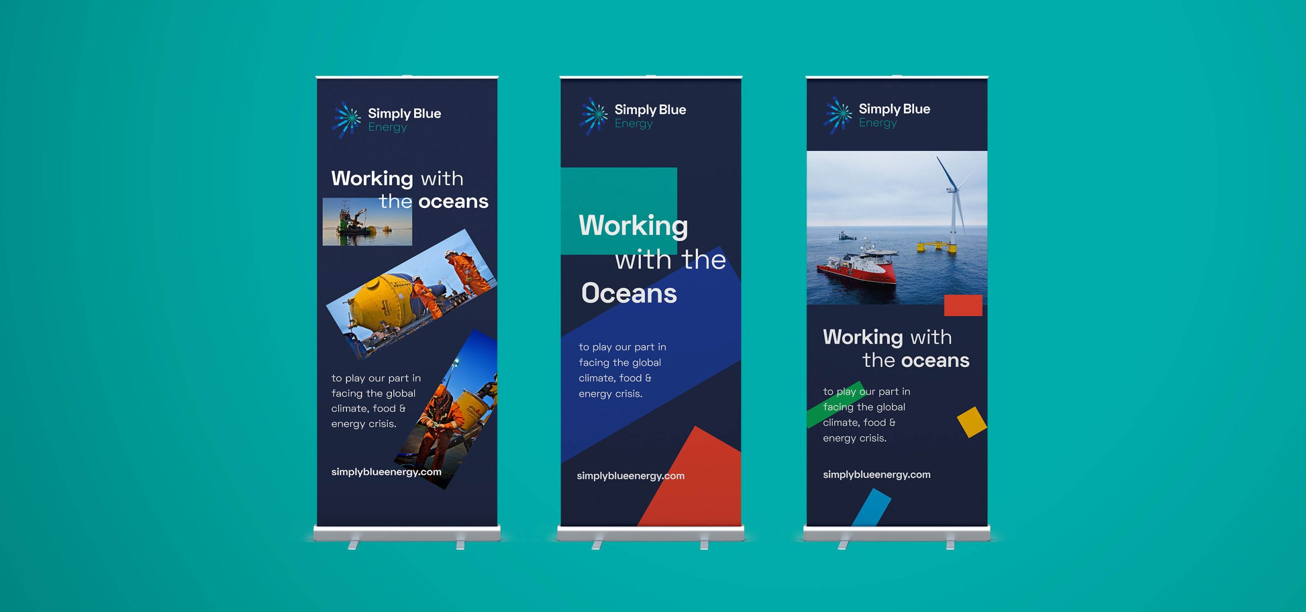
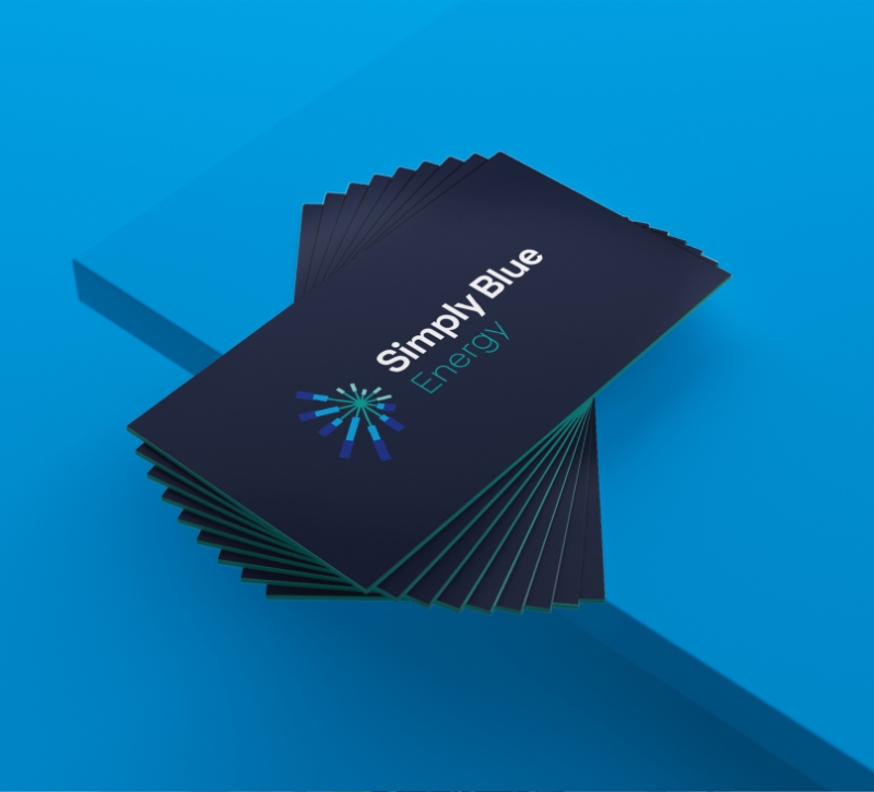
Brand Rollout
The brand was applied across a variety of marketing materials including website, video, Virtual Reality applications, exhibition design, presentations and professional stationery suite. A cohesive set of guidelines were created to ensure consistency across all brand communications
What the client had to say
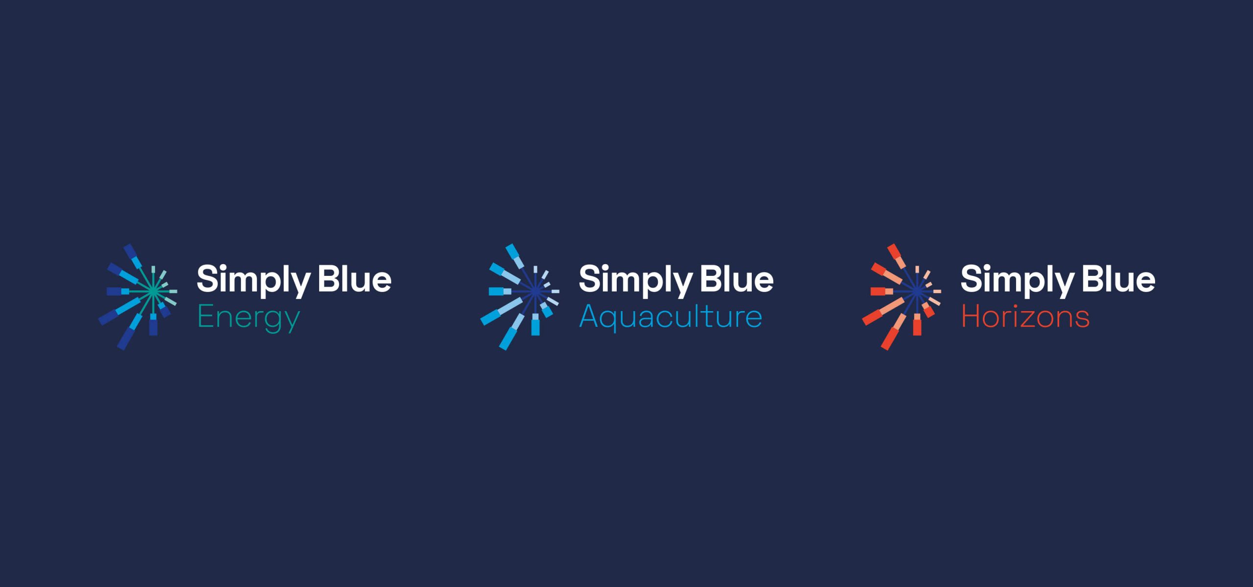
Idea have created a global brand for Simply Blue and more importantly an entire brand system that provides localised identities for our partner projects around the oceans of the world. They have also provided innovative communication and digital solutions for our international teams utilising VR, Video, Display and Digital comms.
Hugh Kelly, Co-founder,
Simply Blue Group
Simply Blue Group
Related Case Studies

Services
- Branding
- Photography
- Video
- OOH Advertising
Project Overview
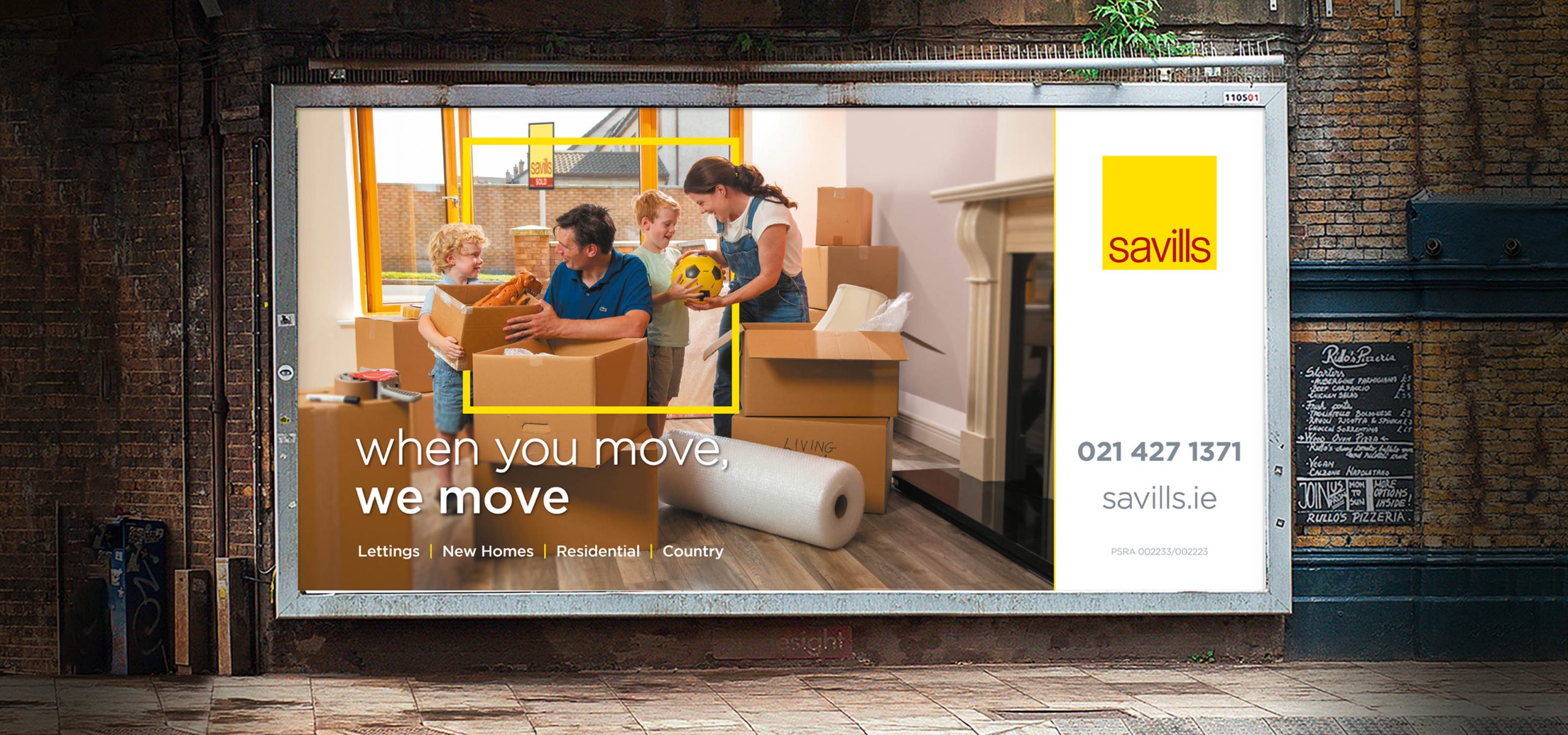
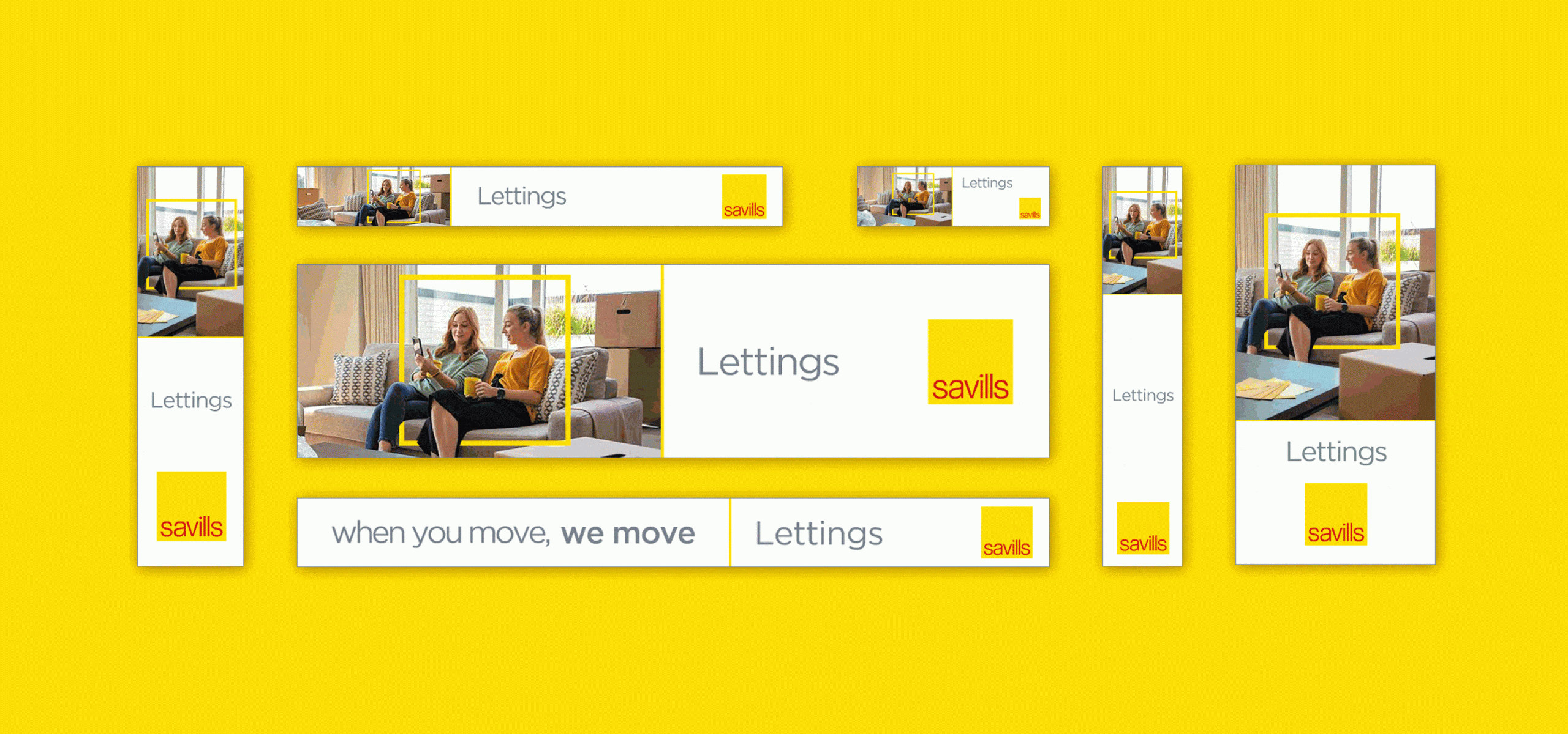
Savills Ireland, a full-service real estate advisory firm, has been a prominent player in the Irish property market for over 50 years. With offices in Dublin, Cork, and Belfast, Savills Ireland covers the entire country, including Northern Ireland. Despite not having many walk-in-branches nationwide, the firm has an excellent presence in Dublin, Cork, and Belfast. To reestablish themselves in the Irish residential market, Savills Ireland aimed to create a nationwide campaign highlighting their residential business.
Specialist Residential Teams
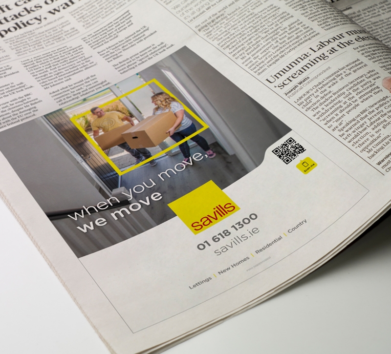
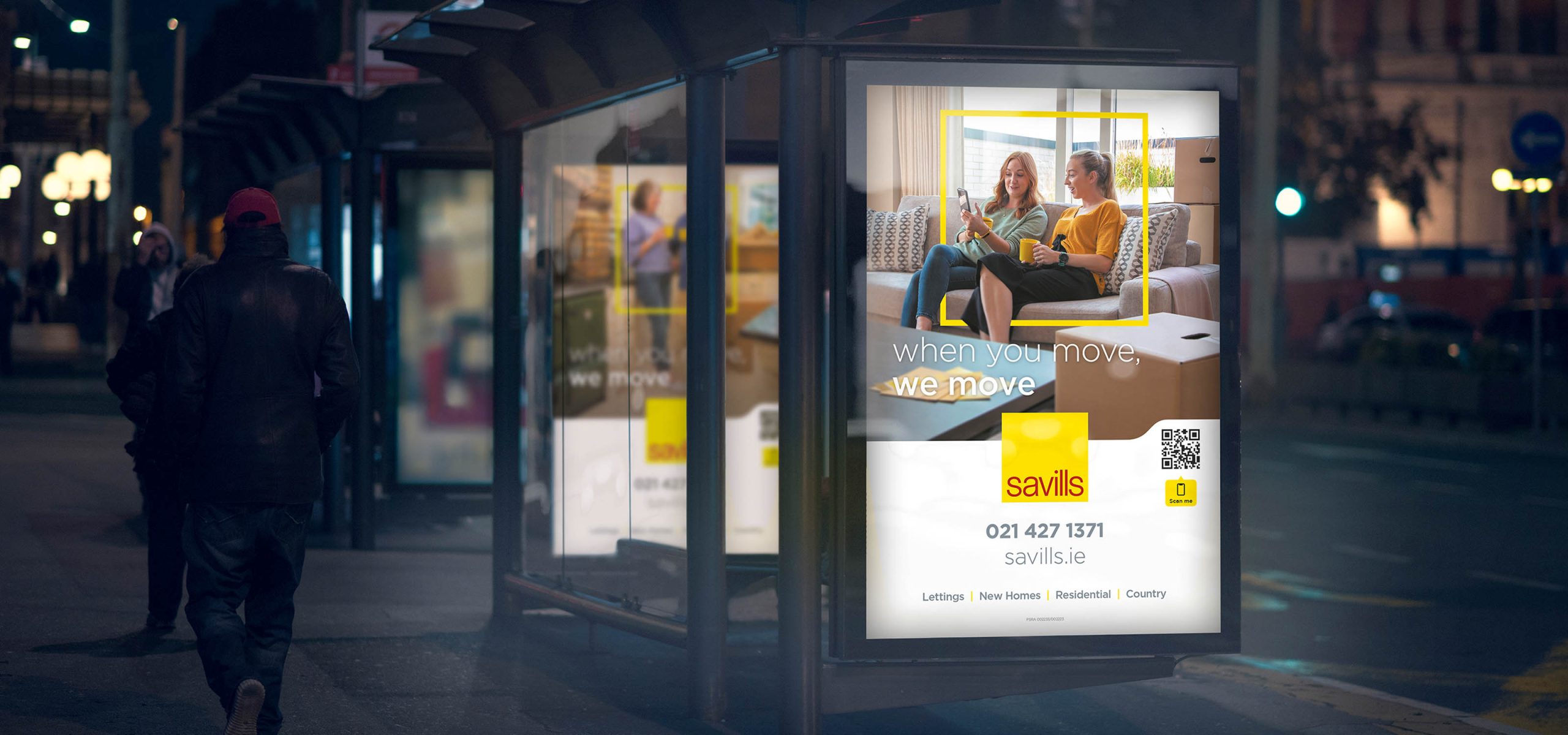
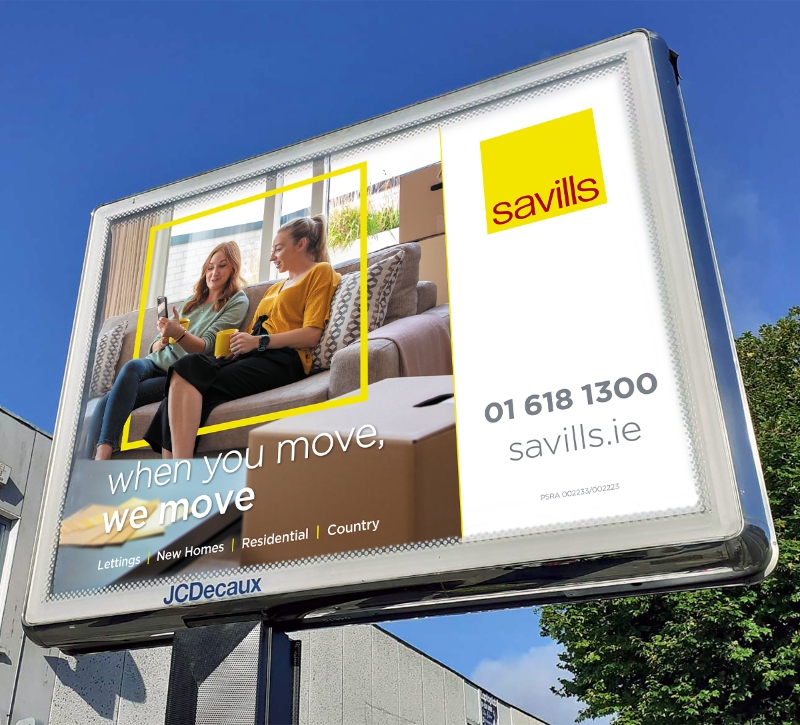
Savills specialist residential teams are there to help whenever you need to move. This could be to rent, sell or buy. We developed the overall concept ‘When you move, we move’, showing that Savills are always on hand when you need them. We selected a series of models that reflected the different audiences that Savills help with their life moves, couples, young families, friends and down-sizers.
Putting focus on the customer
Savills Ireland's advertising campaign utilised the device of the yellow outline (in the shape and proportions of the Savills logo) to focus on the customer(s) who are moving in each ad. This device created a visual connection between the brand and the customer, while the shape and proportions of the outline helped to make the ads instantly recognisable as belonging to the Savills Ireland brand.
Nationwide campaign
To reach a large audience, Savills Ireland ran a nationwide Out-of-Home (OOH) advertising campaign, including bus shelters, bus backs, and Metropole Ads. This allowed the campaign to reach a wide range of people in various locations across Ireland, making it a highly effective way to raise awareness of the brand and its residential business.
Multi-Channel Approach and Successful Campaign
In addition to the OOH campaign, Savills Ireland utilised video, social media, TV, and press advertising to reach a wider audience. This multi-channel approach allowed the campaign to reach people across various platforms and media, creating a cohesive and memorable campaign that resonated with audiences.
The campaign was hugely successful in raising awareness of Savills Ireland's residential business across Ireland, particularly in their key focus areas of Dublin, Cork, and Belfast. The campaign's success in raising awareness of the brand helped to solidify Savills Ireland's reputation as a prominent player in the Irish property market.
The campaign was hugely successful in raising awareness of Savills Ireland's residential business across Ireland, particularly in their key focus areas of Dublin, Cork, and Belfast. The campaign's success in raising awareness of the brand helped to solidify Savills Ireland's reputation as a prominent player in the Irish property market.
Related Case Studies
Services
- Marketing Collateral
- Exhibition Display
- On-Site Map
- Video experiences
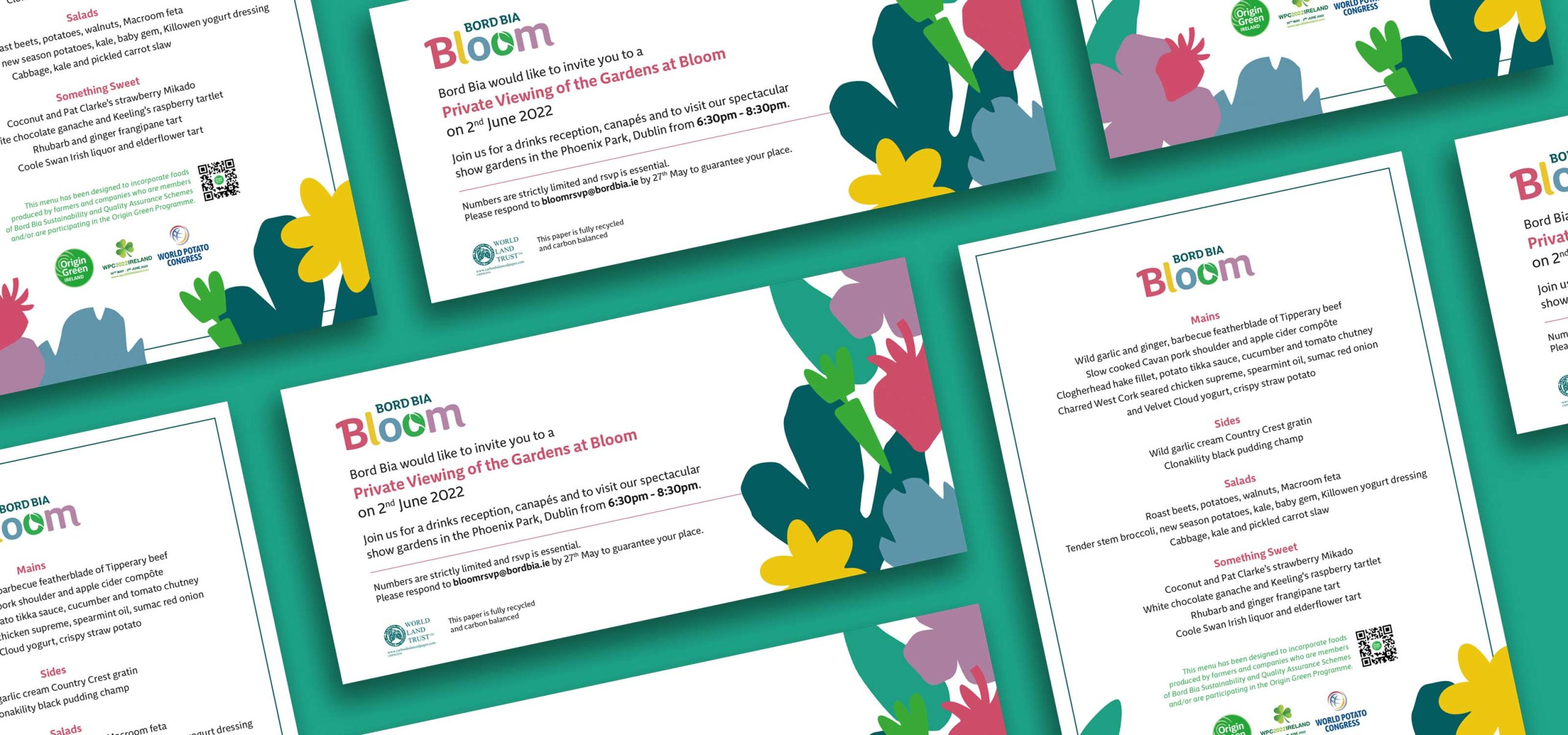
Project Overview
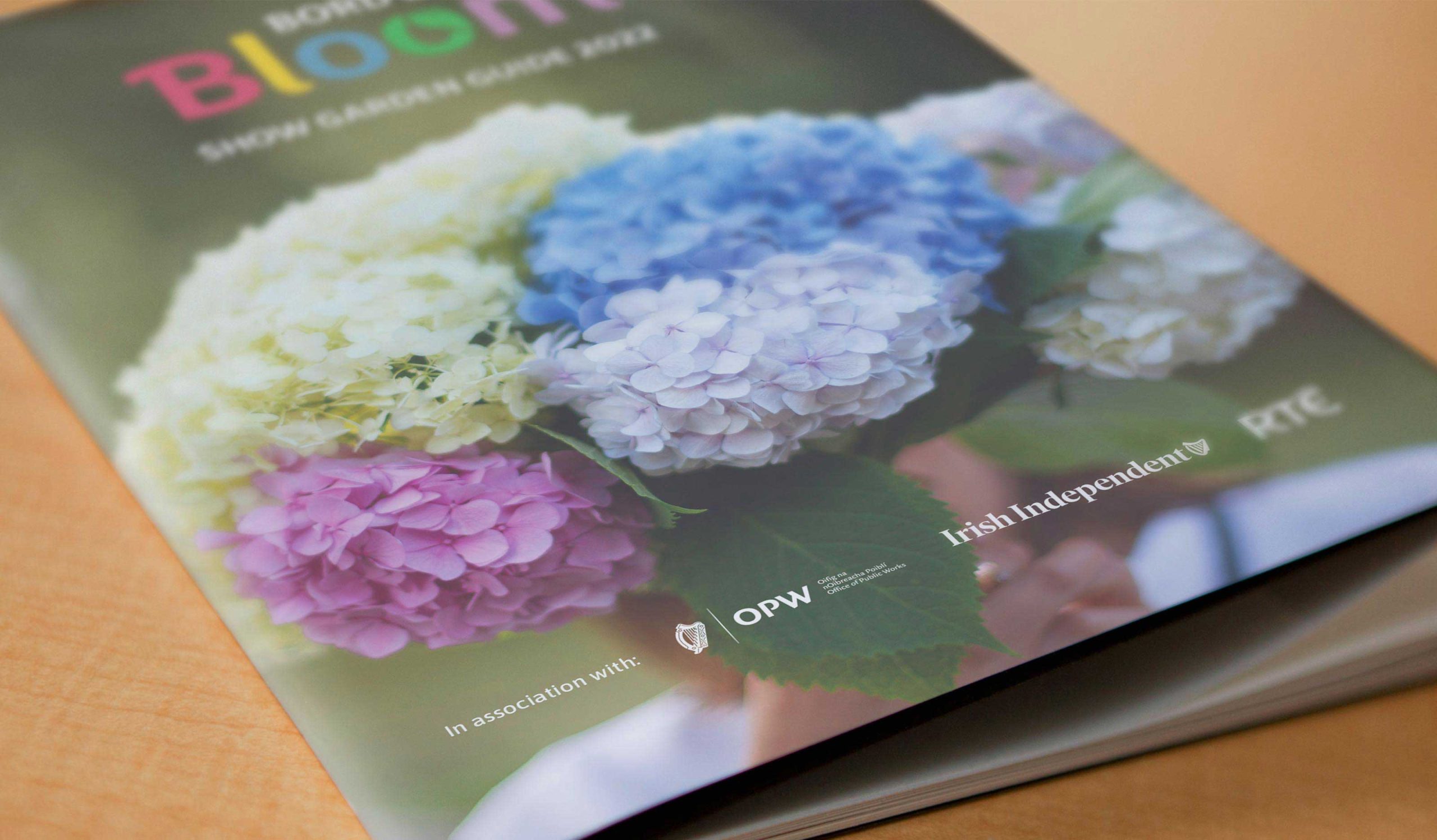
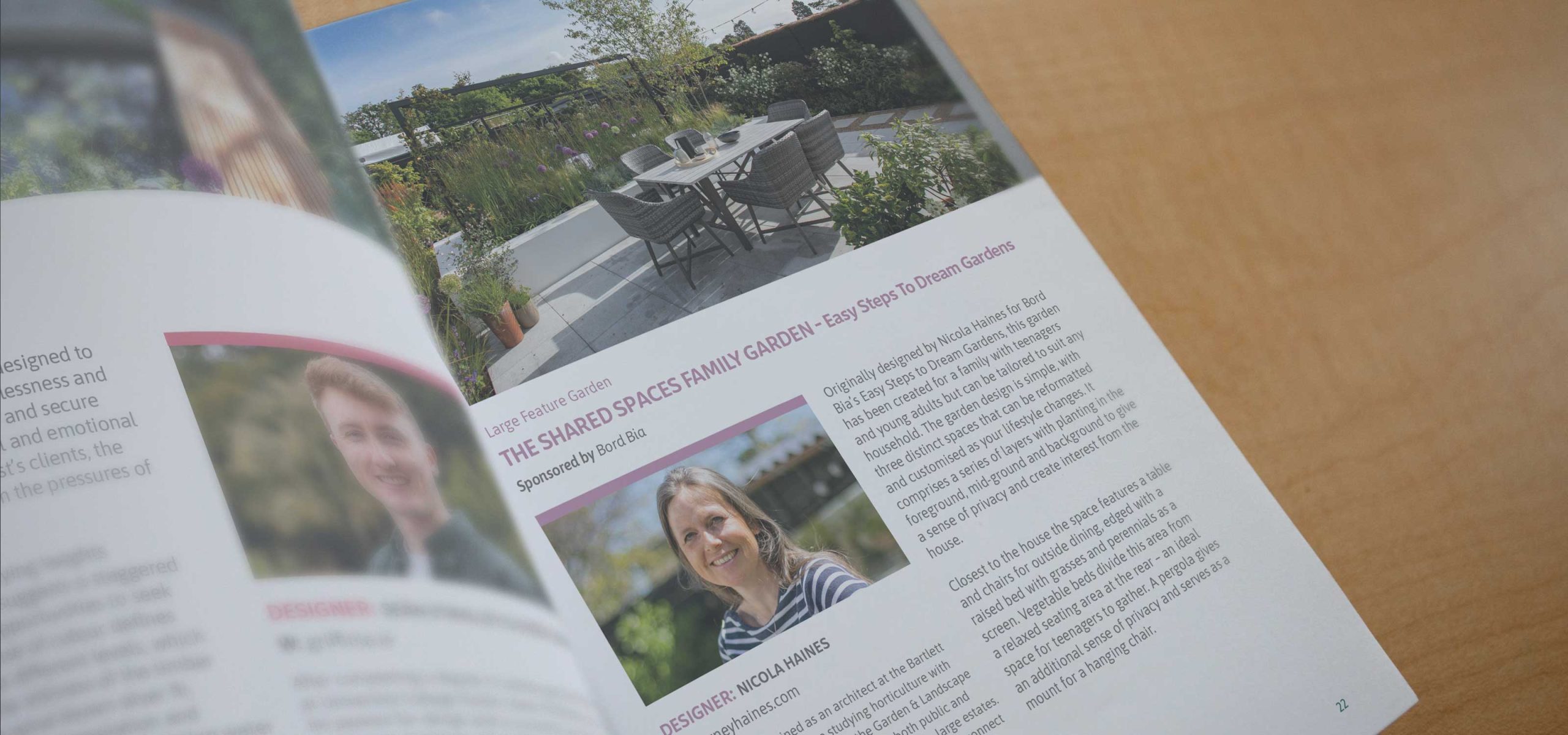
Idea created the name and original brand for this hugely successful annual event and we have worked with the team in Bord Bia on an annual basis for the last 13 years developing advertising concepts, illustrations, radio ads, brochure, exhibition stands, websites and on and off-line marketing collateral. This year we were delighted to create a beautifully illustrated guide to Bloom along with the showgarden guide and exhibition displays for Teagasc and many others.
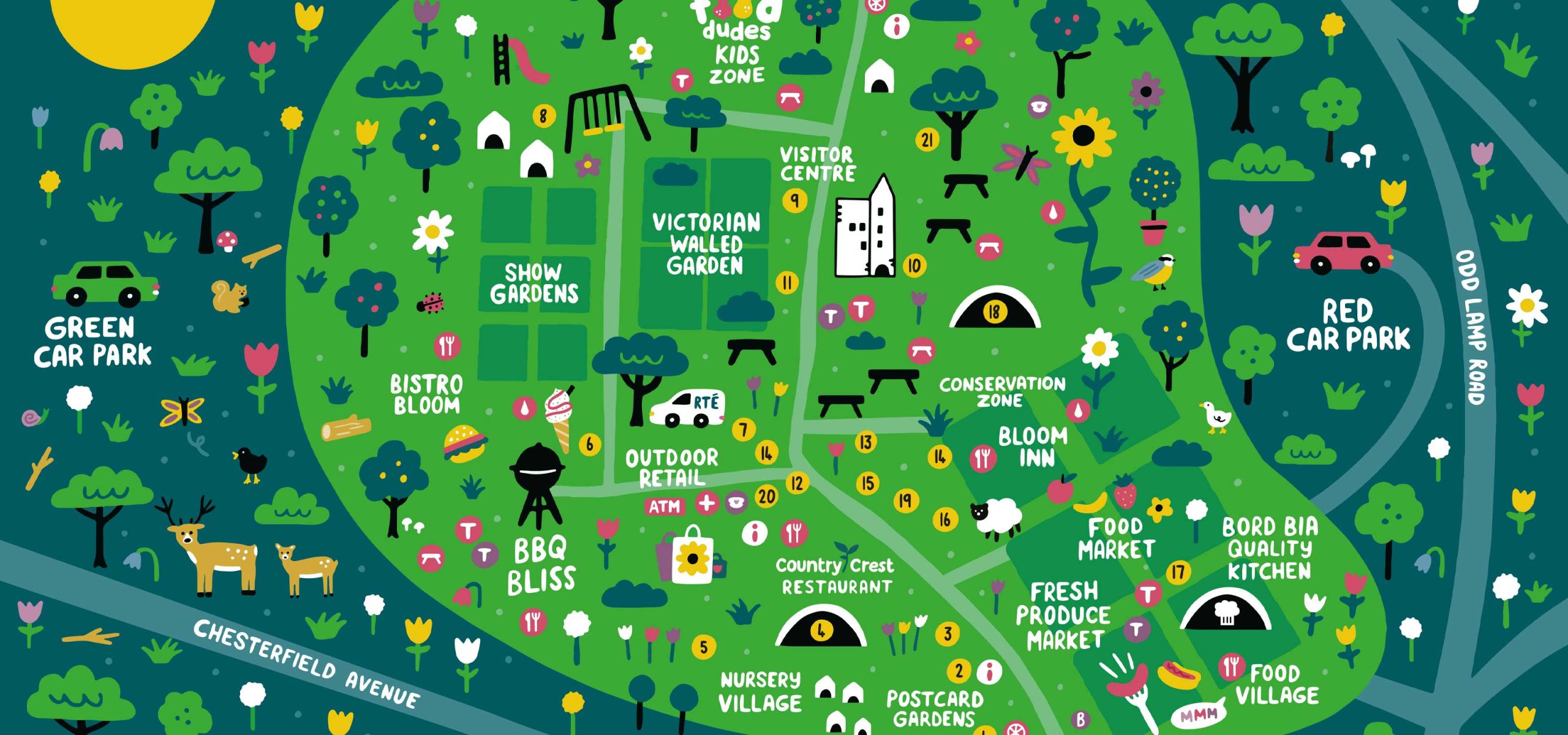
Bespoke Illustration
This year we worked with the Bord Bia team to do something a little different on site and created a bespoke illustration which captured the essence of Bloom. Colourful, fun and jam packed with amazing things to do for all the family it was a pleasure to work with the Bord Bia team and the talented illustrator Aoife Dooley to create this map which was printed large format at Bloom and also distributed along with a schedule of fantastic events happening each day.
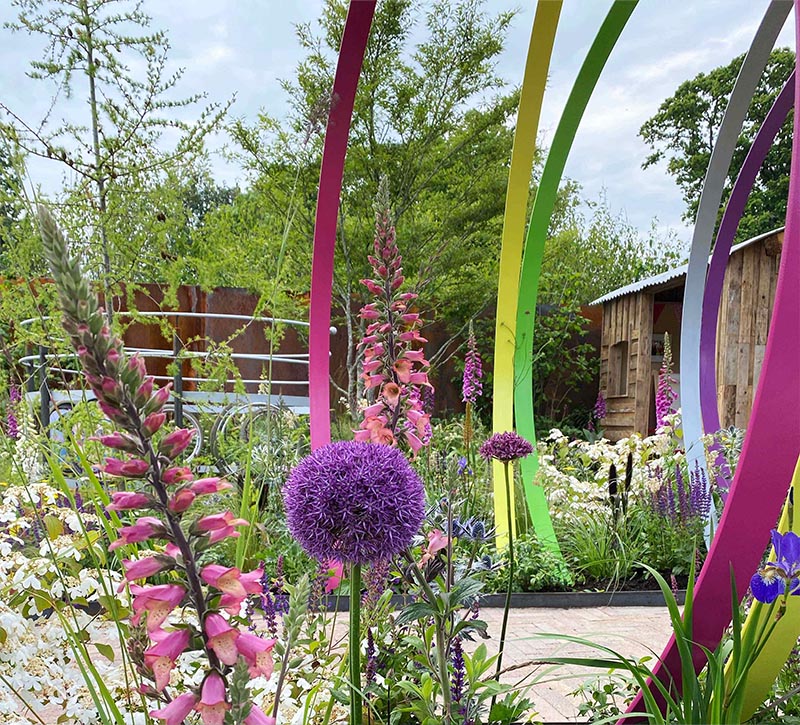
Showgarden Guide
Every year we create a show garden guide which displays each of the stunning showgardens displayed in Bloom. This 40 page guide helps those at the event navigate the extensive gardens whilst also giving some background to each of the showgardens, their designers and a sneak peak of what the gardens will look like. It’s always a race against time for the designers who are finishing the gardens, the photographers trying to capture the shots and ourselves, waiting to piece it all together into a user friendly guide!
Healthy People, Healthy Planet
In 2022 we developed the concept for The Teagasc horticulture exhibit ‘Healthy People, Healthy Planet’. A fantastic exhibit that set out to inspire people and create awareness about Irish plants, fruits and vegetables and their positive impact on personal health and environment.
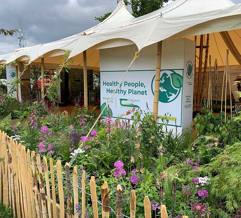
AV experience
Through a series of 6 impactful videos which we played on super sized full screens and displays we championed each of their specialist areas. Everything from the back to nature bamboo stands to the marketing collateral and full AV experience had to be carefully considered and delivered in this amazing tented exhibition space.
Bord Bia Food Garden
We also developed the Bord Bia Food Garden exhibition space (both exterior and interior) to show the various ways Irish Fruit and Veg can be used. This included a demonstration kitchen where different recipes were prepared as well as design of the visual space, recipe boards and the creation of a campaign video.
EU Promotions
We also created the Exhibition Boards Showcasing the fruit and vegetable promotions throughout Europe. We supported this with a suite of merchandise which was distributed throughout Bloom.
Potato Promotion
A separate area that Idea were commissioned to help promote the potato was created at the same time as Bloom, delegates were brought to a space in advance of visiting Bloom to educate them about potato varieties, uses and health benefits.
Related Case Studies

Services
- Brand Strategy
- Branding
- Exhibition Design
- Video
- Design
- Advertising
Project Overview
Barretstown is a not-for-profit camp for children with cancer and other serious illnesses, founded by Hollywood actor Paul Newman. Idea have been working to build their brand and communication through their internal programmes and public campaigns.
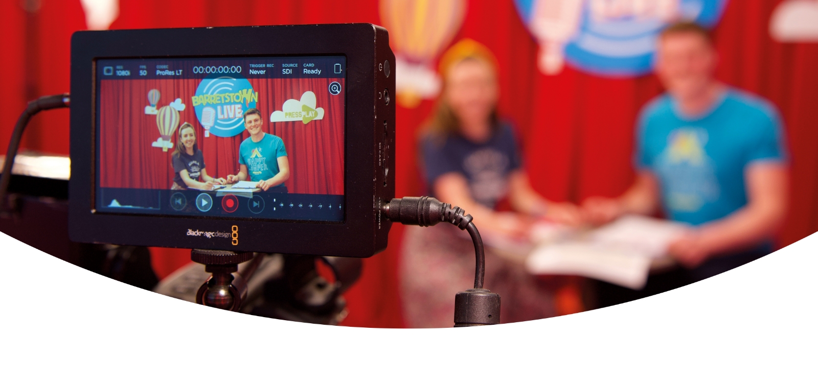
Barretstown Live
Idea worked with Barretstown to continue their programmes even through the COVID 19 lockdowns. We developed the brand Barretstown Live, designed a TV studio on-site and developed activity packs that were delivered to the children who would otherwise be at camp directly to their home or hospital. This virtual programme was a lifeline for many critically ill children during COVID 19.
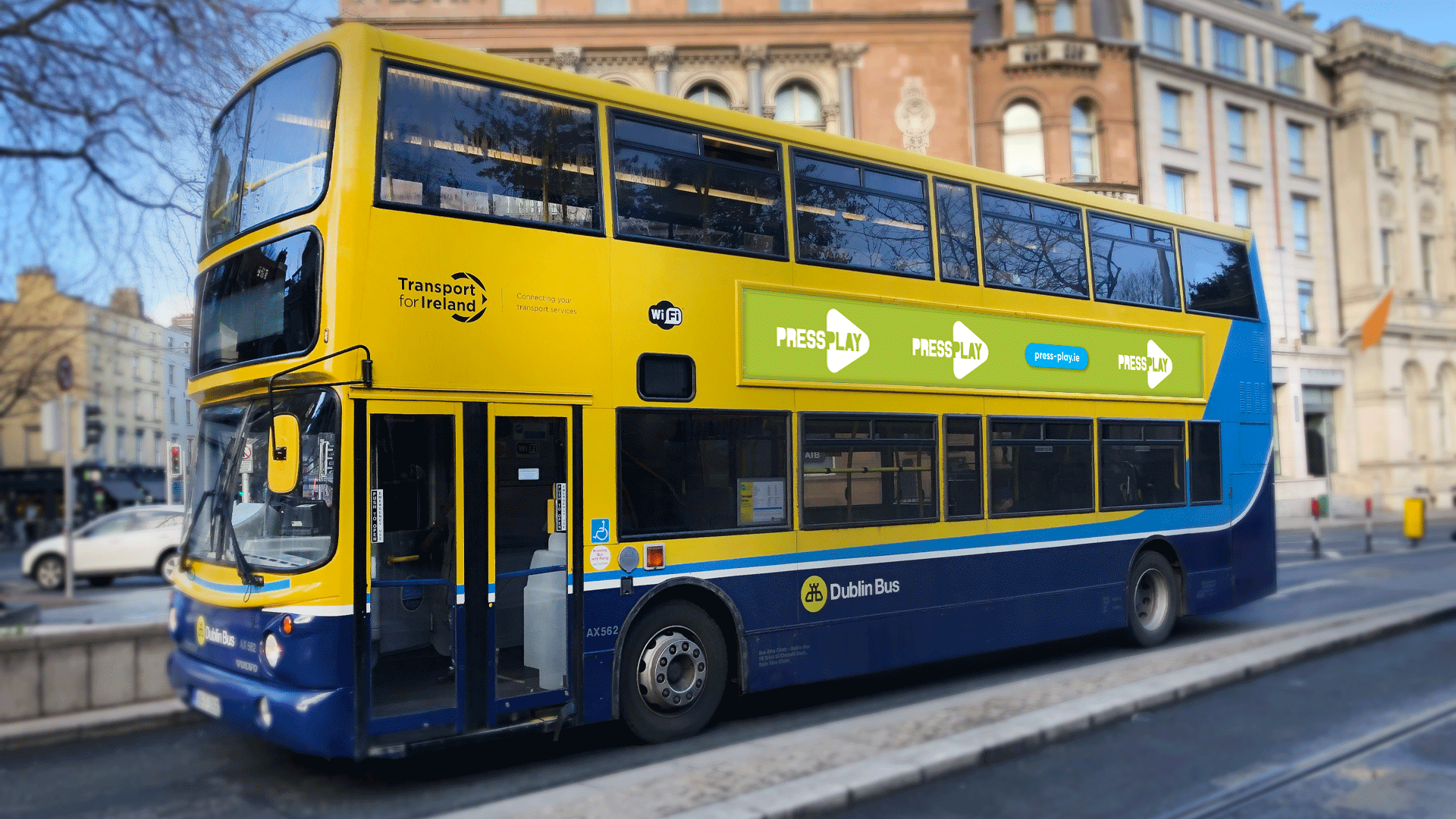
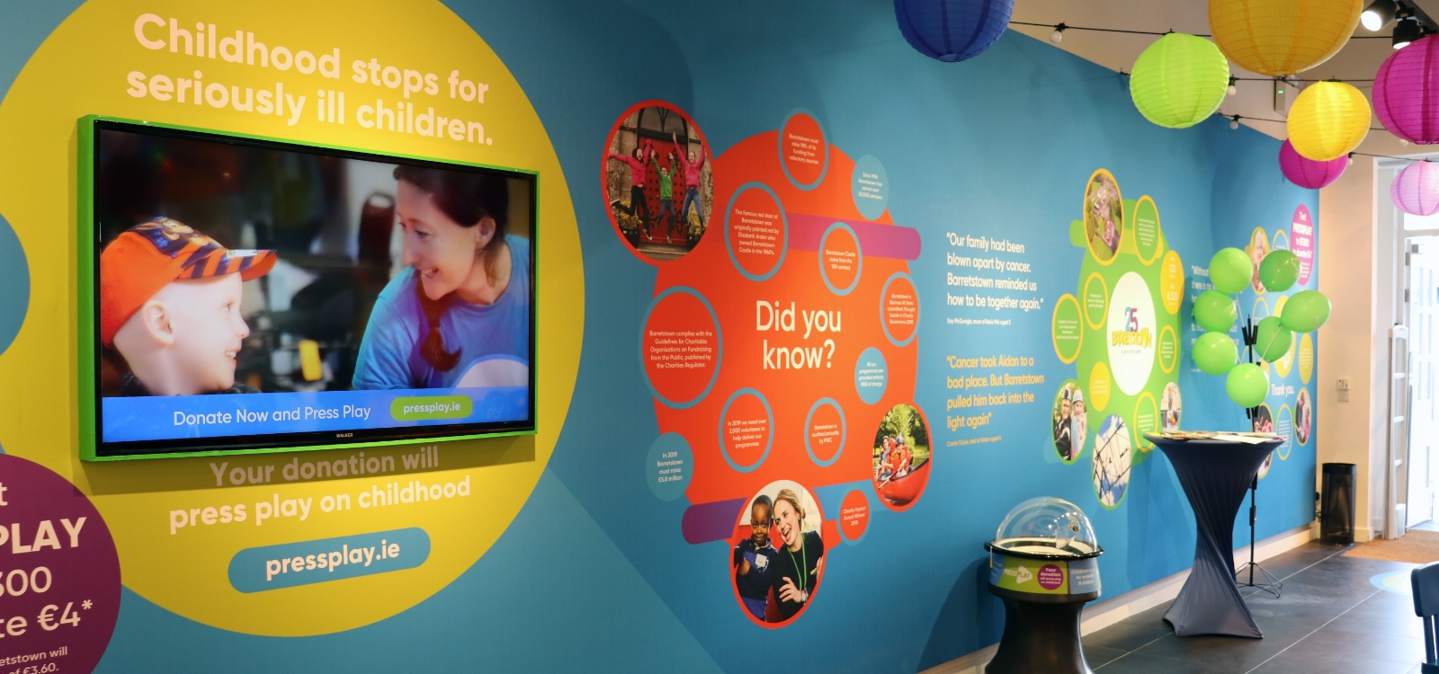
Nationwide Campaign
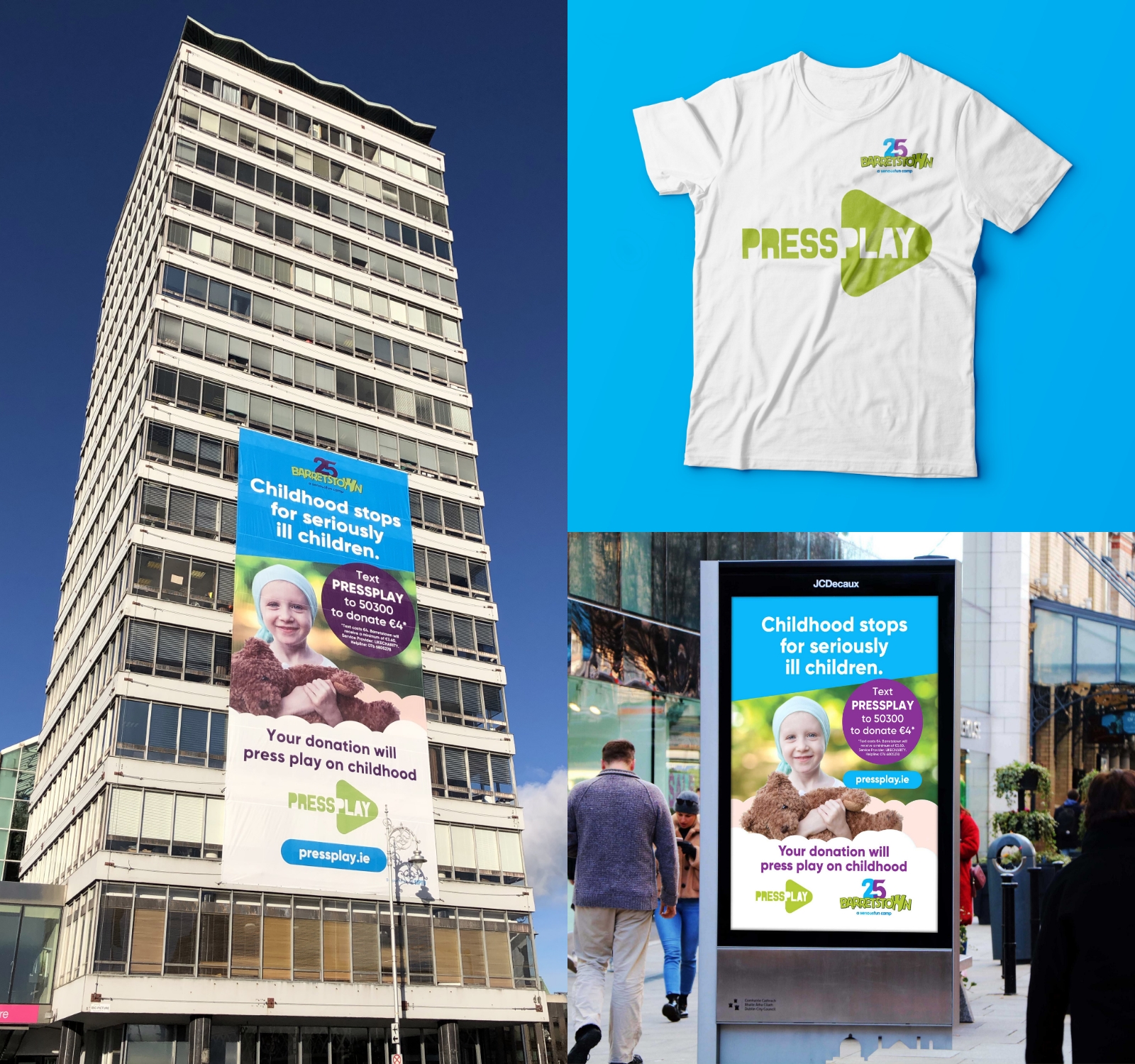
We developed a nationwide campaign called ‘Press Play’, which included TV, Radio and outdoor advertising campaigns as part of Barretstown’s 25th Anniversary campaign.
Through this campaign we showcased how Barretstown changes lives. Childhood stops for seriously ill children, but Barretstown exists to Press Play again on their childhood. We developed a nationwide campaign titled ‘Press Play’ for both the Teaser and Reveal campaigns, this included outdoor media, radio, website, video, TV ad and launch collateral which formed part of Barretstown’s 25th Anniversary campaign. We took the campaign to new heights – with the ‘Press Play’ campaign being displayed on Liberty Hall on Dublin’s Quays.
In the month following the reveal, online donations were up 252% compared to the same period in the previous year, and the number of people signing up to a monthly donation was up 1533%.
An incredible result for an excellent cause!
2021 Annual Report
Idea have designed the Barretstown Annual Report for a number of years including the Award Nominated 2021 Annual Report.
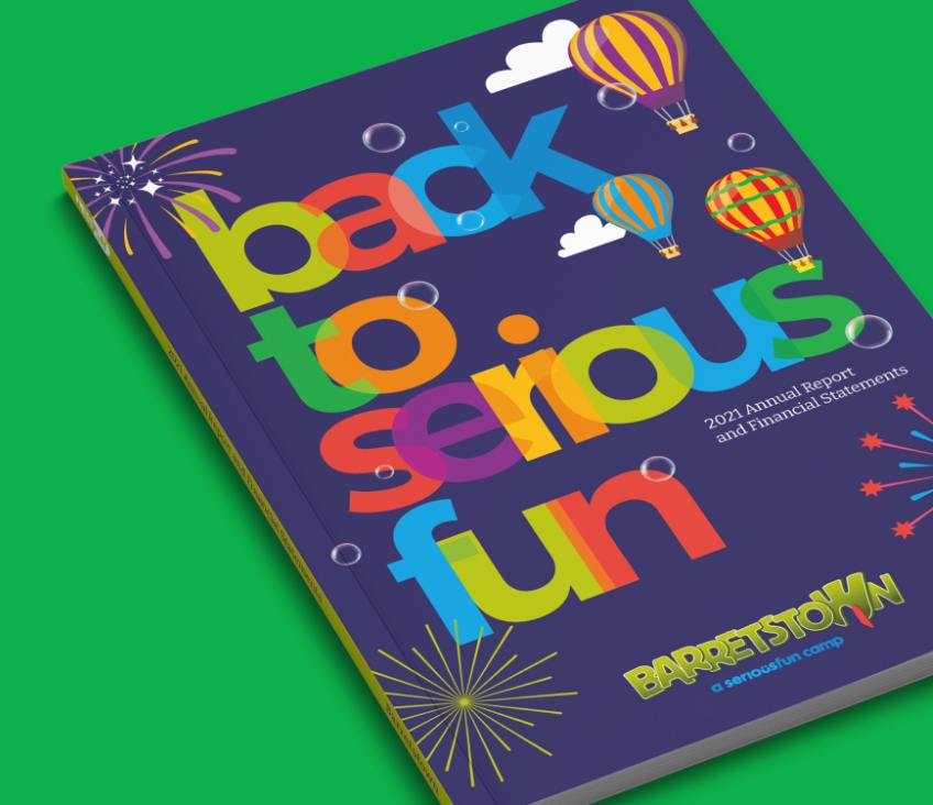
Back to Serious Fun
With the theme of ‘back to serious fun’ as our starting point for the 2021 report, we created a design that was focused on the children that Barretstown helps, telling their stories and communicating the key investor information in a clear way whilst using a vibrant colour palette throughout.
The report is punctuated with bold splashes of colour. All inspired by the ‘Back to Serious Fun’ visual on the front cover, we took elements of this and used it as a graphic device for shapes and backgrounds throughout the report to introduce some ‘serious fun’, what Barretstown does best.
Photography is a hugely important part of Barretstown’s brand. In conjunction with the vibrant colour palette used we also approached how the photography should be used in an impactful way. It is largely through the photography that we can depict what a fun and meaningful experience Barretstown can be to these critically ill children. We were delighted that the Barretstown Annual Report was nominated for two awards, the IDI design award and the published accounts award.
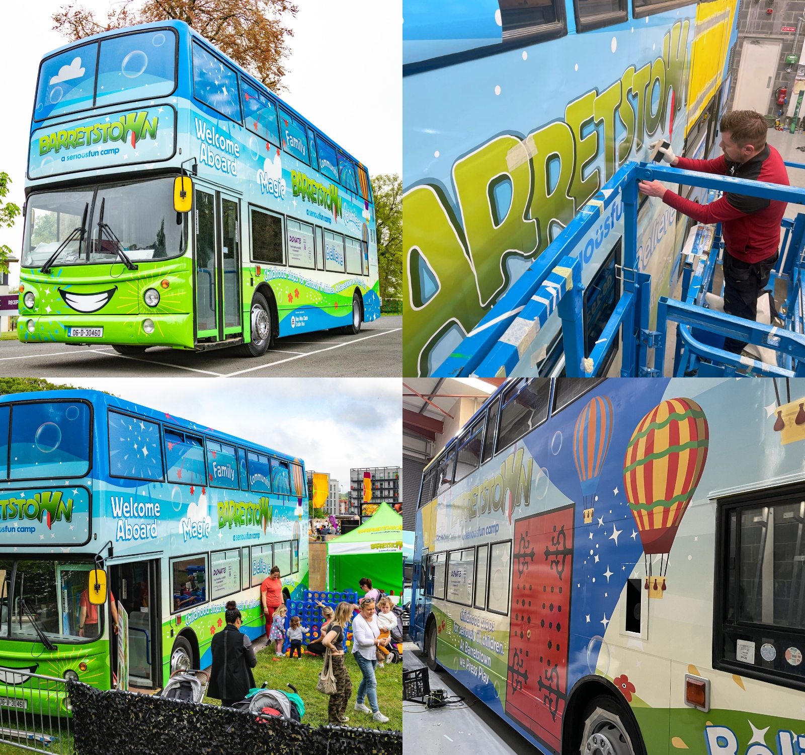
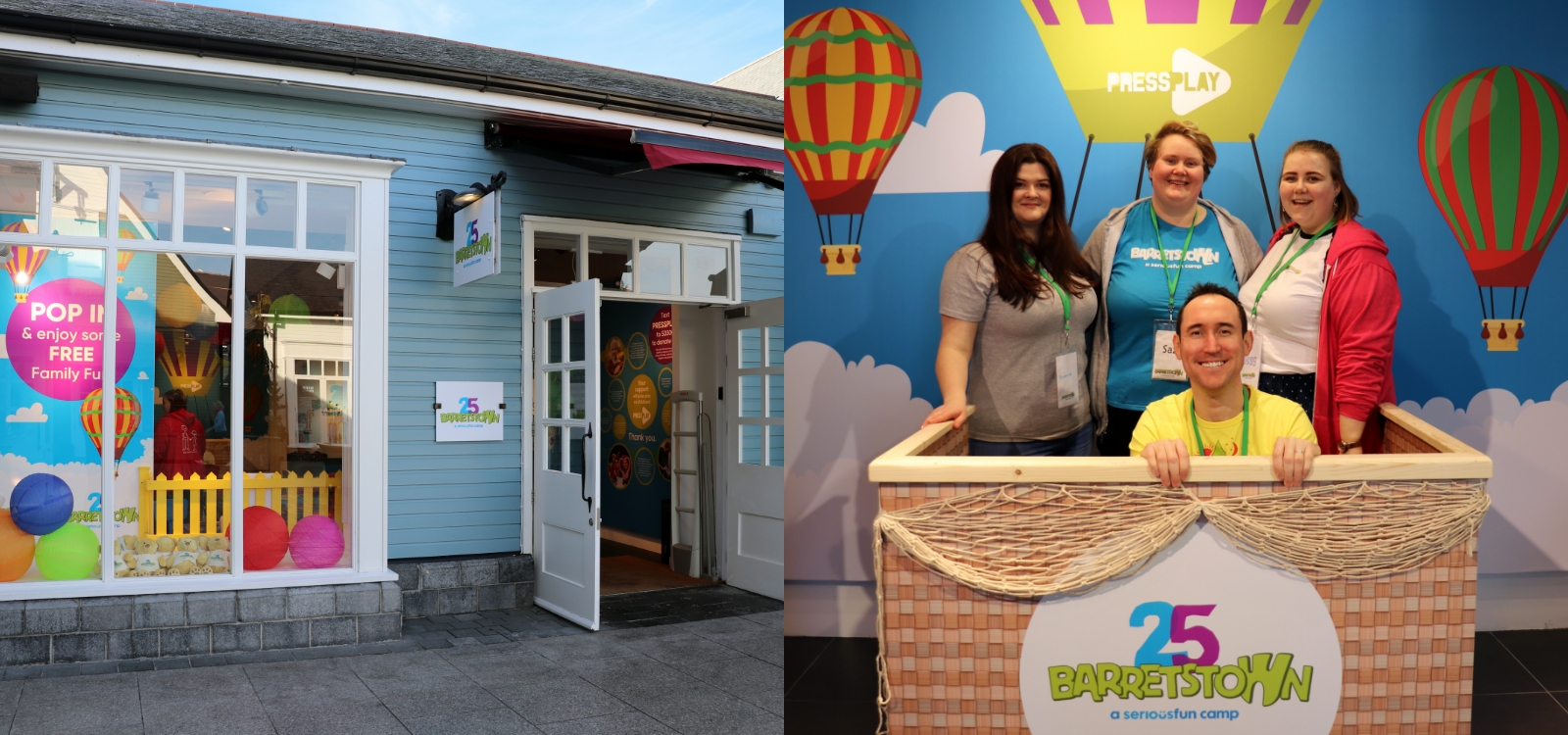
Bringing the Brand on Tour
Idea have also developed a number of innovative ways that Barretstown can bring their message and brand to large events including the design and development of the Barretstown Bus which is used to visit festivals throughout Ireland and a pop up shop which has appeared in both Grafton Street and Kildare Village.
What the client had to say
Idea have been a valued partner of ours for a number of years, they have worked with us on everything from our annual reports to designs for major events, and even double decker bus designs! Projects are always approached with enthusiasm and creativity by the Idea team. They are a pleasure to work with.
Karen Reid, Marketing Director,
Barretstown
Barretstown
Related Case Studies


Services
- Print Design
- Digital Design
- Landing Page
Project Overview
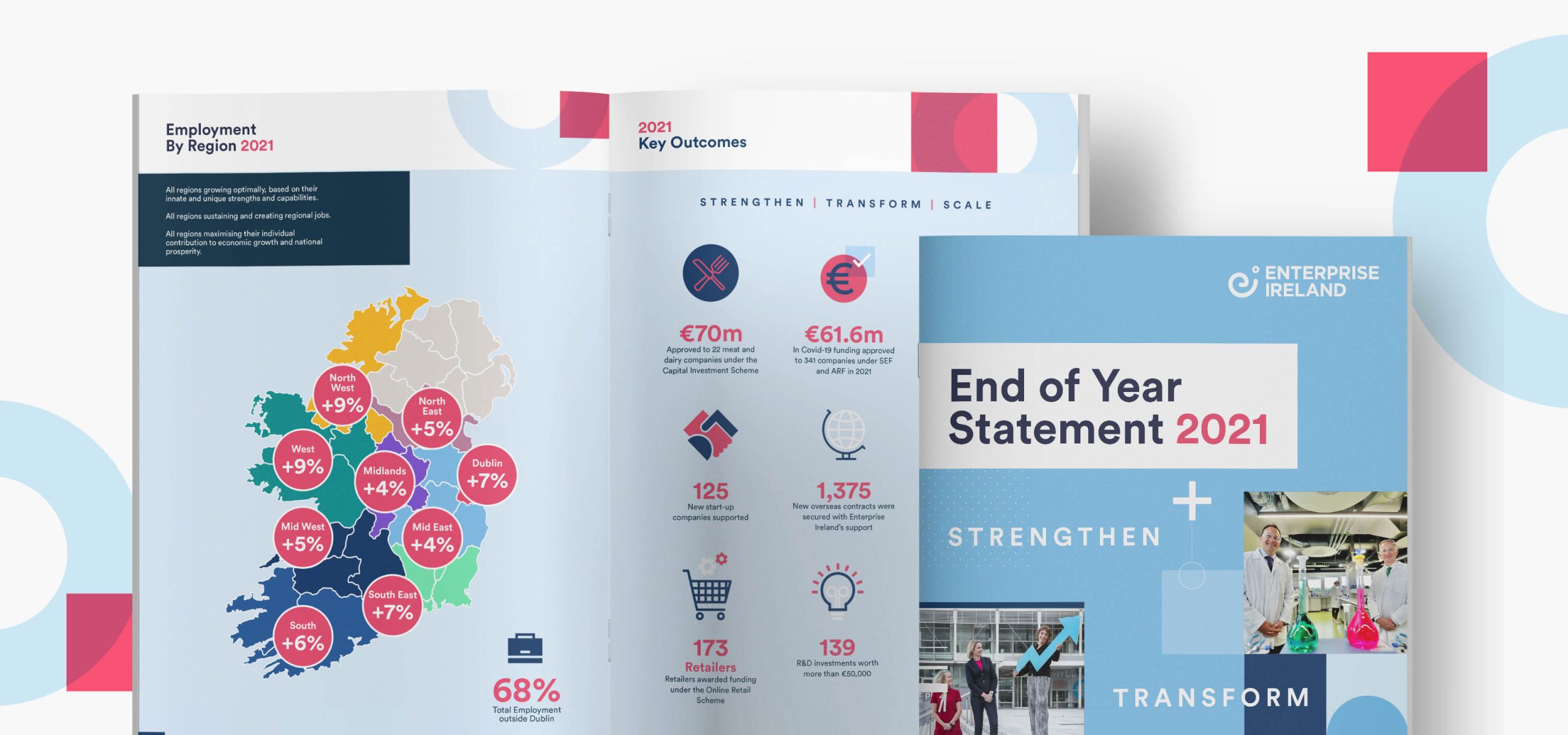
Enterprise Ireland (EI) is the government organisation responsible for the development and growth of Irish enterprises in world markets.
Idea partner with teams across EI in developing on and off-line communications to support Irish companies on their export focussed journeys.
Idea partner with teams across EI in developing on and off-line communications to support Irish companies on their export focussed journeys.
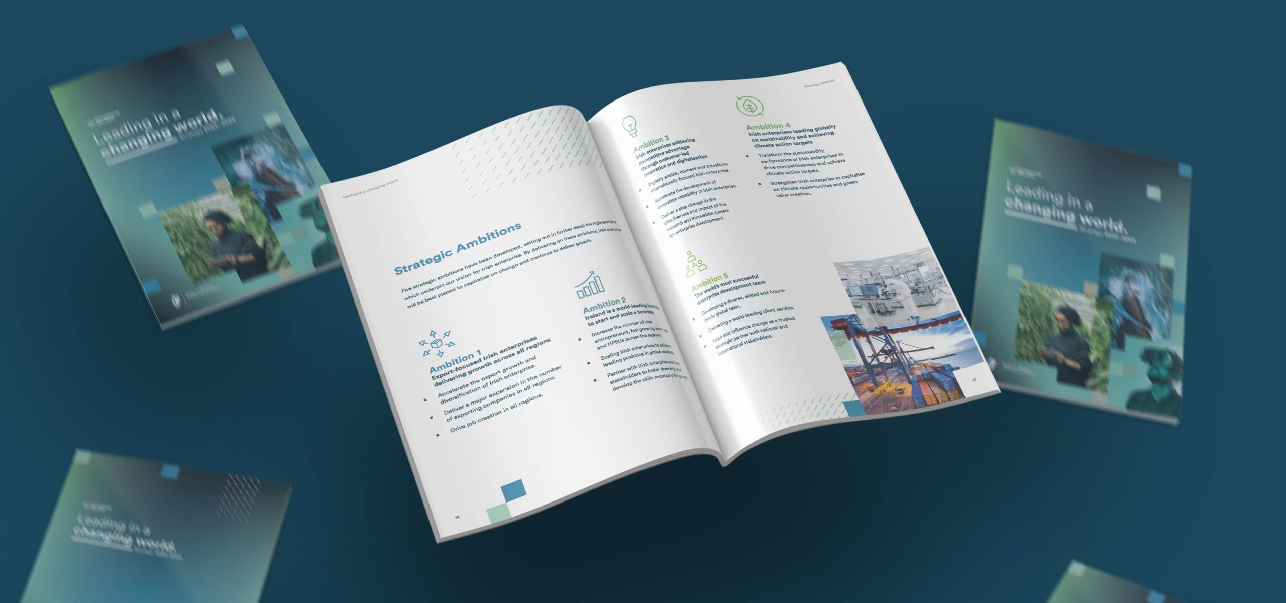
Leading in a Changing World
Launch of the EI Strategy 2022-2024. Design of both the physical print brochure and coordination of consistent iconography and imagery with the EI team for a bespoke landing page.

Cybersecurity
Bespoke infographics, Imagery and assets for use in both on and off-line communications - promoting knowledge sharing, Event Attendance and Client Company Directories and Expertise across Cybersecurity solutions.
HPSU (High-performing Start-up Unit)
The Enterprise Ireland HPSU programme supports and assists those companies identified as having significant export focussed opportunity. The programme assist with funding, training, mentorship and market knowledge and unifies it’s communications with a bespoke palette across all touchpoints.
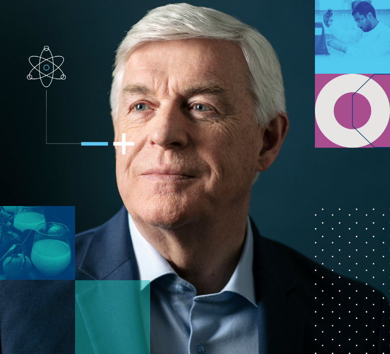
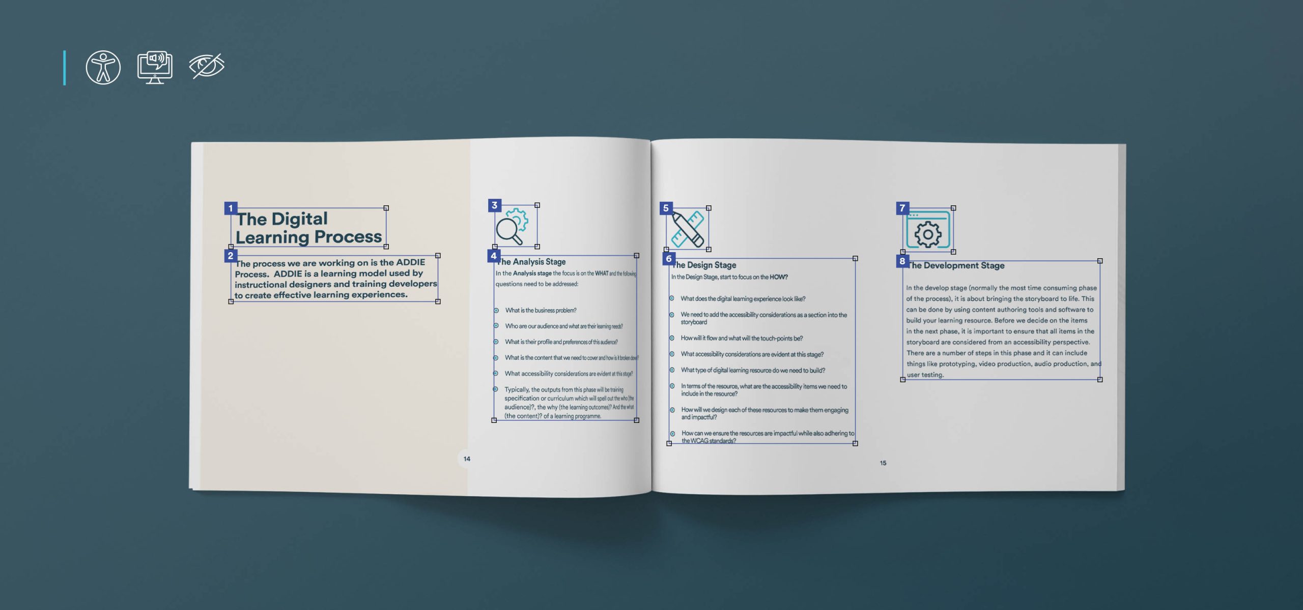
Digital Learning Playbook
Enterprise Irelands Client Management and Skills Department (CMD) provides tailored leadership and development programmes to inspire business leaders to have the ambition and skills to grow their business globally.
One such programme is the “Digital Learning Playbook”, devised with leading digital learning providers to assist management and their teams provide best in class programmes for team training and advancement.
One such programme is the “Digital Learning Playbook”, devised with leading digital learning providers to assist management and their teams provide best in class programmes for team training and advancement.
Related Case Studies
Services
- Brand Audit
- Digital Strategy
- Web Design & Development
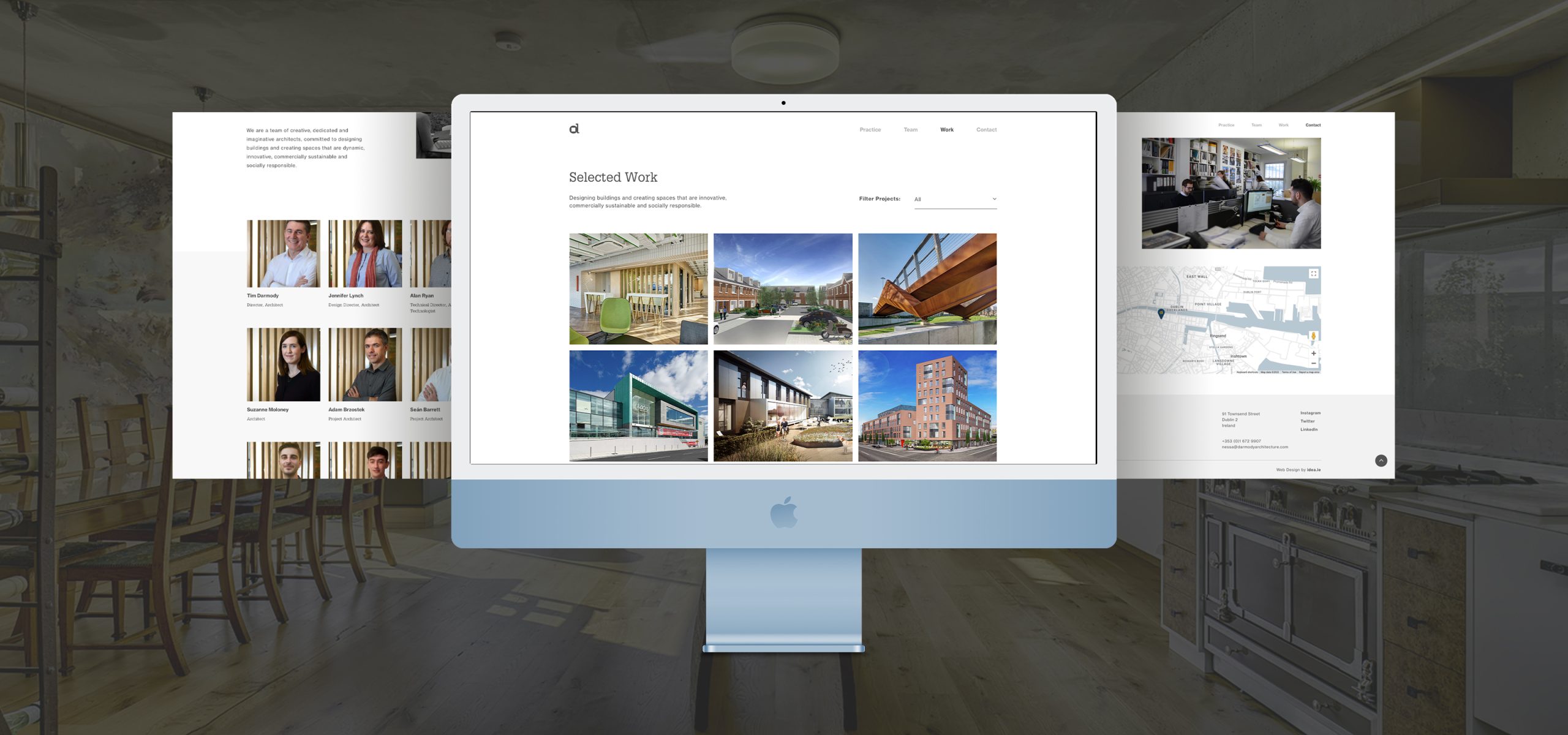
Project Overview
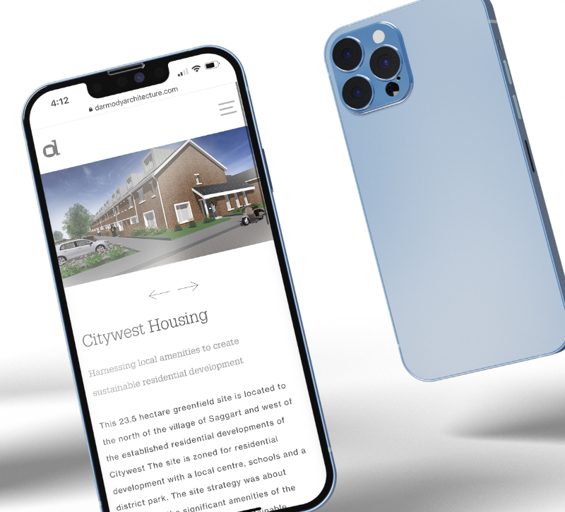
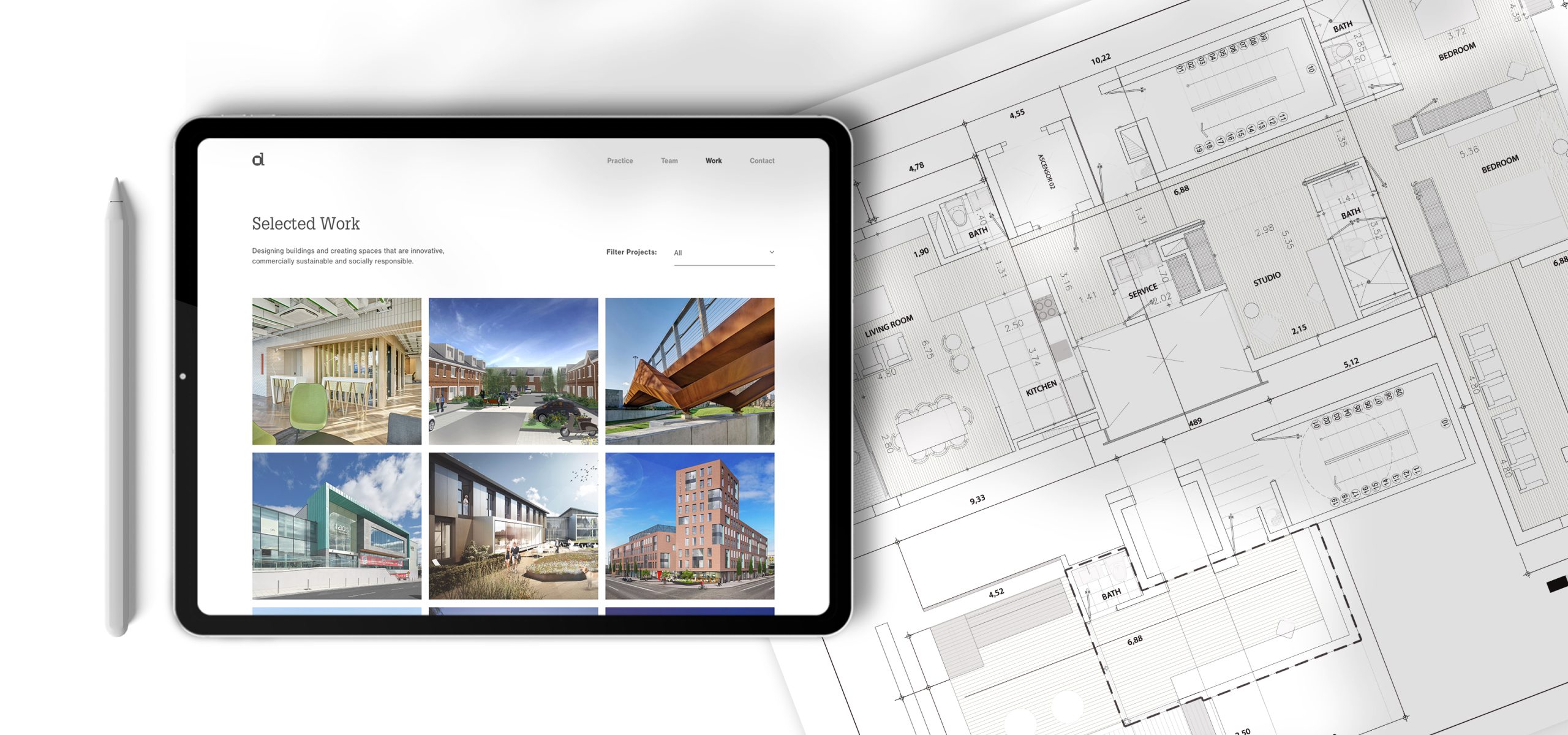
During an overall review of Darmody’s communications in 2020 it was felt that, although the majority of its brand assets were on brand and to a high standard, the current website did not reflect the practice’s current position or showcase its extensive experience in a variety of sectors. Our senior Creative Consultant, Nick Cloake had worked with Darmody for over a decade and was responsible for the development of the brand and its implementation, and was tasked with aligning the website with the rest of their communications assets.

New Website
A kick-off meeting with key individuals in Darmody and Idea was arranged to ensure that we could get their views and ambitions for the new website, and allow us to prepare a plan of action, present a comprehensive review of the existing website and outline a project budget.
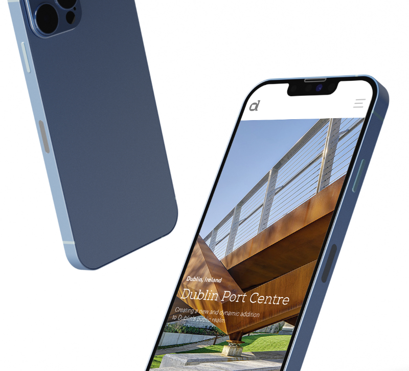
Websites live or die on the strength of their imagery and we were fortunate that Darmody had an impressive archive of project photography, architectural drawings and illustrations. However, they lacked current and appropriate photography of the staff and images of the team in action. The Practice also needed to agree an overall digital strategy and have the facility to manage both their
Upon reviewing our thoughts and recommendations, Idea was commissioned and asked to proceed at full speed.
Discovery Phase
Internally, Idea set up a project team with Project Manager, Digital Strategist who managed the UX element, two UI Designers and an Account Director. We also encouraged Darmody to set up a small steering committee to manage the project from their end and short circuit the need for large group meetings throughout the project.
An initial ‘discovery’ meeting was held that went into great depth in defining the user-needs of the website, the structure and the content in general. This led to a UX plan and the creation of a number of wire-frames for discussion.
Some time was invested in agreeing the most suitable content management system to ensure that Darmody could easily update and edit the site without damaging the flow and structure.
A two-day photoshoot was commissioned to capture a new suite of corporate photography and a full set of portraits for every individual on the Darmody team. In tandem with this a more detailed content plan was developed to identify what content was needed for every page of the site.
Upon approval of the wire-frames and a detailed content plan, the Idea design team took up the challenge of creating a User Interface (UI) that would truly reflect the superb quality of Darmody's output, showcase some of their award winning schemes and populate the site with good corporate and ‘people’ photography.
Mulitple options
Several design options were presented and discussed with the client, who took a particular interest in the design that now exists on the website.
Content Harvesting
The most challenging element of creating a website from the client's point of view is the gathering of content. Idea invested a lot of time in assisting them and actively engaged in both copy creation and quality checking of all photography.
Design and Innovation
The client was delighted with the new website and they are particularly happy to now have a site that absolutely reflects their position in the architectural sector. The site does not strive to illustrate Darmody as ‘big architecture’ but as a proactive practice that stands out for design and innovation. The website is populated with exquisite project photography that makes the site an enjoyable experience. The site operates smoothly and speedily with some interesting UI features that ensure that this is not simply a standard brochure site, but one that reflects the talents of every part of the idea team that created the site.
Strong UX And UI at the core of the site
Upon approval of the wire-frames and a detailed content plan, the Idea design team took up the challenge of creating a User Interface (UI) that would truly reflect the superb quality of Darmody's output, showcase some of their award winning schemes and populate the site with good corporate and ‘people’ photography.
Several design options were presented and discussed with the client, who took a particular interest in the design that now exists on the website.
The most challenging element of creating a website from the client's point of view is the gathering of content. Idea invested a lot of time in assisting them and actively engaged in both copy creation and quality checking of all photography.
With all our contents in hand the design team, with the project manager and digital strategist, managed the movement of the site to the development phase - operating a quality control check throughout this phase
Related Case Studies
Services
- Branding
- Web
- UX/UI Design
Project Overview
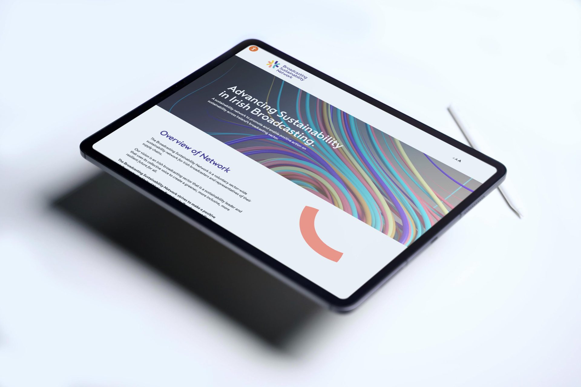
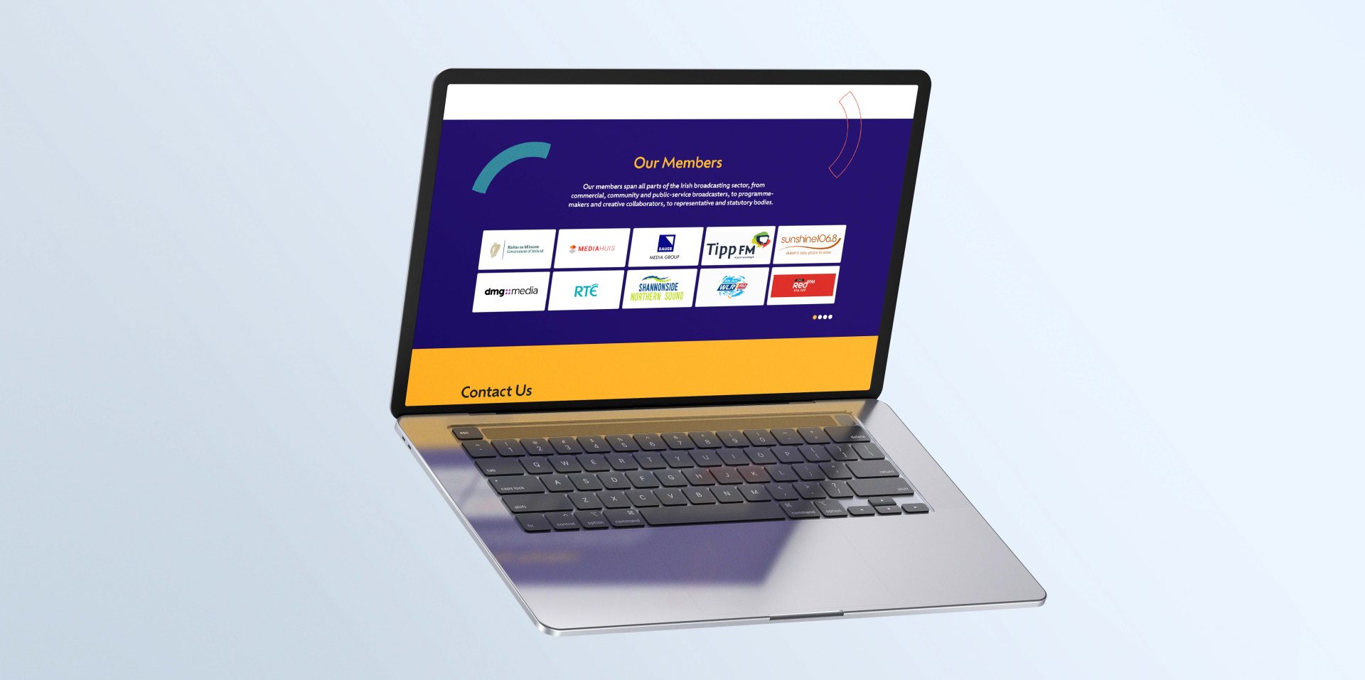
Broadcasting Authority of Ireland is the regulator of Broadcasting in Ireland. In 2020 they launched the Broadcasting Sustainability Network (Now Sustainable Media Ireland) to inspire the Irish broadcasting sector in shaping a sustainable future.
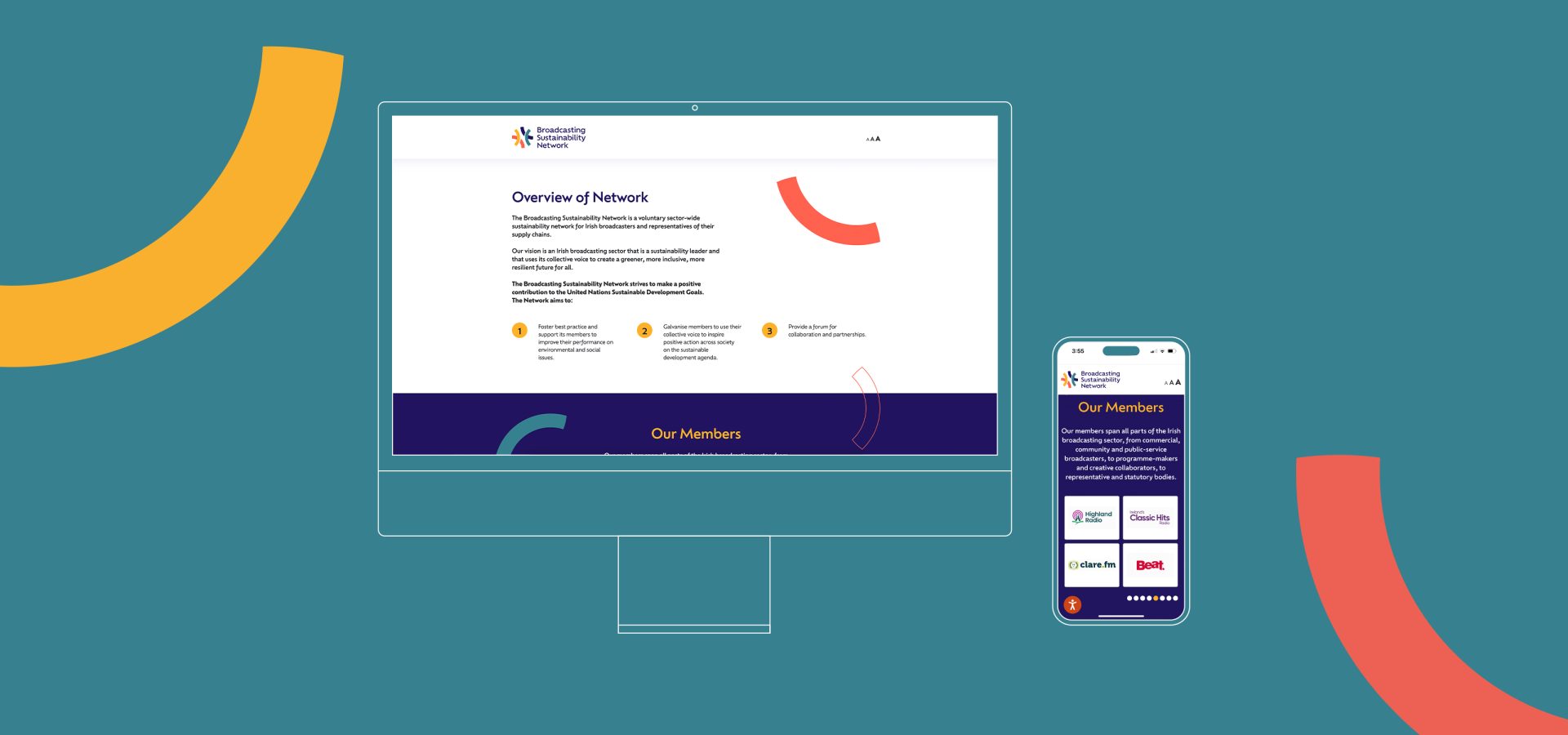
Advancing Sustainability in Irish Broadcasting
The aim of the network is to foster sustainability practices amongst the broadcasting sector via peer support through training, information and guidance. The Sustainable Media website was designed to provide a streamlined, simple, and accessible user experience for members. The website's design features a clean and modern aesthetic, with a focus on easy navigation and user-friendly features. Clear messaging and key goals are well-communicated through the design, highlighting the website's focus on sustainable media production and its mission to promote environmentally responsible practices within the media industry. By incorporating these design principles, the Sustainable Media website aims to create a pleasant user experience, reduce confusion and frustration, and effectively communicate its purpose and goals to members.
Communication at its Core
The brand identity we developed takes its inspiration from signal arcs to represent communication and broadcasting. We chose an appealing colour palette for engagement and to represent the energy and connectedness needed when people come together to plan, discuss and improve their current work practices.
Logo Design
The intersected arcs in the logo represent partnership, discussion, and collaboration, highlighting the importance of working together to create sustainable media practices. The circular holding device surrounding the logo symbolises sustainability, emphasising the need to maintain a balance between economic, social, and environmental factors. The logo's design elements, including the use of geometric shapes and a green and blue colour palette, evoke a sense of nature and the environment. By incorporating these elements into the logo design, the Sustainable Media brand is able to effectively communicate its purpose and values.